
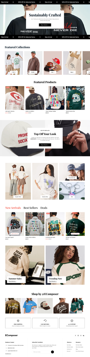
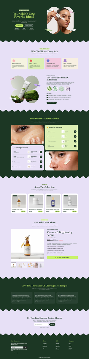
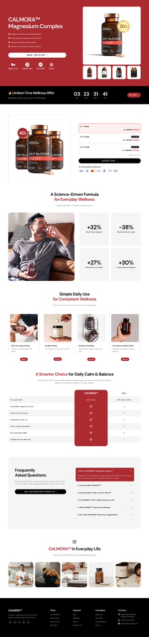
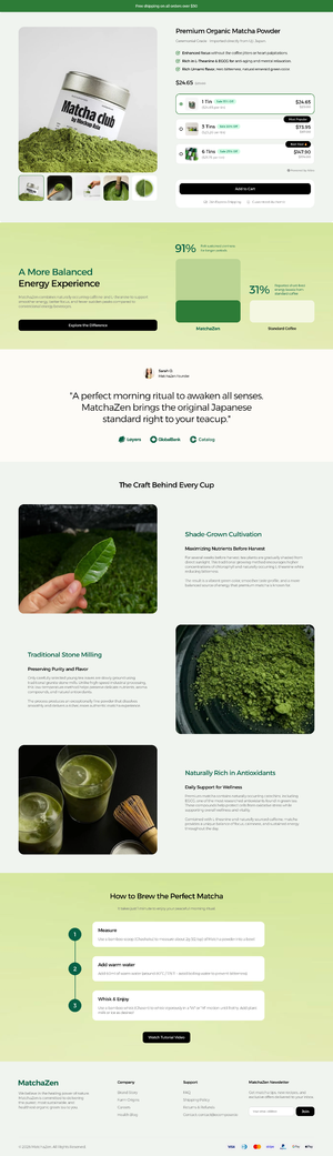
Build Shopify pages live, exactly as shoppers will see them
Drag, drop and type right on your real store. Every change shows instantly on desktop, tablet and mobile, with no code and no guessing.
- No coding required
- Your real theme, header and footer
- Auto save every 5 minutes

How it works
Watch a product page come together







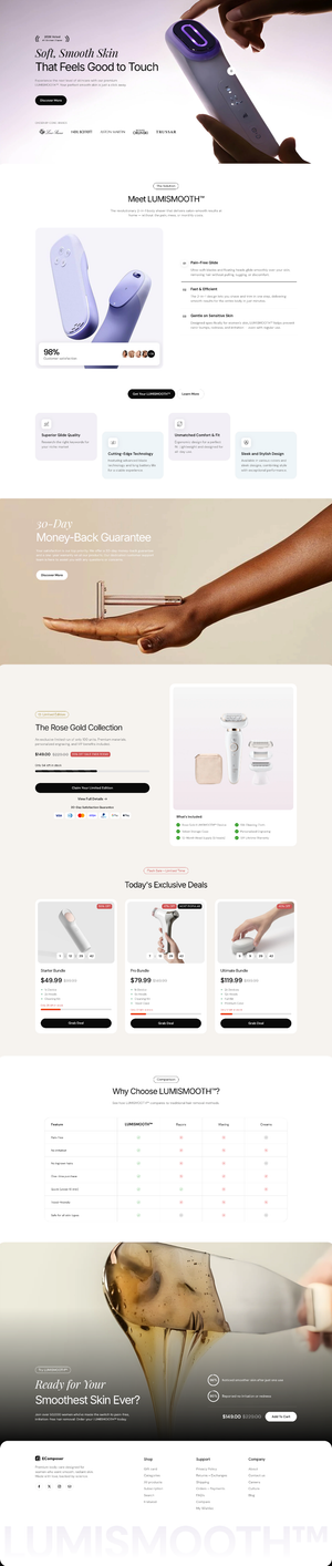
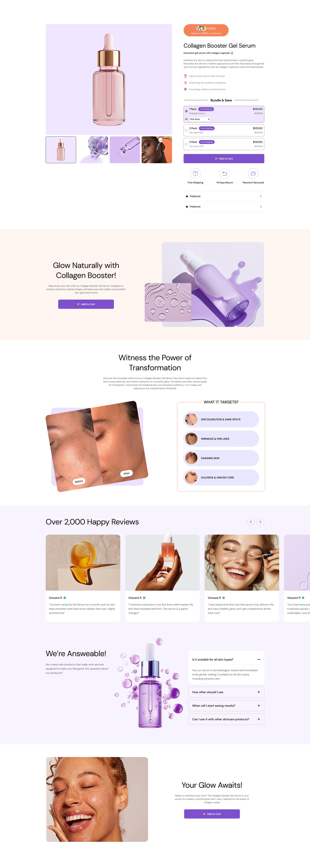
-
1/6
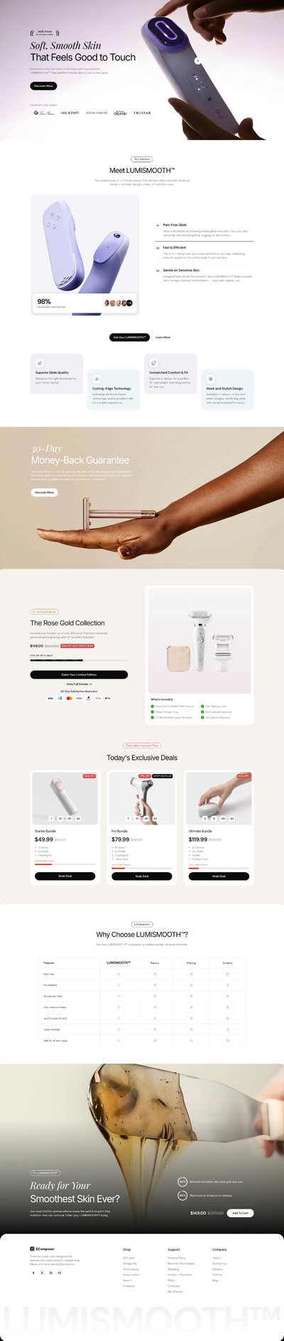
Drag and drop any element
Pick from 100+ elements, like headings, countdowns and testimonials, and drop them exactly where you want them. A blue line shows where each one lands.
-
2/6
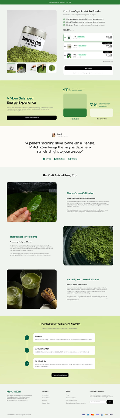
Click any text and just type
Select an element on the page to edit it in place. Its settings open beside it in Content, Design and Advanced tabs, and the page updates as you go.
-
3/6
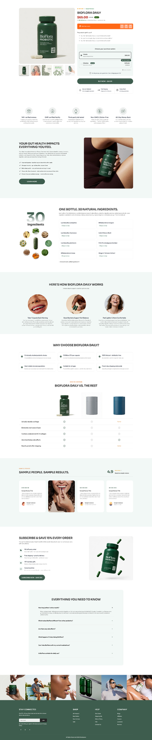
Fine-tune every device
Switch between Desktop, Tablet and Mobile. Changes made on Desktop apply everywhere, while changes made in Mobile mode stay on mobile only.
-
4/6
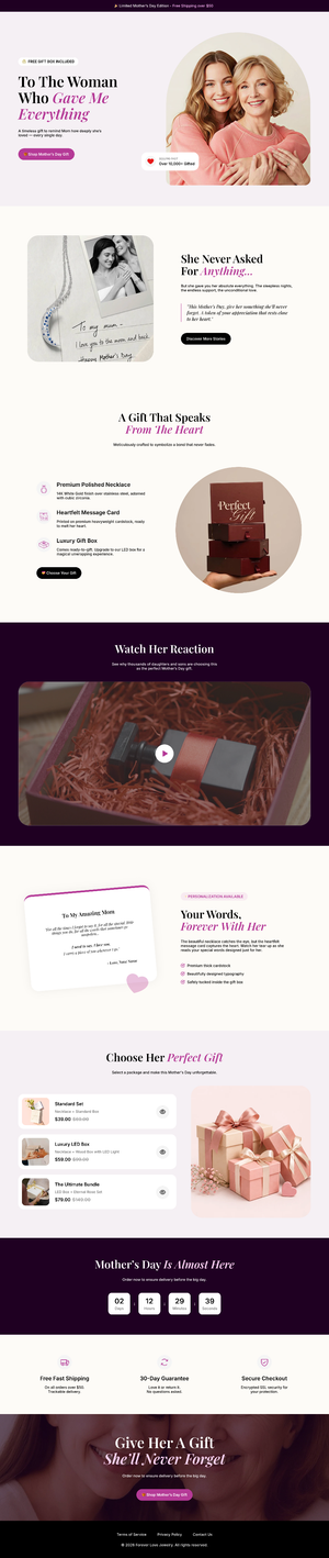
Find and reorder with the Navigator
See your whole page as a tree of sections and elements. Click to jump there, drag to reorder, rename, hide or search anything you built.
-
5/6
Undo anything, restore any version
Step back with ⌘Z and forward with ⇧⌘Z. History keeps every manual save plus an auto save every 5 minutes, so a reload never costs you work.
-
6/6
Publish when you’re ready
Save as a draft, or turn on Publish and hit Save & publish. Your page goes live on your theme in one click.
Pixel-perfect tools
The details that make a page feel designed
Advanced controls for alignment, styling and reuse, all without touching a line of code.
-
Editor configs
Snap lines, distance lines and auto snap line elements up perfectly. Lock mode keeps everything in place while you click around.
-
Site settings
Set global colors, fonts, buttons and spacing once. Every template you import picks them up instantly.
-
Flexbox layouts
Put elements side by side, then set direction, wrap, alignment and spacing in the Flex Container. Responsive without extra rows.
-
Reuse what you build
Save pages and sections to My templates, paste a section between browser windows, or export your design as an .ecom file.
Do I need to know how to code?
No. Building is drag and drop and point and click. If you do code, the editor also supports custom CSS and JS for your own design ideas.
Can I design the mobile version separately?
Yes. Use the device switcher to preview Desktop, Tablet and Mobile. Settings with a responsive icon can have a different value on each device, and changes made in Mobile or Tablet mode only apply to that device.
What happens if I forget to save?
The editor auto saves a local backup every 5 minutes, and every Save or Publish creates a version in History. Auto saves live in the browser on the device you edit with, so press Ctrl + S (Cmd + S on Mac) to save to EComposer’s servers.
The editor won’t load on my store. What can I do?
Store passwords, lock or redirect apps, or a broken theme can block the editor. Turn on Safe mode in Editor configs to edit your page without loading the theme or third-party scripts. It doesn’t affect your live store.
Can I use the editor on a phone or tablet?
We recommend a desktop or laptop. Drag and drop, floating toolbars and nested settings need a mouse and a big screen. You can still preview and fine-tune the mobile version from your desktop.
Make your first page in the Live Editor
Install EComposer free and start editing a page on your real store in minutes.
New to Shopify?Open your store