


Top 35+ Shopify Design Examples to Spark Your Creativity
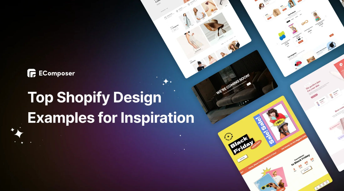
Table Of Contents
Examples of Shopify websites are excellent sources of inspiration for your own store design. If you're looking to boost your Shopify store with fresh and unique ideas, you've come to the right place.
We've searched the web and compiled a list of 35+ top-notch Shopify design examples. These stores excel in both design and user experience.
But we won't just admire them – we'll also explain why they're successful and how you can use similar strategies in your own online store.
Key Features of a Successful Shopify Store Design

Designing a successful Shopify store involves focusing on key elements that enhance the customer experience and boost sales.
- Color and Font Choices: Picking the right colors and fonts is important to make your website look good and feel consistent. Using tools to help choose colors that match your brand can make a big difference.
- High-Quality Photos: The pictures on your site matter a lot. Good, clear photos help show off your products and make your store look professional. It’s worth spending a little extra on great images.
- Focus on Key Products: Small businesses should focus on a few key products instead of offering too many choices. This helps customers find what they want faster and lets you highlight your best items.
- Simple Navigation: Make it easy for customers to browse your site. Features like breadcrumb trails and grid views for similar products help shoppers find what they’re looking for quickly.
Top 35+ Design Examples from All Niche for your Inspiration
Fashion and Apparel
- Bold and Beautify – Landing Page

The "Fashion" landing page is a great example of clean, modern design and easy navigation. Its simple hero section creates an elegant look, showcasing fashion items beautifully.
- The color scheme combines neutrals with trendy shades, reflecting a stylish, contemporary feel.
- The easy-to-use navigation bar helps visitors find what they need quickly.
- The design highlights the latest trends and stylish products, with clear calls to action encouraging users to explore the curated fashion collection.
- It’s also optimized for mobile, offering a smooth and stylish way to browse the latest in fashion effortlessly.
- Will & Bear – Blog Post Page

(Image Source: wildandbear.com)
Will & Bear is a fashion brand that focuses on making stylish, sustainable hats and other accessories. Their prices range from $50 to over $150, depending on the style. Their products are perfect for outdoor adventures and are available for both adults and children. The quality is excellent, especially for those in search of a good hat.
Their blog matches their outdoor aesthetic:
- There are category filters with small circle icons that include matching images.
- A large headline showcases their featured blog, with an image that fills the entire screen.
- They also have adventure blogs featuring models wearing the brand’s products.
- Girlfriend Collective – About us Page

(Image Source: girlcollective.com)
Girlfriend Collective, as the name suggests, is a brand mainly focused on women, though they also offer some products for men. They are a clothing company that values community and ethical consumerism, believing that what we buy and wear impacts the world around us.
Here’s how they express these values on their website:
- An image paired with text that highlights community, along with a welcome message ending with “we’re glad you’re here,” giving a personal touch.
- Several sections with images and detailed text explaining their ethical practices. This kind of transparency is something many consumers appreciate and helps build trust.
- Clear and thorough transparency is maintained throughout their about page.
Beauty and Personal Care
- Nice Skin – Landing Page

The "Nice Skin" landing page has a clean and easy-to-use design. The simple top section with high-quality images quickly catches your eye. The page explains the benefits of skincare in a way that connects with visitors.
- Soft colors create a calm and relaxing feel, perfect for skincare.
- The layout is clear and uncluttered, making it easy for users to find what they need.
- Clear buttons guide users to find personalized skincare solutions.
- Additionally, the website is mobile-friendly, allowing users to explore the "Nice Skin" world, where good design meets effective skincare.
- Bite – Product Page

(Image Source: bitetoothpastebits.com)
Bite is a company that makes toothpaste bites to reduce the environmental impact of the billions of toothpaste tubes thrown away each year. Their formula is free from unnecessary fillers and dyes, using only natural and clean ingredients.
Here’s how they showcase this unique product:
- The product page quickly highlights the benefits and includes an image with instructions on how to use the toothpaste bites.
- A call-to-action banner at the bottom of the screen stays visible as you scroll, encouraging you to take action.
- There’s a section for related products to suggest additional items, with small tags like “33% off” and crossed-out prices to attract clicks and boost sales.
- Krave Beauty – Collection Page

(Image Source: kravebeauty.com)
Krave Beauty is a skincare brand started by YouTuber Liah Yoo. After testing many products on her skin, she found she only needed a few essentials to keep her complexion healthy. With her company, she created just six products to cover different skincare needs, focusing on quality, sustainability, and affordability.
Here’s how their “shop all” page is set up:
- A main image shows all their products together.
- The page is divided into sections for different product series, helping users see which items are essentials and which are extras.
- Stickers on the products highlight their purpose, improved formulas, or new additions.
Home and Living
- Home & Garden – Homepage

The "Home & Garden" homepage is a stylish and practical showcase of home and garden products. The beautiful hero section highlights ideal living spaces, while the rest of the template offers a visual tour of various options.
- A well-organized selection of products, possibly with interactive features, encourages visitors to envision new looks for their spaces.
- The colors reflect the natural beauty of outdoor settings, creating a calm and welcoming feel.
- The descriptive text helps users imagine a peaceful and stylish home, using a touch of botanical charm.
- Blueland – Collection Page

(Image Source: blueland.com)
Blueland offers eco-friendly, plastic-free home products like hand soap and laundry detergents. Their collections page is worth checking out because it’s very well organized. Here’s how their starter kits page is set up:
- Starter kits are featured at the top of the page, so they’re one of the first things customers see and are likely to notice.
- On the left side of the page, there are filters for products and categories, while the products are displayed on the right.
- When you hover over a product, a “quick add” button appears, making it easy to add items to your cart on both desktop and mobile.
- Koala – Product Bundle Page

(Image Source: koala.com)
Koala is a well-known Australian furniture brand, especially popular for their mattresses and sofas. Most of their top products cost over $1,000, but they offer bundles and discounts to help customers save money:
- They clearly show the prices if you buy items in bundles.
- The bundled products are grouped into three categories: bedroom, dining room, living room, and homewares.
- At the bottom of the page, there’s a contact section with three different ways to get in touch with the company.
Health and Wellness
- Enchantment – Landing Page

The "Spa & Wellness" landing page offers a peaceful escape, combining relaxation and rejuvenation. The soothing colors reflect the calming atmosphere of a spa, creating an immediate sense of relaxation.
- The calming hero section shows serene spa scenes, and the page features a carefully selected range of self-care products.
- The page gently introduces wellness services, encouraging visitors to start their self-care journey.
- Interactive features like wellness program previews or virtual spa tours enhance the experience.
- It is optimized for mobile, providing a smooth and relaxing experience on any device.
- Happy Healthy You – Product Bundle Page

(Image Source: happyhealthyyou.com.au)
Happy Healthy You is an Australian wellness brand focused on helping women with hormonal issues. Their products are priced around $40 each, but you can save more by buying bundles:
- You can save 10% to 15% when you purchase a bundle.
- The bundles are displayed in separate boxes, and when you hover over one, the box moves, and the add-to-cart button stands out, making the website more engaging for customers.
- At the bottom of the page, there are over 11,000 reviews, many of which include photos.
- Nette – Blog Post Page

(Image Source: nettenyc.com)
Nette is a soy candle brand that focuses on using clean, sustainable, and organic materials. They carefully select even their glass and ceramic makers to ensure the highest quality for their candle containers. Their candles start at around $70 each.
Their candle-related resources are impressive:
- At the top of the page, there's a catchy tagline that says, "Burn After Reading."
- They offer a series of blogs with attention-grabbing one-liner intros designed to encourage customers to click "Continue Reading."
Electronics and Gadgets
- Electric Accessories – Landing Page

The "Electric Accessories" landing page highlights innovation and practical features. It features an exciting hero section displaying the latest gadgets and offers a curated selection of electric accessories.
- The modern color scheme reflects the advanced technology of the products, creating an engaging look.
- The page explains the features and benefits of the products, inviting tech lovers to explore. Interactive elements like product demos or compatibility guides make the experience more engaging.
- Clear calls-to-action help visitors find the newest electronic accessories, and the page is optimized for mobile, providing a smooth browsing experience on any device.
- Levoit – Product Page

The Air Purifier product page template delivers a breath of fresh air with its straightforward and user-friendly design.
- It showcases sharp images and clear descriptions, emphasizing the purifier's key features and benefits.
- Interactive elements let users easily explore filtration technologies and compare different models.
- With an emphasis on simplicity and practicality, this template provides a smooth shopping experience for those looking for cleaner, healthier indoor air.
- Bruvi – Homepage

(Image Source: bruvi.com)
Bruvi was created to provide the convenience of single-serve coffee pods at home while being eco-friendly. They offer a variety of coffee makers and the coffee to go with them.
Here’s what you’ll find on their homepage:
Pets and Vet
- Pet Supplies – Landing Page

The "Pet Supplies" landing page is designed with care, featuring key elements that make it effective. The hero section grabs attention with high-quality images of pet products, and a clear headline quickly tells visitors what the page is about. The color scheme is well-matched, creating a visually appealing and consistent brand experience.
- The template does a great job of showcasing pet supplies, using creative layouts and possibly interactive features to keep visitors engaged.
- A well-placed call-to-action button encourages further browsing or immediate purchases.
- With smooth mobile optimization, engaging text, and possible social proof, this template provides a pleasant and efficient shopping experience for pet lovers.
- Pet Supplies – Landing Page

The Cat Feeder landing page is a pet lover's dream, blending charm with practicality. Here are what we love about this page:
- With cute images and detailed descriptions, it highlights must-have supplies for pets.
- Interactive features help users explore product details and choose the best option for their cats.
- The page creates an outstanding shopping experience for pet owners because the navigation is really easy to use and visuals are stunning.
- Reggie – Product Page

(Image Source: reggie.com)
Reggie is a company that makes multivitamin supplements for dogs. To create various products for different needs, like multivitamins, anxiety, mobility, and coat health, they use vet-approved ingredients and essential vitamins all at reasonable prices. You can also save more by selecting their subscription plan.
Here’s what you’ll find with their bestseller:
- The supply amount is based on your dog's size, showing how much you get for a month.
- You can quickly check for unnecessary fillers or harmful additives since the product page highlights key ingredients, active ingredients, and other components.
- It includes icons of magazines and websites where the brand has been featured, along with customer reviews.
Food and Beverage
- Food Delivery – Landing Page

The "Food Delivery" landing page is designed to be both inviting and practical. The eye-catching hero section highlights delicious food that is ready on the way of shipping. A neatly arranged menu, possibly with interactive features, gives a preview of the variety of dishes available.
- The color scheme matches the warmth and richness of a great meal.
- The engaging text describes the food in mouthwatering detail, making it sound irresistible.
- Clear calls-to-action help visitors place orders easily, and the mobile-friendly design ensures a smooth and enjoyable experience on any device.
- Wellness Drinks – Homepage

The "Drink Landing" stands out with its eye-catching hero section, featuring high-quality images of beverages. The template effectively showcases products with a noticeable and appealing call to action that encourages visitors to explore more.
- The clear and convincing headline quickly conveys the main message.
- The color scheme is well-chosen, creating a unified brand experience. The use of white space keeps the layout clean and organized.
- With fast loading times and consistent branding, this template is a great choice for promoting and selling drinks.
- Oak & Eden – Collection Page

(Image Source: oakandeden.com)
Oak & Eden is a whiskey brand known for using American oak barrels in their traditional distillation process. They’ve earned several awards from the San Francisco Spirit Competition and Sip Awards. Their whiskeys start at $49.99, offering good quality at a reasonable price.
Here’s how they display their products on their “Shop All” page:
- A menu shows their different product lines, making it easy for customers to find what they want.
- As you scroll down, each product line is introduced with a photo of a man holding a whiskey bottle from that series.
- When you click on a product, a clock-like graphic appears in the image's background, drawing attention and encouraging customers to focus on the details.
- Future Noodles – Blog Post Page

(Image Source: futurenoodles.com)
As the name suggests, Future Noodles aims to be the next big thing in noodles by offering tasty, plant-based options packed with nutrients and sold in recyclable packaging. They come in three flavors, and a six-pack costs about £22.
They also have a helpful recipe section for their noodles:
- There's a banner that says #PimpMyNoodz, a fun way to highlight that their noodles are a great base for creative cooking. This hashtag also helps build their social media presence and adds a catchy element to their brand.
- The recipe section features various recipes along with essential details.
- At the bottom of the page, there's a link to their products with a clear call to action.
Arts and Crafts
- Handcrafted & Unique – Landing page

The Handcrafted & Unique landing page is crafted to attract its target audience with eye-catching DIY images throughout.
- Product categories are creatively displayed using circles representing different types, adding a unique touch.
- The lookbook slider is particularly engaging. It allows customers to interact with pins to quickly discover the products they want.
- Just before the footer, a store location section clearly shows where customers can find this brand.
- La La Land – Homepage

(Image source: aloyoga.com)
La La Land offers a wide range of home products with a modern design that appeals to a younger audience. While the website targets mostly female visitors, it still welcomes male customers.
The website's vibrant design, engaging content, and smooth functionality work well for everyone. La La Land's design is fresh and youthful, attracting a younger crowd while providing an excellent experience for all visitors.
What we were impressed about:
- Modern design that appeals to a youthful audience
- Bright, colorful content with easy-to-use features
25. Uppercase – Homepage

(Image source: uppercasemagazine.com)
Uppercase magazine has provided readers with engaging articles and photos centered on crafts, fashion, illustration, and design, all presented in a beautifully printed format for over ten years.
Jewelry and Gemstones
- Jewelry – About Us Page

The Jewellery "About Us" page quickly highlights their key strengths.
- It starts by stating that they are a top direct-selling company worldwide and explains what makes their brand stand out.
- As you scroll down, the page shows why their products are unique and why customers should choose them, backed by testimonials and endorsements from well-known brands.
- This straightforward approach helps readers quickly grasp the brand's value and reputation, making it clear that this is the brand they need.
- Exquisite Jewelry – Landing Page

We're truly impressed with The Exquisite Jewelry Landing Page. Although the design is simple, it effectively conveys a sense of luxury.
- The minimalist color scheme focuses on the products, highlighted against a brighter background to catch customers' eyes.
- Four benefit blocks are clearly emphasized, showcasing the high quality, inspired design, and exceptional services offered when purchasing their products.
- The page also uses pins on images, making it easy for customers to find and add the products they're interested in directly to their cart.
- Boucles D’Orille Lotus Ring – Product Page

The Boucles D’Orille Lotus Ring Product Page introduces a new approach to product page design that follows the latest trends.
- Instead of the usual layout with the product image on the left, the cart button, and the price on the right, this page places the image at the top, with the rest of the information below. This arrangement uses space effectively and gives the product a distinct, eye-catching presentation.
- In addition to the main product display, there are sections below where customers can find more information, such as a detailed description, customer reviews, and the shipping & returns policy.
Outdoor and Sports
- Electric Bikes – Homepage

The "Electric Bike" homepage offers an exciting look at the future of eco-friendly transportation. The standout hero section displays sleek e-bikes in action, and the template features a curated selection of advanced electric bicycles.
- The modern color scheme reflects the innovation of electric bikes, creating an engaging visual experience.
- The template highlights the eco-friendly benefits and thrilling aspects of riding electric bikes.
- Interactive features, like virtual test rides or bike customization options, add to the experience.
- Your Adventure Awaits – Landing page

The "Outdoor & Travel" landing page is designed to inspire adventure and style. The engaging hero section displays stunning destinations, and the page features a curated list of travel essentials. The nature-inspired colors reflect the excitement of exploration, with shades reminiscent of sunsets and beautiful landscapes.
The visuals spark a sense of wanderlust, telling stories of adventure and discovery. Interactive features, like maps or itinerary planners, offer a sneak peek into the travel experience. Clear calls-to-action encourage visitors to get ready for their next adventure, and the page is mobile-friendly, making it easy to go from inspiration to planning on any device.
- Alo Yoga – Homepage

(Image source: aloyoga.com)
Alo Yoga's sleek and dynamic design quickly grabs the attention of yoga lovers. Even with its simple layout, the website is expertly customized and filled with photos of people doing yoga poses. Thanks to its well-organized structure, the website is straightforward to navigate.
Alo Yoga maximizes its platform by offering stunning visuals, including photos and videos of advanced yoga poses that impress visitors. This approach has helped Alo Yoga become a top brand in the yoga world.
What we were impressed about:
- Dynamic design with a simple, well-organized layout
- Impressive visuals, including images and videos
Seasons and Holidays
- Cyber Monday – Landing Page

The Cyber Monday landing page template is designed to attract bargain hunters. It features an exciting hero section with exclusive deals and showcases discounted products.
- The bright colors match the energy of Cyber Monday shopping.
- The template highlights big savings and limited-time offers. Interactive features like countdown timers or deal sliders add urgency.
- Clear calls-to-action help shoppers find the best deals, and the page is optimized for mobile, making it easy to navigate and enjoy Cyber Monday deals on any device.
- Christmas Sales – Landing Page

The Xmas Landing Page captures the holiday spirit with its charming design and smart features.
- The eye-catching hero section is filled with Santa, Christmas tree images, and a snow effect, creating a seamless and festive shopping experience.
- The color scheme brings out the warmth and coziness of the season, adding to the cheerful atmosphere.
- The template highlights holiday products, possibly with interactive elements, encouraging visitors to find the perfect gifts.
- Halloween – Landing Page

The Halloween landing page is designed to captivate and thrill visitors. It begins with a striking hero section that showcases spooky deals and Halloween-themed products.
- The eerie color scheme and dark tones perfectly capture the season's spirit.
- This template spotlights special offers and limited-time promotions that create urgency.
- Interactive features like countdown clocks or animated elements enhance the spooky atmosphere.
- Thanksgiving – Landing Page

The Thanksgiving landing page captures attention with cheerful text and a cute turkey icon that draws customers in immediately.
- Just below the hero banner, the page features top products perfect for the Thanksgiving holiday and a countdown timer that makes shoppers feel urgent.
- In addition to the main items, customers can add to their carts since the store offers a wide variety of complementary products.
- Real customer reviews are also showcased, helping to build trust in the quality of the items.
3 Simple Steps to Design a Stunning Shopify Store
Creating a page on Shopify is easy because the platform offers many apps that help you design and integrate the key elements you need.
One such app is EComposer Page Builder, which allows users to create professional online storefronts without needing any coding skills. EComposer offers a wide range of templates, including landing pages, homepages, and product pages, along with over 100 drag-and-drop elements to customize your store.
With more than 300 pre-made templates available, EComposer caters to various industries such as Fashion, Food, Technology, Furniture, Jewelry, Home Decoration, and more.
Step 1: To get started, simply install the EComposer Page Builder app from the Shopify App Store: EComposer Landing Page Builder

Step 2: Choose a Page Template
- Open the EComposer app, and then start building your page.

- Choose Landing Page

- Scroll down to explore a variety of page templates. They are categorized as Newest, Popular, Featured.
- You can preview each template and opt fpr the one that best fits your Shopify store.

- Click the Next button to proceed.
- Give your page a name, then select Start Building > Insert to begin creating your Shopify Thanksgiving landing page using EComposer.

- In the EComposer editor, you can personalize the template to match your brand using various elements and extensions. Simply drag and drop the chosen element from the left sidebar into your preferred spot, then adjust it to your liking.

- Additionally, to modify any details in the template, simply hover over the area you wish to change and click the pencil symbol. The editing choices will be displayed on the left side. You can update the text in the Content section and adjust colors or alignment in the Design section.

- If you need additional extensions or integrations, please navigate to the Extension Library on your left side column; the icon is in the sixth position.

Step 3: Save and Publish
- Click "Publish" in the top right corner and select "Save and Publish."
- To preview your page, click "View."
EComposer makes it easy to create a stunning page – its design is made simple, just for you.
If you don't have a Shopify account yet, take advantage of a special offer: get your first month for just $1 on any plan and explore everything Shopify has to offer.
Others also read
Top 26 About Us Page Examples for Every Industry
Landing Page Copywriting: 11 Tips & Examples for Successful
10 Tips to Edit Homepage SEO on Shopify
Wrap Up
To sum up our review of these impressive Shopify design examples, it's clear that each offers unique ideas and inspiration. From sleek designs to user-friendly layouts, there's a lot to learn from these successful stores.
Remember, it is essential to adapt these ideas to match your brand and target audience. So, feel free to add your personal touch and create a store that looks stunning, resonates with your customers, and performs well. We hope these examples have inspired you to build a standout Shopify store for your business confidently.
=================
Add EComposer Next generation page builder Here
Follow Us on Facebook
Join Official Community
Build your highest-converting page in 15 minutes


Blog Categories


0 comments