


Shopify Website Ideas: Learn from 23+ Best Successful Stores from Design to Branding
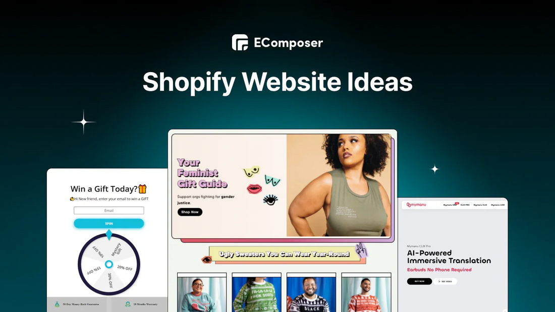
Table Of Contents
Either way, eCommerce is booming, and standing out in a sea of online stores is harder than ever. You have probably found yourself scrolling through Shopify, wondering, What kind of store should I start? What actually works?
Well, good news—I have done the deep dive for you. I’m about to walk you through 23+ of the most successful Shopify stores, breaking down exactly what makes them work, from jaw-dropping design to branding that practically prints money. Whether you’re looking for inspiration or just want to see how the pros do it, you’re in the right place.
The Secret Sauce of a Standout Shopify Store

So, you wanna build a Shopify store that doesn’t just exist but thrives—one that doesn’t get lost in the endless void of the internet like that one sock that mysteriously disappears from every laundry load.
Well… The most successful Shopify stores don’t happen by accident. And phew! We are about to break it down:
1. Feel Like a Breeze with Shopping Experience
Have you ever visited a website where finding what you need felt like completing a complex puzzle? Yeah, no one has time for that.
A great Shopify store makes shopping so simple that people can enjoy easy browsing and purchasing. It is about simple navigation, about clear product categories and quick-loading pages, of course.
2. People Don’t Think Twice at Checkout
Imagine this: Someone adds products to their cart, they’re ready to buy, and then they abandon it because checkout is a hassle. Ouch. The best Shopify stores remove every bit of friction at checkout.
- Multiple payment options (credit card, PayPal, Shop Pay, and even Apple Pay)
- A guest checkout option (because not everyone wants to make an account)
- Transparent pricing (no last-minute surprise fees)
3. A Brand That Sticks in People’s Minds
A good store sells products. A great store builds a brand. The kind that people remember, talk about, and stay loyal to. What makes a brand unforgettable?
- A unique tone of voice (fun, bold, friendly, whatever fits your audience)
- A design that matches your brand personality
- A story behind the brand (why did you start? What problem are you solving?)
Now you see the importance of having the right components combined to create an outstanding online store at the edge of digital growth. So, if you haven’t set one up yet, Shopify makes it simple with its drag-and-drop store builder; no coding is needed!
Need an easy way to launch your online store?
Explore all their plans for the first 3 months with only $1 paid.
Shopify Website Ideas: Real Stores That Nail It
1. Fashion Store

(Image Source: Fashion Store)
It is not just about selling clothes when talking about a fashion shop; this store nails more than that. It is about creating a feeling that makes customers think, "Yep, this is totally me," because of a vibe, a lifestyle.
From the moment you land on this Fashion store page, the design speaks directly to trend-conscious shoppers. Here’s what makes it stand out:
- The aesthetic? On point. Clean layouts, high-quality images, and just the right amount of whitespace give it that premium-yet-welcoming feel.
- Smart storytelling: Instead of just listing products, it groups them into themes like Sustainable Fashion and Effortless Chic. Shoppers instantly get a sense of what the brand stands for.
- Deals that pop: The Limited Time Deals section uses bold visuals and discounts that make you want to click before the sale disappears.
- Trust-building brands: It is even more trustworthy when featuring big fashion labels like Burberry and ASOS within your webpages.
- Call-to-action magic: Simple yet compelling buttons like "Shop Now" and "Explore Now" make it easy to take the next step.
This store is not just selling fashion; it is selling confidence, style, and a shopping experience that feels effortless.
2. Enchantment Spa

(Image Source: Enchantment Spa)
A great spa website doesn’t just sell treatments; it sells calm mornings, stress melting away, and that “just one more hour, please” feeling. The best ones? They keep it soothing, elegant, and effortless to book.
Think about it: When you’re on a spa site, you don’t want to hunt through messy layouts or wonder what’s included. You want clear services, relaxing imagery, and a booking process that feels as easy as sinking into a massage chair.
- Colors that calm: Soft backgrounds, gentle tones, and serene images make every service look like a retreat.
- Simple choices, less stress: Clear treatment categories, package options, and a smooth booking button keep the flow easy.
- No hidden surprises: Straightforward pricing, service details, and FAQs build trust and transparency.
- A personal touch matters: Warm team photos, client testimonials, and human-friendly copy make the brand feel like your local spa guide, not a faceless business.
A well-designed spa website makes you feel like you’ve already booked your escape. But… they’ve truly nailed it if you can almost hear the soft music and running water just by scrolling.
3. Plant Shop

(Image Source: Plant Shop)
Plant Gift Shop chooses to focus on what truly matters to its customers: bringing nature into their homes in a simple, stylish, and affordable way. The website feels welcoming, clear, and made for real plant lovers—not just another copy-paste store.
So, why’s it working so well?
- They know their audience: The site highlights what shoppers really want—beautiful plants that fit any space—while showing exactly how each product adds value as a gift or home essential.
- Keep it fresh; keep it simple: Clean product cards, lifestyle images, and easy-to-find categories walk visitors through browsing without overwhelm.
- Social proof builds trust: Customer reviews and testimonials reassure new buyers that these plants arrive healthy, cared for, and well-packaged.
- Design meets usability: The modern layout, clear pricing, and intuitive CTAs make shopping straightforward while keeping the brand stylish and memorable.
Thinking of starting your own eco-friendly or lifestyle brand?
This is a great example. Be honest, be clear, and create a shopping journey that feels as natural as the products you sell.
4. Laptop Store

(Image Source: Laptop Store)
When brands truly know what their customers want, they don’t show it off with technical jargon. That’s what this laptop store is doing. They optimize their website to make it quick and easy to buy the right product.
Here is how they do it:
- High-Tech, No Apologies: A striking, modern aesthetic is achieved through a bold, dark theme, dynamic fonts, and vibrant neon accents. This design creates a sense of speed, innovation, and a focused experience tailored for advanced users.
- Straight-Up Comparisons: No fluff, no jargon overload, just side-by-side product specs, so customers make informed choices fast.
- Trust-Building FAQs: They answer the real questions customers care about, like warranties, payment options, and returns, so buyers feel informed and confident.
When building your store, remember to just make sure it’s easy to use, it should be best to be nice to look at, and have that friendly, personal touch that makes people feel right at home.
5. The Outrage

(Image Source: the-outrage.com)
The Outrage isn't just a store, it's a bunch of people who want to change things. They're not afraid to speak up. It's for people who want to make the world better, and who want their money to help do that, not just buy stuff.
Am I saying this brand is just another online store selling cool graphic tees?
Nope. And you shouldn’t think that either.
Here’s why:
- Messaging that actually matters: Every headline, every product description, every call to action is short and real, solving the problem immediately.
- Design that doesn’t whisper: Bright colors. Bold fonts. Playful doodles. This site isn’t afraid to take up space, and it sure as hell isn’t blending into the background.
- Products with a purpose: This isn’t fast fashion. Whether it’s a sweatshirt that makes a statement or a tee that backs real activism, everything here fuels change.
Clearly, The Outrage has brought its commitment to action (so reliable, right?), they prove it's a brand of substance and do not stop at just words.
6. Abera US Store

(Image Source: rubyrose.com.co)
Now, take a moment to visit Abera’s website. What’s your first impression?
Let me guess — it feels much simpler than most other skincare brands, right? That’s because Abera takes a different path. They focus on what truly matters: effective skincare, backed by science, without all the unnecessary noise.
- Straight-to-the-Point Branding: “Nurtured by nature, perfected by science.” One sentence, and you know exactly what they’re about.
- A Clean, Editorial Feel: Crisp product shots, a soft neutral color palette, and a modern layout make everything feel effortless and trusted.
- Reviews That Sell for Them: Customers share real stories and real results. It builds trust fast—even before someone clicks “Add to Cart.”
Keep things honest and clear. When your products work, you don’t need flashy tricks. A clean design and real voices are often all you need
7. Mymanu

(Image Source: mymanu.com)
The year is 2025. We live in a world where tech isn’t just about gadgets—it’s about experiences. And Mymanu Shop? They get it.
Here’s why their design hits different:
- Crystal-clear messaging: Bold headlines highlight benefits like real-time translation and high-quality sound; it would help visitors not need to guess much.
- A lifestyle, not just a product: The visuals show off their products in real life, like traveling, working, and connecting. It brings a sense of trust.
- Urgency without the cringe: Pre-order options and limited-time deals spark that I need this now energy, without feeling like a used-car sales pitch.
- Seamless shopping: The brand successfully nailed it with intuitive navigation to clear CTAs like "Shop Now," and every detail of the page makes buying feel truly effortless.
Mymanu Shop is more than just a tech store — they understand what customers need and use clear, friendly language to make shopping simple and enjoyable.
8. Ravpower

(Image Source: ravpower.com)
RavPower is known as a tech brand built specifically for customers who need reliable power while they’re on the go without the hassle. Every part of their website is designed for efficiency, making it easy to find, trust, and buy the right charger.
- A Seamless Shopping Flow: The website has clean layouts, straightforward specs, and a fast checkout process. With PayPal’s ‘Buy It Now’ button, you can purchase quickly without any obstacles.
- Engagement That Works: A pop-up spin wheel would definitely add a lot of fun, interactive touch while offering real value. Customers can feel like they’re winning.
- Deals That Matter: Limited-time discounts are highlighted without overwhelming the experience, creating urgency without pressure.
RavPower is doing well in keeping the site simple and effective, the website that really does what customers need: fast, trustworthy, and built for action.
9. Uppercase magazine

(Image Source: uppercasemagazine.com)
UPPERCASE feels like a creative safe space. Everything on the site feels personal—from the beautiful book covers to the warm welcome from Janine, the founder.
It doesn’t feel like a typical store. It’s more like visiting a creative friend who loves to share ideas.
If there’s one thing UPPERCASE nails, it’s personality. It’s not about cold corporate fluff; it’s about genuine storytelling and design that speaks directly to you (you know quality is a promise).
UPPERCASE's website really impressed me because every step of the way to navigate was easy.
10. Magic Spoon

(Image Source: magicspoon.com)
You know what’s cool here, It is just like the cereal itself, Magic Spoon's website has a fun vibe.
Yes, the home page is really lively, emotion like childlike in feel, with bright colors, and floating cereal loops. Magic Spoon's website makes you realize that they provide guilt-free, high-protein cereal that takes you back to your childhood.
Here is why it works:
- Instant Vibe: "Childlike cereal for grown-up bodies" - you immediately get the fun, healthy angle.
- Bright, Bold, and Fun: The brand did so well on vibrant colors, dynamic animations, and playful cereal loops floating across the screen. It is really interesting.
- Customization Made Easy: Their “Build Your Own Box” feature is so cool, it lets customers mix and match flavors effortlessly, and to be honest, who doesn’t love options?
- See what people are saying: The reviews are full of excitement. People love the taste, the health benefits, and the nostalgia.
Magic Spoon nails the balance between fun and function, offering a visually striking yet seamless shopping experience.
11. Good in the Woods

(Image Source: goodinthewoods.co)
Among many fashion brands, Good in the Woods is known as a lifestyle label inspired by nature and the outdoors. Every part of the site speaks to those who love adventure and want their style to reflect it: rugged, timeless, and effortlessly cool.
- A Brand That Gets Its People: The site opens with a hero banner of campfires and mountain peaks; you know it is about embracing the outdoors.
- Visuals That Sell the Experience: Rich, nature-inspired visuals bring each piece to life; every item shown looks just as good in the city as they do in the wild.
- Reviews That Show, Not Just Tell: The homepage features real customer reviews, complete with images of people wearing their pieces in real-life adventures. Each review takes you straight to the product, which is cool because you can see how others are using it.
Good in the Woods feels genuine, like they're connecting with people who see life as one big adventure.
12. Kulala

(Image Source: kulalaland.com)
Kulala is not just another baby sleep brand; it is a science-backed solution designed to help families sleep better, effortlessly. Every part of the website reassures tired parents that better sleep is within reach; clear, effective, and beautifully simple.
- Straight-to-the-Point Messaging: “Sleep better, backed by science.” One line, and you know exactly what they stand for. It tells solutions for sleep-deprived families.
- A Calm, Trustworthy Design: Soft blue tones, minimalistic product shots, and a clean layout create a soothing experience, just like the sleep they promise.
- Science That Speaks for Itself: Designed by Dr. Sofia Axelrod, the products and app aren’t just another trend. With an 80% success rate, the results do the talking.
Kulala keeps it simple and effective; no gimmicks, just better sleep backed by real science.
13. Red Candy

(Image Source: redcandy.co.uk)
Red Candy’s website is full of color, fun, and surprises. Every inch of its website is designed for people who love quirky, fun, and out-of-the-box finds. They get their audience and serve up a shopping experience that feels like a joyride.
- No Boring Product Displays: Every section pops with bold graphics, funky patterns, and high-energy layouts that are completely in sync with their brand vibe.
- Smart Product Pairing That Just Makes Sense: The “Similar Products” section on the Product Page is a well-thought-out upsell that feels natural. Do you like a witty card? Here are three more you might love.
- Fun and friendly language: Instead of boring stuff like “You may also like,” they say things like “Tickle your fancy?” It feels like a truly real friend.
Every click feels in Red Candy’s website feels like finding something new, making you want to explore more.
14 Great Jones

(Image Source: greatjonesgoods.com)
Great Jones may look like just a cookware brand, but it’s really an open door to a kitchen full of color, personality, and joy. The same typeface from the logo appears in headings across the site, and the color palette is loud in the best way, especially when it comes to showing off seasonal or special products.
- Sticky Add-to-Cart That Stays With You: No need to scroll back up. Whether you’re eyeing a bold baking dish or a nonstick loaf pan, the “Add to Cart” button stays within reach, making checkout effortless.
- Vibrant Colors That Pop: No dull grays here. Great Jones leans into bold, cheerful colors that make cookware fun. It is a brand that understands that the kitchen should be anything but boring.
- Leading Words That Feel Like a Friend: “Take the guesswork out of gift-giving.” “Cooking made better together.” Instead of bland, robotic product descriptions, Great Jones talks to you like a fellow home cook, not some pushy sales rep.
If you’re planning to update your store, choose one strong font for your headings, use a bold banner to highlight offers, and always keep your design clear, simple, and true to your brand.
15. Loot Crate

(Image Source: lootcrate.com)
Loot Crate is a subscription box for people who love games, movies, and cool pop culture stuff. Every part of their website speaks to superfans who want more than merch; they want a piece of the worlds they love.
- A Checkout Process as Fast as a Power-Up: Pick your crate, hit subscribe, and get ready for the ultimate unboxing experience. Simple and frustration-free.
- Big-Name Partners That Build Trust: Loot Crate flexes its partnerships front and center; they’re official collaborations with the biggest names in pop culture.
- Real People, Real Passion: Behind the brand? Fellow fans who get the hype. The About section highlights the team, their love for fandoms, and the excitement that goes into every crate.
Let’s be honest — you can easily feel that Loot Crate has really brought a special experience for you and all pop culture lovers.
16. Totteland

(Image Source: totteland.dk)
Totteland is a pet store, and it is a celebration of dogs and the people who adore them. Every inch of the website feels warm, friendly, and full of tail-wagging joy, from the playful orange branding to the heart-melting dog photos.
- A Brand Story That Feels Personal: Right on the homepage, Totteland tells you who they are and why they do what they do. A heartfelt story about their love for dogs and their mission to bring quality supplies to fellow pet parents.
- Colors and Images That Bark with Joy: The signature orange pops against a sea of happy, well-loved dogs. Every product page, banner, and button feels like a natural extension of their passion: bright, fun, and unmistakably dog-friendly.
- A Treat for Signing Up: Who says newsletters have to be boring? Totteland makes it rewarding; sign up in the pop-up, and you get two free bags of treats. It is a small gesture that makes a big impression (and gets tails wagging).
Totteland keeps it real: no clutter, no nonsense, just great products, a great vibe, and a whole lot of love for the four-legged family members that make life better.
17. Allbirds

(Image Source: allbirds.com)
From sustainable materials to thoughtfully designed stores, everything about the Allbirds brand is built for people who care about the planet as much as they do about shoe comfort.
- Stores You Can Actually Visit: Allbirds makes it easy with a sleek, interactive map showing real store locations. Making it an even more trustworthy store.
- Sustainability That’s More Than a Buzzword: They don’t just talk about being eco-friendly; they prove it with their strategy and how they operate.
- Color Swatches Availability: Soft neutrals, earthy tones, and the occasional bold pop; the swatches make it easy to find your perfect match.
Allbirds keeps it clear, conscious, and comfortable. No flashy gimmicks, no unnecessary fluff; just shoes that look good, feel good, and do good.
18. Pela

(Image Source: pelacase.ca)
You know, a phone case will do more than just protect your phone.
Nowadays, many people, especially young people, choose cases because they express their personality, and Pela gets that. Each case is like a part of their own style (although… everyone has dropped their phone a few times, right?).
- Find Your Perfect Fit in Seconds: Smart filters let you quickly pick your brand, device, and style so you get exactly what you need without the guesswork.
- Use effective content: Pela also shares simple tips about living green and taking care of your tech, which makes the website helpful even if you’re not ready to shop yet.
- Real People, Real Reviews – Want to see how the case looks before buying? The site has honest reviews and videos from real customers.
19. Chubbies

(Image Source: chubbiesshorts.com)
Chubbies really stand out and are attractive because they have most of the elements of a fashion brand. I feel like every inch of its website screams fun, from the bold designs to the playful product descriptions. Shopping here feels less like a chore and more like picking out the perfect weekend vibe.
- A Mega Menu That Shows, Not Just Tells: No boring dropdowns. Chubbies lets you browse with pictures, making it easy (and fun) to find your perfect pair.
- Zoom In, Get Up Close: Their product pages let you zoom in on every detail so you know exactly what you’re getting, whether it is the fabric, fit, or that wild flamingo print.
- Model Size Featured: I see clearly that each model’s height and size are listed, so you can easily figure out what’ll fit without the hassle of returns.
With Chubbies, you’re not just buying clothes. You’re buying into a brand that believes life (and your wardrobe) should never be boring.
20. Lotta Curl

(Image Source: lottacurls.com)
Great hair shouldn’t be a struggle, Lotta Curls knows. For people who want real results without heat damage or complicated routines, the website was born out of this. From a quick quiz to personalized recommendations, they make getting perfect curls easy and fun.
- A quiz to catch your needs: A short quiz asks about your hair type and actual condition, then recommends the best curling band for you that fits your needs.
- Easy how-to guide: The instruction page shows you step-by-step how to use it, just wrap your hair, sleep, and wake up with beautiful curls.
- Quick view: You can look at products quickly without going to a new page. It saves time and makes shopping easier.
21. Kith

(Image Source: kith.com)
Kith is a clothes store with an out experience. Every detail of the website feels intentional, from the cinematic hero video to the way products are presented. It is not just shopping; it is stepping into a lifestyle.
- A Menu That Feels Like a Mood Board: The menu on the left-hand side keeps everything neat, with pictures that make browsing not boring if only text is included.
- A Hero Banner That Hooks You: Forget standard product shots. Kith’s homepage greets you with a video of a fisherman reeling in sneakers, turning everyday items into something worth chasing.
- Style Made Simple: The “Complete the Look” section on product pages takes out the guesswork, helping you pull together an outfit that just works.
Shopping here feels like discovering something fresh, unexpected, and effortlessly cool.
22. HELM Boots

(Image Source: helmboots.com)
HELM is a store that sells boots; it is easy to see what they have got just by looking first sight on their website. It reflects that same dedication, making the shopping experience as solid as the boots themselves.
- Rewards That Make Sense: The rewards page lays it all out; earn points, redeem discounts, and get more from every purchase. No confusing rules, just straightforward perks.
- Gift Cards for the Tough-to-Shop-For: Not sure which pair to pick? Digital gift cards give quality without the guesswork.
- Stay Connected, Stay Inspired: Social media icons at the bottom of every page keep you in the loop. Whether it is new styles, behind-the-scenes craftsmanship, or customer stories, HELM keeps the conversation going.
HELM doesn’t just sell boots; it builds a community around them. Reliable, stylish, and made to last, just like the people who wear them.
23. Hydrant

(Image Source: drinkhydrant.com)
Hydrant is all about hydration that works, showing that clean ingredients do their job. From the moment you land on their site, you see the difference. Stunning visuals, science-backed, and straight to the point.
- Side-by-Side Ingredient Transparency: Hydrant doesn’t just say it is better; they show it by comparing Hydrant’s clean formula against traditional energy drinks, with real numbers and real ingredients.
- Bundles That Actually Save Money: Their dedicated bundle page shows deals that make sense. Buy more, save more, and score exclusive freebies.
- Mobile Shopping, But Make It Stunning: Hydrant’s site looks just as good on your phone as it does on a desktop. Vibrant visuals, easy navigation, and a seamless checkout process.
Hydrant is not just selling drinks; it is changing the way people think about hydration. Simple, effective, and designed for real life.
Others also read
- How to Use AI to Build A Shopify Store
- Top 20+ High-Performing Shopify Landing Page Examples
- Top 15+ Best One-Product Shopify Stores Examples
Design Principles to Make Any Shopify Store Convert

Ok, let’s be real—shopping online should feel effortless. If I have to struggle to figure out what you’re selling or why I should care, I’m already clicking away. (Just me?)
But a well-designed website doesn’t just look good—it gently nudges visitors from “hmm, interesting” to “shut up and take my money.” So, how do we make that happen?
1. First, clarity is king. Your website should have one crystal-clear path to action with a solid reason why. If visitors have to guess what to do next, they’ll probably just leave.
2. Next, structure matters more than you think. Ever heard of reading patterns on F-shaped and Z-shaped? Takes advantage of that, your visitors’ eyes follow predictable paths, and smart web design. Lay out your pages in a way that naturally guides them from curiosity to conversion.
3. And let’s talk about consistency. If your homepage screams minimal elegance, but your product pages look like a clear goal. No distractions, no confusion—just a dire neon carnival, you’re sending mixed signals. A cohesive color palette, font set, and overall vibe, just stick to it across every page to build a brand that feels intentional and professional.
Oh, and don’t forget—people trust people. Real customer testimonials and social proof can do what even the best copywriting can’t: convince potential buyers your product is the real deal. Sprinkle in those glowing reviews, and watch hesitation turn into action.
With Shopify, it is even easier to apply this strategy with the help of various themes and page builders like EComposer.
Any of your pages could become visually attractive and highly converting with the help of EComposer. No code needed, 400+ premade templates & 28+ built-in CRO extensions.
Where to Find Inspiration and Keep Up with Trends?
Trends change fast, but staying fresh is not about copying; it is about making ideas yours. So, where do you find inspiration that actually works?
1. Look Beyond Your Niche: Great ideas come from unexpected places. A sneaker brand’s bold storytelling might inspire your candle shop. Social media trends show what grabs attention fast. Even high-end physical stores can teach you how to create a premium feel online.
2. Watch What Customers Love: Trends come and go, but real customer reactions matter most. Read reviews, watch unboxing videos, and pay attention to what people love (or hate). Your own customers often have the best insights; just ask them!
3. Follow Ecom & Design Experts: Shopify blogs, YouTube store breakdowns, and platforms like Dribbble are gold mines for fresh ideas. Learning from pros keeps you ahead of the curve.
Remember that the goal is not to keep striving to follow trends blindly but to evolve in a way that fits your brand. Keep learning and improving; your store will always feel fresh and relevant.
Ready to Build Your Shopify Store?
You’ve seen the best, stolen—I mean, learned—their tricks, and now it’s your turn. No Shopify store starts out perfect. The biggest brands? An idea, a few gutsy choices, and a whole lot of trial and error, the point is they started.
So stop waiting for some magical “perfect” moment. Pick a design that feels right, tweak it as you go, and let your brand take shape naturally. Keep it simple, keep it you, and most importantly, just keep going.
Your dream store won’t build itself overnight. But hey, today’s as good a day as any to get started. Ready to make it happen?
Build your highest-converting page in 15 minutes


Blog Categories


0 comments