


High Converting Mobile Landing Page: 8 Tips & 10 Examples
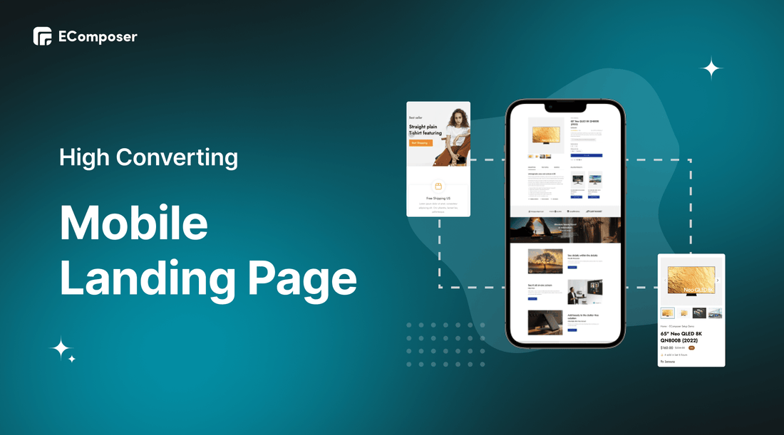
Table Of Contents
According to Statista, more than 54% of website traffic occurs on mobile devices. People are increasingly interested in online shopping using mobile rather than desktop because of its convenience. In fact, it only takes a few seconds for a potential customer to open a landing page and make a purchase decision. Therefore, if your mobile landing page isn't fast and engaging enough, customers will return to their search results and possibly click on your competitors.
In this blog, we will show you How to create a high-converting Mobile Landing Page. Before going into the details, make sure you have built an eCommerce store on Shopify!
What Is a Mobile Landing Page?

A mobile landing page is a web page that’s designed specifically to convert mobile-device users.
Mobile landing pages serve as a destination for consumers arriving through advertising campaigns, internet referrals, marketing efforts, and search results, just like a normal landing page would.
Typically, a mobile landing page contains just one call to action. Though it's not always the case, the navigation may be limited on certain sites to increase the likelihood of conversion.
What’s the Difference Between Mobile and Desktop Landing Pages?

Although both have a similar goal (to convert), the design and call-to-action may not be the same. This is because the intentions of mobile users occasionally differ from those of desktop users. For instance, while making a reservation from a restaurant's home page, a user may want to utilize the desktop booking system and the mobile click-to-call feature.
The optimal user journey may alter depending on the device because the mobile experience isn't always as simple to utilize on a desktop.
8 Tips for High Converting Mobile Landing Page

Be concise in your written copy
The essence of mobile landing pages is concision. Think about how readers will interact with your material. Make it simple for visitors to scan your website by limiting the material to the absolute necessities with bullet points, brief words, cryptic acronyms, and ASOASF.
Nail the content above the fold
Above-the-fold content is essential on any landing page, but it's especially important for converting mobile users. For the most part, people spend less time on websites when using a desktop than when using a mobile. That means your content needs to attract visitors as soon as they land on your page.
Keep your design super simple
Compared to desktop computers, the displays of mobile devices are frequently smaller. This indicates that there is insufficient room on mobile devices for webpages with many columns. Your mobile landing pages would become clunky and challenging for mobile customers to browse through if you utilize such a design.
This doesn't mean you can't include great graphics or compelling explainer videos. You can still create great graphics but make sure it's optimal and doesn't make it difficult for customers to experience.
Make use of sticky bars
The goal of landing pages is to convert visitors, but on smaller screens, it can be challenging to attract their attention and encourage them to perform the desired action. Sticky bars or sticky menus can help by quietly pursuing your visitors as they scroll around your website, keeping your call to action (CTA) top-of-mind (or top-of-screen).
In fact, a straightforward sticky menu frequently boosts navigation by 22% and has unthinkable effects on mobile conversion rates.
Optimize Forms
Lead capture forms, often placed in landing pages to help collect important consumer information, make it boring for many to complete them on mobile devices. Therefore, you must be prepared to maximize your forms. Get only the data you want, then follow up if you need more.
Here are a few tips to help you optimize forms for landing pages:
- Use attention-grabbing but relevant headlines
- Limit forms to as few fields as possible
- Choose the appropriate vertical alignment for the fields
- Includes auto-selected answers and drop-down menus for added convenience
- Add a recognizable and clickable "Submit" button
Make sure all buttons work
Typically, landing pages will have multiple call-to-action buttons. You need to make sure all those buttons work well on both the desktop and the phone interface. The links the button points to should also be optimized on the phone interface so that customers do not feel uncomfortable..
Be sure everything loads lightning-fast
According to research by experts, bounce rate and mobile landing page speed are directly related. In this day and age, a modest decrease in page load time of 0.1 seconds can have a big impact on conversion. In other words, if you want to get the most out of your mobile landing pages, having them load quickly is essential. The best course of action is to take all reasonable steps to speed up the loading of your mobile landing page.
[ecom-global-block]ecom-shopify-trial-block[/ecom-global-block]
Create optimized mobile landing pages with EComposer
Nowadays, you will not have a hard time finding an app that helps you create a landing page on Shopify. However, finding an app that both helps you create landing pages on both desktop and mobile, gives you many ideas to design, and helps you optimize that landing page quickly is not easy.
In this blog, we will guide you to create a Landing Page using EComposer - Landing Page Builder.
EComposer is one of the top landing page builder apps on Shopify. It provides an infinite collection of templates that make it easy to create a landing page even if you don't have a design idea. You can also design your own Landing Page thanks to EComposer's amazing collection of extensions and elements. Especially, EComposer has a direct drag and drop, so the process of designing and editing your Landing Page will become easier and faster.
Follow the steps below to create the right Mobile Landing Page for you.
Step 1: Sign up for your Shopify account
- If you don't already own a Shopify store, you need to sign up for Shopify (free)
- Log in to your online store using your registered email and password.
Step 2: Install and open EComposer - Landing Page Builder
- In the Shopify App Store, search EComposer Landing Page Builder then click Add App
- To activate the use of the app, Install the app to your Shopify store.

- In the Dashboard menu, go to Apps, click EComposer Landing Page Builder.

Step 3: Start building Mobile Landing Page
- Click Start Building in the right corner of the dashboard and select Landing Page.

- Choose any EComposer template you want by clicking Select a template.

- If you want to create your own landing page, please click Setup page info. Then, select Start Building.

- In EComposer's editor, please click the Responsive icon to select your desired display mode.

Step 4: Customize your Mobile Landing Page
* Option 1: Using EComposer’s prebuilt templates
- Hover over each section of the template, and an editing pen appears, click on it to open the editing section on the left.

- You can change the text in the Content section, adjust the colors or images in the Design section, or customize everything related to display settings like code, background, animation, and more. in the Advanced section.
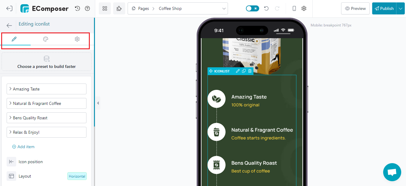
- Additionally, you can add more elements to your landing page using EComposer.

* Option 2: Using EComposer’s elements to build from scratch
- First, choose a structure you want.

- Select the elements by drag-drop them into the desired location.

- Customize in the Content, Design, and Advanced sections as in a first option.

Step 5: Save and publish
Once you are satisfied with your customization, in the right corner of the edit page you have options to save and publish.

10 Examples for Mobile Landing page
1. Loomly

Loomly is a popular automation app for social networking. They mostly use a single-column style, a sticky navigation menu bar, images, videos, and lots of white space on their mobile landing page.
The website is not text-heavy, and the clear, concise headlines make it easy for you to follow along. For those who don't want to read the text, the linked movie, which is 90 seconds long, is positioned carefully to outline Loomly's advantages.
It is a useful strategy to implement on your own landing page in order to lower the total bounce rate.
2. TouchBistro
A top-rated restaurant POS solution provider like TechBistoro is a great illustration of what a solid copy can do. Their mobile landing page combines succinct words, lists, and brief paragraphs to draw attention to key functions and their advantages for organizations.
Customers adore this since it makes the design simple to understand and relate to. However, they don't end there.
They also provide a little excerpt of what clients are saying about them, which serves as social proof and nudges site visitors to take the required action. By selecting the "Book A Demo" call to action button, they further lure them with a free demonstration.
3. Western Rise

E-commerce is greatly influenced by social media. About 54% of social media users who are engaged do product research on these sites, and about a quarter of them click on sponsored posts each month. But in order to increase conversions on social media platforms, users must have a consistent, seamless experience from the minute they click an ad on their timeline to the point where they are attempting to remember their PayPal login during a purchase.
Co-Founder and Creative Director Will Watters of the utilitarian clothing firm Western Rise explained how the business converts mobile visits into well-dressed consumers.

A service like Rocket Lawyer's might be quite helpful if you require immediate legal guidance and support. This mobile landing page is actually rather simple, with only the open-ended "Legal Advice in Minutes" form at the top and some fundamental information about how it functions underneath. With this example, I wanted to demonstrate how a few little changes to the desktop design may result in a much more simplified experience for mobile users.
5. Dress Up

Dress Up is an online dress boutique that makes it a cinch for women to find the trendiest new fashion products. Additionally, you can pick up a lot from their mobile landing page, beginning with the design. It includes gorgeous pictures with models in the front and bright, pastel-colored backgrounds for a fantastic contrast that beautifully displays their goods.
That should be enough to attract a large number of visitors and encourage a significant portion of them to explore their mobile site. Let's now get deeper into the specifics. A slider at the very top enables customers to swiftly view Dress Up's current options.
6. HelloFresh

The HelloFresh mobile landing page is a great illustration of a straightforward but striking design. It has a full-width background picture, a sticky navigation bar, and a fantastic mix of succinct yet clear writing supported by high-quality photographs of delectable treats to pique visitors' curiosity.
This illustration demonstrates the various content authoring techniques mentioned before. Their headlines are succinct yet compelling, and the combination of brief phrases and bullet points makes it simple for mobile visitors to get what they're looking for quickly.
7. Shopify

The free trial mobile landing page for Shopify, a well-known eCommerce service provider, is intended for anybody who wants to begin selling goods or services online. The landing page is pretty straightforward to view from the viewpoint.
The content is succinct, interesting, and persuasive since it emphasizes the most important aspects of the product. To entice consumers to click the carefully positioned call to action button and begin their free trial, the designers also included some social proof and click-trigger wording in their well-balanced use of white space.

Regardless of the media, emotional marketing is a fantastic tool, but it works particularly well on mobile. Videos of puppies snuggling with ducks or whatever you guys are into these days have a tendency to emotionally prepare those who use their phones to participate most in social media.
This landing page for Country Chic Paint, created by Webistry, has an emotional component that increases the likelihood that mobile users would connect with it.
9. Good Eggs

It might be challenging to sell your goods or services to mobile users. Most likely, people aren't taking the time to read what you have to offer. Typically, they are on the go, glancing at their phone sometimes as they wait in traffic or line up for coffee. Even if they are on your website, you still need to put in a lot of effort to maintain their interest.
With this landing page, Good Eggs encountered additional difficulties. The market for grocery delivery services is getting more congested, therefore the business needs to stand out from its rivals. That entails having the chance to discuss how this service differs from others.
10. Helix

Although sleep is rather fashionable these days, it appears that people have been sleeping for thousands of years. Helix Mattress takes advantage of the widespread obsession with sleep by using a landing page that brilliantly demonstrates mobile's capabilities. This page has a lot of information, yet it never seems overwhelming because of some fantastic design choices that give each part a different visual sense. But Helix's usage of pertinent testimonials and its clever lead creation tool take the website to the next level.
[ecom-global-block]ecom-shopify-commerce-coach-block[/ecom-global-block]
Wrap up
Mobile landing pages are increasingly becoming a popular digital tool for online businesses to increase conversion rates and reduce bounce rates. We hope this blog can help you create the right Mobile Landing page for your Shopify store.
If you want more information or want to learn more about EComposer, follow us at ecomposer.io or click on the message icon located in the right corner of the screen.
=================
Add EComposer Next generation page builder Here
Follow Us on Facebook
Join Official Community
Build your highest-converting page in 15 minutes


Blog Categories


0 comments