10+ Effective collection page templates in Shopify
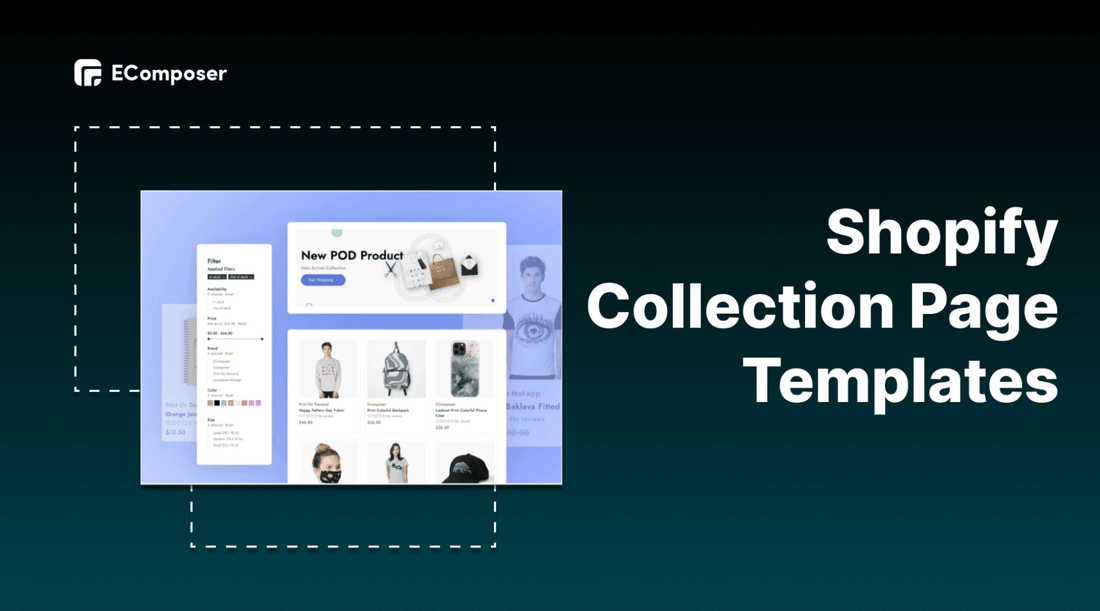
Table Of Contents
Collection page is the crucial page which leads customers to final decisions. Before a customer falls in love with a product and places an order, the journey has its own set of steps: filter, sort, and compare products.
You can explore inspirational collection pages from well-known brands in this blog. Additionally, you can learn how to create an effective Collection Page for your Shopify store with EComposer that works well and makes it easy for customers to evaluate all the products you offer. Your Collection Pages will be specially designed to convert with the key successful components.
What is a Shopify collection page?

(image source: EComposer layout)
Collection page is a page of an ecommerce website, where the products are categories within a common point. These products are browsed according to customer’s need.
Two types of Shopify collection
Before creating a collection page, you have to group all of the available products to suitable collections as you want. There are two kinds of collections
Automated
Automated collection includes corresponding products by using selection criteria. Up to 60 selection criteria can be added. Additionally, you can state whether or not a product must satisfy each and every requirement in order to be part of the collection.
The product is automatically added to the collection when you add a new one that satisfies the collection's selection criteria.
Pros: Automated collections are typically favored since once the prerequisites are established, new products are automatically added. If you have a vast range of products or seasonal or changing inventory, implementing automated collections can help you save a lot of time.
For instance, you own a clothing store. All of your seasonally appropriate clothing can be automatically added to the matching collection if you tag all of your products with a seasonal tag, like summer or fall.
Cons: The inability to remove certain products from an automated collection without altering the collection's conditions or changing the product's details so they no longer satisfy the conditions is one disadvantage of doing so.
Manual
A manual collection only consists of the items you select yourself. As a result, unless you manually add or remove things, the collection always contains the same products.
Pros: For small or niche collections that you want to individually organize, manual collecting is a reasonable option. For instance, you can set up a discount that only applies to the products in a manual collection if you intend to host a one-time flash sale with only a few products.
Cons: This method requires more effort to complete and maintain
Note: A collection's type cannot be altered once it has been created. Hence, you should base on your products and services to decide your suitable collection type.
[ecom-global-block]ecom-shopify-trial-block[/ecom-global-block]
What is the Shopify collection page used for?
Collection page plays an essential role in the customers’ journey. If you can utilize it effectively, it can generate sales for your business.
Also, by using a Shopify collection page, you can categorize your Shopify stores in a similar manner, saving your customers time and making it simple for you to direct them to the items they seek.
Optimize customer experience

The collection page allows customers to find what they need fast and easily contribute mainly to bringing the good customer experience on the customer's journey.
Along with customer experience optimization, the crucial thing when doing business is customer satisfaction because if your consumers are pleased with the provided product or service, they will decide to continue to engage with your store and make purchases many times later.
Attract customers
When customers come to the collection page, they can see the categorized products in specific collections. The best-sellers, which are the most popular items, the special collections and even the hot deals will appear at the top center of the page to get customers’ attention.
Promote new products

When a product is newly released, you want to boost it to your customers and make it visible whenever your customers visit the online stores for shopping. You can utilize the collection page to put your launching item at the center and highlight it for catching your customer’s attention.
10+ Attractive Shopify collection page templates
1. Package Free

(image source: packagefreeshop.com)
The overall of Package Free's collection page is so harmonious, it represents the company's brand image. a product filter with essential characteristics that visitors can use to browse products more quickly. They also provide "values" as a selection, maintaining true to their mission and taking into account those who care about the environment.
Additionally, you can "sort" by featured, alphabetical order, and lowest-to-highest price on the right-hand side (and vice versa).
rows of products with highlighted photographs that, in the upper right corner, rotate into an earth icon. Users may immediately identify those with discounts or limited-time deals thanks to the corresponding badge.
2. Blueland

(image source: blueland.com)
Their Starter kits are one of the first items buyers see and are likely to gravitate toward because they are at the top of the page in the navigation.
On the left side of the page are the product and category filters, and on the right are the corresponding products.
The imagery and the clever CRO (Conversion Rate Optimization) strategies utilized to convey urgency and scarcity, such as "holiday", "best seller" and "save 30%."
When you hover over the card, "quick add" appears. This has amazing user experience and makes it simple for consumers to add items to their carts on both desktop and mobile devices.
3. Raaka

(image source: raakachocolate.com)
Raaka’s collection page is simple but very attractive with eye-catching images. The colors harmonize with the packaging which creates an amazing overall. Hence, it boosts the customer purchasing process effectively.
4. Happy socks

(image source: happysocks.com)
One peculiarity of their socks is that some product pictures are scaled larger than the rest. This strategy works well as a pattern interrupt since it forces you to stop scrolling. It works well for guiding browsers to the relevant places. Besides ,the numerous filters are quite user-friendly. The Images are also so colorful and attractive.
5. Fix & Fogg

(image source: shopusa.fixandfogg.com)
The collection page is well-constructed. A heading promoting the real stores where customers can find the merchandise.
Before the products even appear, they advertise their free shipping offer and 100% money-back promise to provide their consumers peace of mind as they inspect the selection.
At the bottom of the page is a recommendation to follow on Instagram.
6. Deux

(image source: eatdeux.com)
Use text marque as well as a pink color scheme and eye-catching images. Let's investigate what makes Deux's collection page special.
Excellent headline and supporting language that properly express the brand's selling point: tastes really delicious and decadent, yet is truly healthy.
Product icons that are circular provide the collection page a more distinctive and appealing appearance.
On the lower right side is a video from the founder discussing the advantages of the product. I really like the video feature since it gives the page a wonderful, personal touch that may increase conversion rates.
7. Fellow Creatures

(image source: fellowcreatures.co.uk)
Fellow Creatures is a vegan chocolate manufacturer that thinks there is always room for improvement in procedures and formulas. The brand has a strong stance against the abuse of cows used for their milk, which inspired them to develop a more eco-friendly and long-lasting answer to these much loved needs.
They sell spreads and bars, which are all listed on their "Shop All" page.
To draw the viewer's attention, they use vibrant colors and inventive designs.
Even as users scroll down, they may still access the website menu, which is located at the right of the screen.
At the bottom of the page, a promotion for their subscription service.
8. Dream Pops

(image source: dreampops.com)
Dream Pops's collection page with a shop-by-product type filter that allows users to easily switch between categories by selecting a product tab (such as "crunch," "drip," etc.).
The images of the individual product choices become even more attractive to the consumer when they are hovered over to reveal what they appear like when they are really eaten.
9. SKKN by Kim

(image source: skknbykim.com)
SKKN by Kim designs a brief header description that outlines Kim's goals for the goods and brand. Swatches of the product texture are displayed as you hover over the features of the various products.
An indication of each product's star rating, which aids in establishing social proof and trust with new visitors.
choices for sorting and sifting food.
Additionally, this collection contains pagination so that users can browse additional products after the initial set of loaded items. It enhances user experience and boosts site performance and speed.
10. Core and Rind

(image source: coreandrind.com)
Their collection page looks like this (which is wonderful if you don't have a wide variety of items).
When you hover your cursor over a product, sauce is shown. At the bottom of the page, a carousel of their Instagram postings.
How to create a professional collection page with EComposer
You are only able to modify a limited portion of your theme's default Collection Template. EComposer page builder is an excellent option if you want to make more substantial adjustments or if you want to be able to completely customize your collection pages but don't know programming knowledge.
How do you make this with the EComposer page builder app? We'll demonstrate the level of customizability EComposer offers for your Collection pages.
EComposer helps you solve the page building problems by providing a lot of elements and features as well as premade templates for you to customize creatively.
Moreover, these functions bring professional visuals and attract potential customers to your online stores. Now, follow step by step to explore the special performance of EComposer in creating a collection page.
Step 1: Install EComposer - Landing Page Builder
- In Shopify app stores, hit “add app” EComposer - Landing Page Builder

- Click install app in your Shopify admin to approve the use of the app.
Step 2: Start building your collection page
- Open app EComposer: go to apps, click and choose EComposer’s symbol

- In the EComposer menu, click Collection Pages, then hit the “Build Collection Page” button

Now you have two options to start your collection page which are using EComposer’s elements or using EComposer’s layout
Using EComposer’s elements
- Click choose on Blank template to create your own collection pages

- Fill in template title then click start building

- Selecting structure first

- Configure the elements by dragging them from the left-slider bar.

The following elements make up the Collection template:
- Title: Using this option, you may display the Collection title.
- Description: The descriptions of the Collection are displayed here.
- Banner: With the help of this element, you can use the collection image as a banner.
- Filters: Customers can use filters to sort products in a collection by availability and price.
- Applied Filters: This lets you present the choices that your consumers are choosing to purchase.
- Tags: All product tags for the items in the collection will be shown.
- Sorting: Customers can use this to arrange the products in a collection according to the featured, best-selling, price, name, and date.
- Products: All of the products in the collection are shown in this area.
Within a single Collection Template, a connection can be made between a Basic Element and a Collection Page.
Step 3: Customize the Shopify collection templates
Using EComposer’s premade layouts
- Hover through the premade templates, you can see preview before clicking on the choose button to start customizing.

- Fill the title of template then start building

- You can drag and drop extra elements from left sidebar to customize the collection page if you want

- To adjust the information about the image, background and text. Hover then click on the editing pen at the top of each section, an editing window will appear on the left screen.
Content: You edit text here

Design: You customize visual in this section

Step 4: Save and Publish
- After finishing customization for Shopify collection page, Click Save button on the top right corner.
- On the Saving Popup, there are three Apply for options for you
None: This indicates that you apply to nothing and just simply save it.
Application for all Collections: All of your collections will have the EComposer Collection template applied as a result of this activity. It will replace the default Shopify template.
Specific collections: This indicates that you will be applying for a few of the collections you choose later.
- Choose Save and publish

This is the result.

How to restore to the Shopify Collection templates
- From EComposer Dashboard, go to Collection page option
- Hit Restore button beside Shopify Collection pages

How to delete Collection template
- Go to collection pages on EComposer Dashboard
- Hover on the template, choose remove button to delete

*Note: To take user experience a step further in creating a stunning Collection page, we recommend using Nitro Lookbook app. This app allows you to display optimized images in engaging lookbook and shoppable galleries to showcase products in your pages.
With Nitro Lookbook, it encourages customers to spend more time browsing, making exploration intuitive and enjoyable. Fully customizable and easy to navigate, it helps create a seamless browsing experience that invites customers to explore your products, boosting both satisfaction and conversions.
[ecom-global-block]ecom-shopify-commerce-coach-block[/ecom-global-block]
Key takeaways
There are numerous strategies for encouraging customers to make purchases. You can use FOMO, provide feedback, or use visual advancements to create alluring product benefits. Please pay attention to these important suggestions to apply for your Shopify stores.
Use high quality images
The key points are high-quality product photographs. So maintain their quality and consistency by including photographs of your products from various angles, saving them in high-quality format, and being extremely consistent.
You can use GIFs or videos to make the collection page more dynamic if you want to dive up the design a little. But don't let all of these captivating animated images distract you. You must consider how the combined appearance of all the product photos will seem. They ought to be performed harmoniously. Additionally, they need to continue to adhere to the tone and style of your brand.
Place the best at the top
It is making a positive first impression. Try to showcase your best-sellers at the top of each collection page to create a sense of trust and encourage consumers to make purchases. By directing customers to your best-selling products with badges such as "Best Sellers," "New Arrivals," or "50% Off," you can orient your customers' journey even further.
Design an effective navigation
Depending on your customers' requirements and expectations to design your navigation part. Shoppers can easily locate and get the item they want thanks to a simple and straightforward navigation system. Particularly , the navigation section should result in both revenue and high customer satisfaction.
To sum up, a collection page is like a landing page which can convert visitors into customers easily. Hence, utilize the tips and tricks as well as EComposer’s templates to customize your amazing collection page for your Shopify stores.





0 comments