How to Create and Customize Shopify Footer
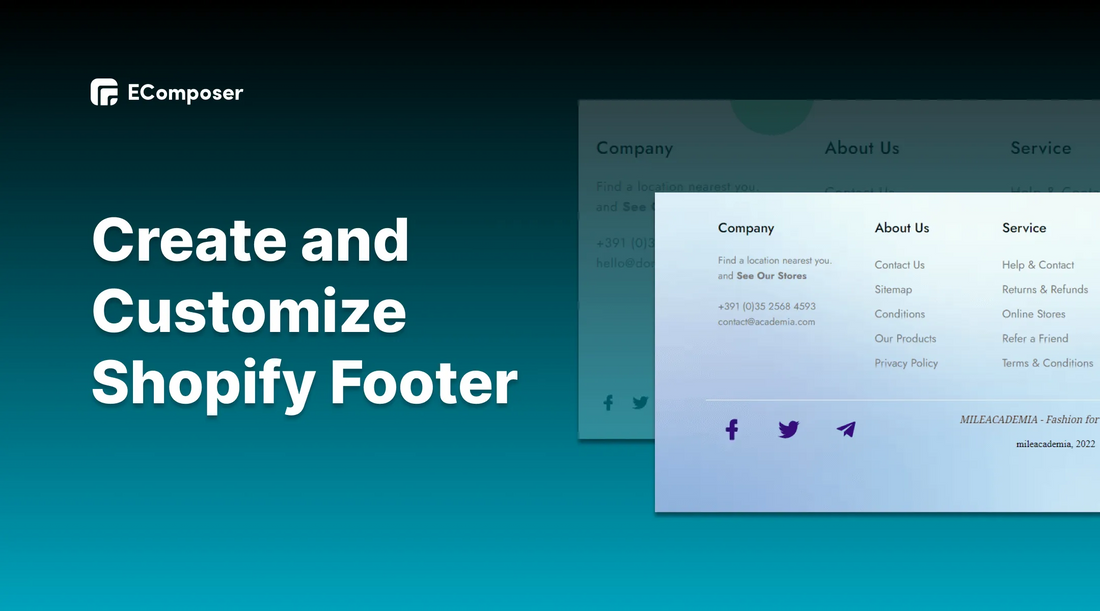
Table Of Contents
Have you ever been unable to find what you want in the main navigation (header, sidebar) of a website? What will you do then? Surely most users who encounter this situation after a while of struggling will choose to leave the website.
Don’t worry! An attractive Footer full of information will be an effective solution for your store in this regard. This blog post will give you detailed information on how to build a perfect Footer for your online store on Shopify even if you are a beginner.
Also, you can check this E-commerce Inspector Tool and reveal all secrets behind every Shopify store.
What is Shopify Footer?

(image source: Footer layout - EComposer)
Shopify Footer is located at the bottom of your store website and displayed on all pages of your website. This part contains quick links and overall links to other parts of your website which helps customers find the missing information during visiting the online stores easily.
The Footer often displays information related to your business such as: address, phone number, email, fax number, map, links to social networking sites, etc.
[ecom-global-block]ecom-shopify-trial-block[/ecom-global-block]
Why do you need a Shopify Footer?
You may think that it is not necessary to spend a lot of time and effort to design the Footer because this position is at the bottom so it will not get much attention. However, in fact, a well-designed Footer plays an important role in the online business process for some benefits it brings about.
Create trust
This is the place to synthesize basic information to help businesses create trust for customers as well as to easily contact you when needed. Thus, considering the web Footer as an important part for users who can't find the information they need in other parts of the site.
Optimize Customer Experience

enhances the user experience by making it easier and faster for people to access the information they need, ideally within three clicks maximum. Consequently, giving your users what they want and making their lives easy by including all the necessary information in the Footer. By doing this, the user experience is improved. Consequently, customers are more likely to convert from website visitors to customers.
Increase conversion rate
Optimizing the customer experience in every aspect of your website as well as Footer can increase conversions rate for your Shopify store. A well-designed Footer can attract and stimulate visitors to engage longer with your brand and so next action through Call to Action or Newsletter form and links to other parts of the website like products page, etc.
How to create Shopify Footer
There are two ways for you to build a Footer section which are using the Shopify function and using EComposer’s features.
Using Shopify default function
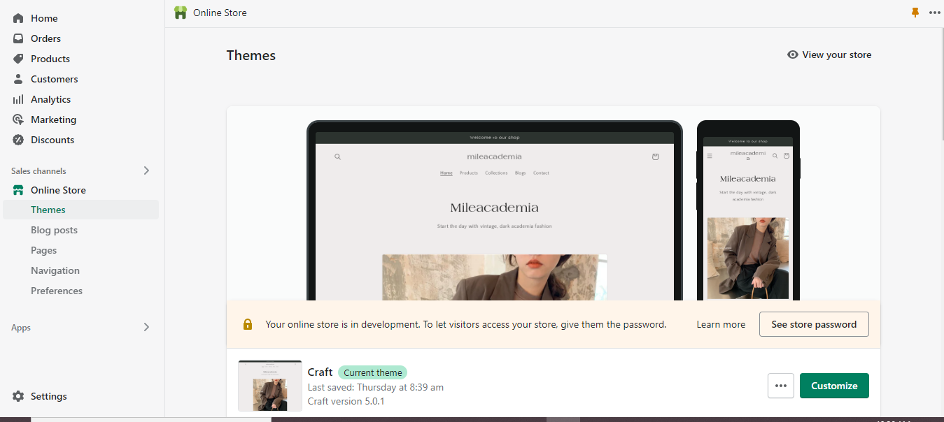
Step 1: Open Shopify online store
Open your online store in Shopify, in the Shopify admin, click “online store”; in the “themes” section, choose “customize” in the current theme.
If you have not had a store yet, please sign up Shopify here to get a 3 months free trial.
Step 2: Start create and edit Footer:
When your online store appears, scroll down to the last part, you can see the Footer section here.
In this part, you can edit the Footer information such as image, quick links, contact us, address. Besides, you also can “add blocks” to customize your footage stores.

Click Footer section and adjust others ones like color scheme, email signup, Social media icons

- Show email signup: by clicking the box of show email signup, you allow email signup form to appear on the website Footer.

- Show social media icons: Tick on the box of social media to make the link between your website to other channels such as Facebook, Instagram, Tiktok, etc.
![]()
Insert the corresponding link to the box.

Step 3: Save and Publish
Click save in the top right corner and see your result.

Using EComposer - Landing Page Builder
EComposer is a next generation landing page Builder which is created to provide best measures for sellers who want to have an online store on Shopify.
It brings some Footer templates to customize fast and easily with stunning design and high customization ability in your style. Below is the way to create a Footer by EComposer. Follow us!
Step 1: Install EComposer Page Builder for your Shopify stores
- Add app at Shopify App Stores: EComposer Landing Page Builder

Step 2: Choose Footer template
- Open app EComposer by clicking EComposer in the apps section of the Dashboard.

- To build a new Footer for your online store, please navigate to App Dashboard. In the drop-down menu of Actions, choose Footer.

- Clicking “Create Footer” to start building a new one with EComposer.

You can utilize an existing layout from our collection or the elements to create the content for your new Footer.

Step 3: Start building

- You can drag and drop elements from EComposer to create your own Footer.

- You adjust information according to your store by clicking in each part and change it via the Editing section with content, design and advanced function.

Step 4: Save and Public
After designing and adjusting, please click in Publish button at the top right corner.

A small window will appear to confirm your action. Remember to click on “Mark as default”, choose “save and publish” to allow this Footer to appear in all of your website pages.

This is the result.

Please look at the detailed guide of creating a Footer by EComposer here.
How to customize Shopify Footer with EComposer
Edit Shopify Footer columns
The Footer menu is usually divided into some columns, to edit Footer columns, click on the edit pen at the top right corner of each column, an editing window will be opened on the left. You can change the width or align elements inside in the content section. Also, you can add a background image for each column.

Add Shopify Footer background image
Background image is an effective way to personalize your brand with theme colour and pictures which reflects your products.
- Click edit pen to appear editing section
- In the editing section, go to Design, click on the background part. Here, upload your background image, ideally edited using an online background eraser for photographers to ensure optimal clarity, then choose “select”.
- Click Publish to save the change.

Add logo to Shopify Footer
The importance of Logo image in Shopify Footer
A logo may attract customers' attention and express the value of your business in a distinctive way. If you can create a strong logo to represent your brands, it is a necessary component that most users shouldn't neglect.
Also, A strong brand can convey to its audience a simple and straightforward story that affects their feelings. A logo works well as the cornerstone of the overall story that your brands are built.
Finally, logos enable you to quickly communicate to your clients why they should choose you above competitors in your field.
How to add logo to Shopify Footer
Step 1: In the bottom right corner of the Footer, click the sample image
Step 2: In the left side, click “change” in “choose image” part to upload your logo image then click “select” to finish
Step 3: Click Publish to save change.

In another way, if there is no image in the template, please use “advanced image” basic elements to add your logo to website Footer.
Follow detailed guideline from EComposer here: Advanced Image

Change Shopify Footer copyright
What is Footer copyright?
Copyright is used to denote the exclusivity of the work that the author has created. It can protect works, mental creations to avoid copyright infringement.
A copyright notice placed on your website acts as a clear indication to users that the content is your intellectual property. The Footer is an ideal place to put copyright on because it can be found on every page.
You should also mention the year the work was first produced when doing this. That demonstrates when you made a claim to the work.
How to change Shopify Footer Copyright
Step 1: Click the Copyright area, edit the content as you want in the editing text section on the left.

Step 2: Click Publish to save change and see the result.

Remove “powered by Shopify” from Footer
What does “power by Shopify” mean?
Shopify is an e-commerce platform that makes it simple to create online stores and sell goods. To let customers know that a store is using Shopify's services, Shopify automatically and consistently inserts the phrase "powered by Shopify" into every store.
You are granted a license to use Shopify's hosting and site-building tools as a subscriber. Thus, this is what makes it possible for you to create an intricate eCommerce site quickly. Because of this, every new store has the powered by Shopify tag in the Footer.
How to remove “powered by Shopify” from Footer?
There are several ways to dismiss this tag from your Footer store. In this part, the easiest method will be shown to you for every one can follow and apply it successfully.
Step 1: Click "Online stores" on your dashboard, then select the "Themes" icon.
On the screen, a drop-down menu with the "Edit language" option will appear. Just click it.

Step 2: Search “powered” in the search bar then all of “powered by Shopify” results on your online stores will appear.

As you can see, areas like the "Check out & systems" tab, Powered by Shopify Box - Links section, have fading "Powered by Shopify" placeholder text. All you have to do to make the faded lettering disappear is press the spacebar.
Use the HTML search bar in the same manner.
Step 3: Finally, to save your changes, click the "Save" button in the top right corner of the screen.

As a result, the "powered by Shopify" line has been effectively deleted from your website Footer as well as your online stores.
Add social media to Shopify Footer
Adding social media icons into your website is an impressive way to increase the interactions between business and customers. Moreover, it can boost brand awareness among visitors because of the popularity of social networks nowadays.
Step by step to add social media into your website Footer:
Step 1: Adding Icon
- To access the icon, go to Elements, choose Basic
- You can move the Icon element by dragging it from the left sidebar to the desired location.

Step 2: Configure icon
- Click on the content to get started.
- Then click the associated symbol in the left sidebar: you can either upload your icon on the right side next to the search bar or go to System to find the icon there.
- To complete, click the "Select" button below.

Insert the link of your social channel in the blank to create the connection among your store channels.

Edit things with “Design”
- Alignment: The icon's location can be adjusted flexibly.
- Size: The icon's dimensions are modifiable.
- Alternately, you can modify the icon's rotation, color, background, and border, among other things including Hover, a really special feature we wish to send you (for instance, you can change the color when you hover the icon)

Step 3: Save and Publish:
Click Publish at the top right corner, then choose Save and Publish, remember tick on mark as default to enable your footer to appear on every website pages.
Restore to Shopify Default
If you want to return to Shopify's default Footer, just go to the Footer you originally prepared and select the Restore button.

Delete the Footer layout in EComposer
Please make sure you have restored to the Shopify default Footer before attempting to delete the Footer in EComposer. After that, you can click the Remove button by hovering over the template.

5 inspirational Shopify Footer examples
1. Dezeynne
(image source: dezeynne.com)
Dezeynne Footer is designed with lots of information and links but it still has a minimalist approach. Each section is carefully organized and separated by space so users know exactly where to click if they want to sign up, learn more about the studio, answer support questions, or contact the business.
2. Griflan Design Inc
(image source: griflan.com)
The design is very simple and clean, it only contains contact options, such as email, phone number, and social media. The best part of the design is the unique logo-drop effect whenever you hover one typical part. This has a dynamic text underline effect and a powerful overlay effect. Even better, it can be clicked!
3. Pink Lily

(image source: pinklily.com)
Although Pink Lily's Footer contains all the necessary parts of a Footer such as Footer menu, newsletter form, social icons, payment badges, copyright, etc; it still follows the simplest and minimalist style which brings comfort to the customers.
4. Elevated Faith
(image source: elevatedfaith.com)
Elevated Faith demonstrates their commitment to creating a beautiful Footer.
First and foremost, they emphasize a simple, elegant layout with white text on a black background. Second, their social media icons, trust badge, and brand logo closely resemble one another. Thirdly, each page that customers want to visit has navigation. Everything is clearly visible and in the right order.
5. Fandom
(image source: fandom.com)
The Footer design for "Fandom" is clearly defined and dynamically colored. Users are drawn in by the lively color palette, and the copy has a hover effect. The download options encourage users to use Fandom, increasing its user base.
[ecom-global-block]ecom-shopify-commerce-coach-block[/ecom-global-block]
Final Words
It can be seen that the Footer is an indispensable part of the website. You can customize the information in the Footer so that customers can find useful information and bring value to the brand and sales.
You can consider adding more content for the Shopify Footer such as: Company introduction, products, address, directions, contact... Especially, when designing Footers you need to pay attention to color and how to arrange the layout to ensure the prominence and harmony when looking at the overall website.





0 comments