


Top 20+ High-Performing Shopify Landing Page Examples
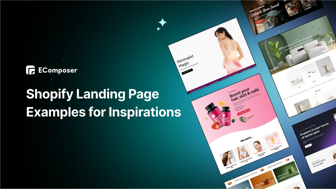
Table Of Contents
When creating a marketing strategy, many marketers look to industry leaders for ideas. We can do the same by examining Shopify landing page examples.
These standalone web pages help businesses of all sizes guide customers through their buying journey. Before exploring 20+ Shopify landing page examples, let’s find out what types of landing pages you can make most out of it to benefit your business.
10+ Common Types of Shopify Landing Pages

An effective landing page converts visitors into customers. It combines key elements like a clear headline, persuasive copy, relevant images, social proof, and a strong call-to-action (CTA).
So what are the most common types of landing page? Landing pages are crucial for attracting visitors to your Shopify store and turning them into customers. Here are some popular types:
- Lead Capture Landing Page
- Collects user info (like email) in exchange for offers (ebooks, webinars).
- Often used with PPC ads for high conversion rates.
- Customize with strong headlines, CTAs, and minimal required fields.
- Click-Through Landing Page
- Provides info to persuade users to click through to a purchase or transaction page.
- Often used to offer free trials or coupons to move users down the funnel.
- Splash Page
- Captures attention with an announcement or initial choice (e.g., age, language).
- Usually simple with minimal text and no conversion goal.
- Squeeze Landing Page
- Short, direct pages designed to capture user info quickly, often for downloadable content or bookings.
- Long-Form Sales Page
- Detailed page with persuasive content, testimonials, and CTAs to drive sales.
- Often includes discounts or urgency to close sales.
- Subscription Landing Page
- Encourage visitors to register for a subscription service or recurring product delivery.
- A page promoting a monthly subscription box, highlighting the benefits, and featuring a sign-up button.
- Coming Soon Page
- Builds anticipation for a future launch or website update.
- Include a countdown and “notify me” form to collect leads.
- Product Page
- Focuses on a specific product with detailed features and media.
- Helps showcase products with high engagement potential.
- Event Landing Page
- Provides details and registration info for events.
- Use countdowns and past event highlights to increase registrations.
- Seasonal Landing Page
- Promote seasonal products or sales with a themed design.
- It can be a Halloween-themed page showcasing holiday-specific products, like costumes or decorations, with a limited-time offer.
A great landing page should be focused, visually appealing, and easy to navigate, clearly showing its value and guiding visitors to take action.
20+ Best Shopify Landing Page Examples & Templates to Get Inspired
1. Spa Landing Page

This is a perfect example of spa or wellness store that feels calming, elegant, and luxurious. This Shopify landing page captures that soothing atmosphere from the very first scroll.
What you can learn:
- Striking hero section: The top banner features a serene spa image with minimal text and a clear call-to-action button. It instantly sets the mood for relaxation and premium care.
- Core spa services spotlight: I love how the page highlights treatments like skin health, bodywork, and massages in clean, rounded image blocks. It’s easy to explore and beautifully organized.
- Retreat packages block: This section combines imagery of spa interiors with clear package details. It feels like a perfect way to showcase exclusive offers or bundles.
- Price list section: Treatments are listed neatly with service names, prices, and icons. It feels transparent and professional, just like a real spa menu.
-
Team and testimonial callouts: The “Meet the Spa Team” and “Happy Clients” sections add a human touch, building trust and personal connection right on the homepage.
2. Plant Landing Page

If you sell plant or lifestyle store that feels fresh, modern, and inspiring, this Shopify landing page is a best example of capturing that natural, stylish vibe right from the first scroll.
What you can learn:
- Hero spotlight: A bold plant image paired with minimal text and a “Shop Collection” button makes the intro clean and inviting. It sets the mood instantly.
- Customer review row: Real feedback with star ratings adds trust and shows buyers they’re not alone. It feels authentic and welcoming.
- Shop the Space gallery: Lifestyle photos of plants styled in interiors give shoppers décor inspiration. It’s a great way to connect products with everyday living.
- Product grid with discounts: Clear cards show plant varieties, pricing, and sale tags. Browsing feels simple and fun, like flipping through a curated catalog.
- Seasonal guide banner: A stylish section with plant care tips adds value beyond products. It encourages shoppers to see you as both a brand and a helpful guide.
3. Giveaway Landing Page

Giveaways are a great way to boost brand visibility and gather leads. However, the success of your giveaway hinges on how well you design your landing page, where you explain the benefits and rules of entering. If the page isn't set up right, your contest might not get the attention it deserves.
Let's explore what you can learn from this Back-to-School giveaway landing page to make yours as effective as possible.
What you can learn:
- Show the Value: If you're giving away something valuable, make sure people know it. A simple way to do this is by listing the item's price. For example, if the prize is worth $279, mention that to highlight the value of signing up.
- Display All Prizes: Even if you're offering multiple items, clearly show everything included in the giveaway, like backpack, laptop or headphones in this example. It helps users understand exactly what they could win.
- Simplify Sign-Ups: To attract more participants, keep the sign-up process easy. This landing page only asks for an email, making it quick and simple for people to enter.
*Note: You don’t need to wait for special events to run a giveaway. Holding regular giveaways can encourage customers to return for more chances to win. If they really want the prize, they might end up buying it from you instead.
4. Xmas Landing Page

The last month of fall is when we start preparing for the holidays, and Christmas is one of the most exciting ones. Not only is Christmas just a religious holiday to celebrate the birth of Jesus, but also a big cultural and commercial event.
This retail landing page example showcases a well-organized and attractive Christmas Deals section, designed for the holiday shopping season. It has a clear and easy-to-navigate layout, making it simple for users to find categories like Santa, Socks, Trees, and Print on Demand, which makes shopping quick and pleasant.
What you can learn:
- Holiday Theme: Using festive images and a red-and-white color scheme quickly gets visitors into the Christmas mood.
- Products for the Occasion: Highlighting holiday-themed products helps shoppers find the best gifts and deals, giving them confidence that they’re getting the best prices during the busy shopping season.
- Emotional Appeal: The countdown timer with “Santa's Sleigh Takes Off In” connects with people’s feelings about the holiday season, adding a touch of genuine Christmas cheer.
5. Black Friday Landing Page

For many customers, your Black Friday landing page is where they’ll decide to buy. This page highlights your offer and encourages visitors to click the buy button.
Sending traffic to a busy homepage or a specific product page can lead to lost sales due to distractions or narrow focus. A dedicated landing page helps visitors understand your Black Friday deals without distractions.
What you can learn:
- Eye-Catching Design: When you visit the page, the striking images and bold colors of the headline quickly grab your attention.
- Clear Savings and Urgency: The page effectively highlights the savings by showing how much less you'll pay compared to the regular price. It also adds urgency by mentioning that the offer is limited and won’t come back.
- Feature Breakdown with CTAs: As you scroll, the page lists the features and benefits of the bundle, with clear call-to-action buttons to encourage purchases.
6. Fashion Landing Page

(Image source: the-outrage.com)
The outrage excels in design and user experience. Its smooth and easy-to-use layout grabs visitors' attention right away, making it simple to navigate and browse.
The landing page focus on a great user experience sets a high bar for online fashion stores, creating a visually appealing and engaging shopping experience that keeps customers coming back.
What you can learn:
- Eye-Catching Design: Use bright and vivid colors that match your brand’s style throughout the page. This makes the page visually appealing and keeps everything looking consistent.
- Clear Categories: Arrange your page so that important sections like products, home decor, activist style, and policy changes are easy to find. This helps visitors quickly get to what they’re interested in.
- Build a Community Feeling: Make your visitors feel connected by showing how your brand supports social causes or includes community-focused content. This helps create a sense of belonging and engagement.
7. Men’s Products Landing Page

(Image source: beardbrand.com)
Beardbrand shows how a store can use a landing page approach on its homepage. Beardbrand prioritizes conversion strategies from the homepage, making it straightforward for customers to engage and purchase.
What you can learn:
- Personalized Recommendations: Instead of just showing generic links like "All Products" or "Best Sellers," Beardbrand directs users to a quiz that offers customized product suggestions. This makes it easier for customers to find what they need.
- Eye-Catching Design: Beardbrand’s landing page uses a full-screen image to showcase the brand and products, making a strong first impression. This design focuses on encouraging visitors to make a purchase.
- Simple Navigation: The site uses bright, contrasting buttons and a transparent grid layout so customers can easily find categories, read reviews, sign up for the newsletter, or join the forum. This setup makes shopping straightforward and user-friendly.
8. Merchandise Landing Page

(Image source: mrbeast.store)
The Mr. Beast merchandise landing page has a vibrant and engaging design that effectively showcases the brand's products.
What you can learn:
- Sliders in the Hero Banner: The page features a dynamic banner with sliding images showcasing popular items like t-shirts, back-to-school gear, and 3D-printed products. This helps highlight essential products effectively.
- Color Scheme: The page uses a consistent color palette of pink, blue, black, and white. This color scheme reinforces the brand’s identity and makes the page visually appealing.
- Customer Testimonials: The page includes two sections for customer feedback: one with real images of happy customers and another with their reviews. This builds trust and makes the page more engaging.
9. Cosmetic Landing Page

A cosmetic landing page is a special web page created to promote cosmetic products, services, or offers. It’s designed to attract potential customers with its eye-catching visuals and targeted messages. This page highlights specific skincare items or services, showing their benefits to encourage visitors to buy, register for a newsletter, or book a consultation.
What you can learn:
- Attractive Design: The cosmetic landing page uses high-quality visuals and soft colors to create a soothing and appealing look, making it easy to catch visitors' attention.
- Clear Information: It effectively explains the benefits of skincare, helping users connect with the content and understand what’s being offered.
- Easy Navigation: The template is optimized for mobile devices, ensuring a smooth and enjoyable experience as users explore the page and find personalized skin care options.
10. Drinks Landing Page

(Image source: drinkolipop.com)
Olipop offers healthier sodas made with plant-based ingredients and prebiotics to boost digestive health. The brand addresses common concerns directly, such as the sugar content, and markets the drink as a satisfying alternative for those trying to cut back on regular soda.
What you can learn:
- Clear, Bold Text and Product Info: Use easy-to-read text and detailed product information. Include reviews with star ratings for credibility and ensure a clean, intuitive layout with high-quality images.
- Strong Visual Impact: Create a visually striking hero section with clear headlines and a well-chosen color palette. Keep the design uncluttered with effective use of white space.
- Engaging Elements and Mobile Optimization: Feature an attractive product showcase and prominent call-to-action. Ensure the page is mobile-friendly, loads quickly, and includes engaging copy and social proof.
11. Food Landing Page

(Image source: pipsnacks.com)
This page from Pipcorn is an outstanding example for a Bundle Landing Page. The page is visually appealing and showcases attractive offerings. The hero section features enticing different tastes of popcorn snack, while the vibrant, inviting colors create an appealing feel.
Well-placed calls-to-action guide users to explore and enjoy, and mobile optimization ensures a smooth experience on all devices.
What you can learn:
- Customization Options: The "Build a Bundle" feature allows customers to mix and match snacks, creating personalized bundles with different pack sizes and immediate price visibility.
- Increased Order Value: Offering customization can boost the average order value (AOV) by encouraging customers to purchase more.
- Enhanced Shopping Experience: Providing a tailored shopping experience benefits both the store and customers, making it a win-win for personalization and sales.
12. Sustainable Landing Page

(Image source: behuppy.com)
The Huppy landing page cleanly and effectively highlights their eco-friendly toothpaste. At the top, you’ll find real reviews from TikTok users, adding credibility. The product is prominently displayed with a short description and key details.
What you can learn:
- Real Reviews Up Top: Featuring authentic reviews from TikTok users at the top builds trust and grabs attention.
- Product Placement and Info: The product is prominently displayed with a brief description and key details, making it easy for visitors to get important information quickly.
- Comparison Table: Including a table helps customers see how Huppy toothpaste compares to other brands, making it easier to choose.
13. Sport Landing Page

(Image source: cowboy.com)
Here’s a great example of a lead capture landing page that works really well! It’s designed perfectly for its main purpose: getting people to sign up or provide their contact information. The page does an excellent job of grabbing attention and encouraging visitors to opt in.
The design is unique since it offers bicycle types and a free test ride based on your address and city.
What you can learn:
- Attractive Offer: Cowboy's offer of a test ride is a strong way to get people to share their contact details. It’s a valuable proposition that draws in potential customers.
- Convenient Scheduling: The page lets users schedule a bike test ride at the best location, making the process easy and appealing.
- Future Marketing Opportunities: Cowboy still gets a user's email address even if the user doesn’t show up for the test ride. This provides a chance to follow up with marketing and turn them into customers later.
14. Care Delivery Landing Page

We all know that a clinic landing page provides essential details about a health service, similar to how a product page works for online stores. It’s your opportunity to inform and persuade potential clients to choose your practice over others.
You can use these pages for different goals, like as part of an advertising campaign. For example, it’s a care delivery clinic in this case, its landing page focused on chiropractic care services.
What you can learn:
- Show What You Offer: Clearly list the health services your clinic provides so visitors know what you do and what you don’t offer.
- Keep It Simple: Avoid clutter on your page. Focus on one main action you want visitors to take, like contacting your clinic. A clean page helps people find what they need and reduces confusion.
- Organize Information: Make sure the information is easy to read and well-organized. Remove any distractions and direct visitors smoothly to the main action you want them to take.
15. Health & Wellness Landing Page

(Image source: livewholier.com)
The Wholier product landing page is designed to effectively showcase their Organic plant protein and prebiotics. The layout features the product prominently at the top, with key information and trust-building elements placed strategically throughout the page.
What you can learn:
- Product Placement: The product is featured at the top of the page, ensuring it grabs visitors' immediate attention.
- Trust-Building Elements: Certification badges and customer testimonials are placed strategically to build trust and credibility.
- Clear Benefits and Ingredients: The page clearly highlights the product’s benefits and ingredients, making it easy for customers to understand and be attracted to the product.
16. Pet Landing Page

Leaving your pets alone can be stressful and pet lovers may not know how to feed them properly, so this brand uses social proof to reassure visitors with the feeder machine. Their landing page features real client testimonials and information about their Guarantee and 24/7 support. Plus, the cute animal pictures add a friendly touch.
This brand understands that visitors are looking to easily feed pet machines, so their landing page quickly addresses this need with straightforward solutions.
What you can learn:
- Eye-Catching Design: Use clear headlines and high-quality images to grab attention quickly. A well-designed top section makes your page look attractive and sets the mood.
- Showcase Products Well: Display your cat feeder in an engaging way. Use creative features and interactive elements to keep customers interested and encourage them to explore more.
- Encourage Action: Include a clear call-to-action button to guide visitors to make a purchase or explore further. Make sure the page works well on mobile devices and consider adding customer reviews to build trust.
17. Electronic Landing Page

Landing pages allow retailers to showcase their products in detail, including style, features, and unique qualities.
For example, this page for a high-quality drone provides lots of information about different models, lenses, batteries, and controllers. It uses large images and clear text to highlight the benefits, and the “Add to cart” button takes customers directly to the shopping cart, making it easy to complete the purchase.
What you can learn:
- Highlight Key Features: Use a dynamic hero section with background video to showcase your latest drone versions and a sleek color scheme to match their modern look. This sets a high-tech mood and draws in tech enthusiasts.
- Engage with Interactive Elements: Include features like product demonstrations or compatibility guides to make the page more engaging and informative.
- Guide Visitors with Clear Actions: Place calls-to-action strategically to help visitors easily explore and purchase the latest drone accessories. Make sure the page works well on mobile devices for a smooth experience.
18. Lead Generation Landing Page

This simple and clear webinar landing page grabs attention with a striking graphic of a professional speaker, people, and leaf icons. The signup form is easy to fill out, asking only for your name, business email, and a message if customers want to include one.
The page uses plenty of whitespace, clear sections, and icons to present information in an easy-to-read way, showing what attendees will gain with details on topics, schedule, and speakers.
What you can learn:
- Keep It Simple: Focus on one main goal, like generating leads, and avoid adding unnecessary details. Make sure the information is clear and easy to follow.
- Use Timelines: Show a clear timeline of what will happen at each stage to build trust and set expectations for visitors.
- Include Social Proof: Add reviews or testimonials from past attendees to boost credibility and trust.
19. Technology Landing Page

(Image source: starlink.com)
The Starlink landing page features clear images, engaging videos, and exciting descriptions, all introduced with eye-catching headlines for its internet service.
This content is designed for the target audience and guides visitors towards the main call-to-action, which appears again at the bottom of the page. It effectively highlights the benefits of new technology and draws users in with a special offer.
What you can learn:
- Clear Categories: Organizing products into clear categories, such as roaming, boats, and residential, makes it easy for visitors to find what they're looking for.
- Highlight Benefits: Presenting the benefits of the products helps attract and inform potential customers.
- Social Proof: Including ratings and reviews from past users helps build trust and credibility, which can lead to more people taking action.
20. Notebook Landing Page

(Image source: notebooktherapy.com)
The Notebook Therapy landing page is designed in a charming style that perfectly fits their dropshipping brand. It is visually stunning and captures the brand’s personality, making it easy for visitors to connect with the products.
What you can learn:
- Compelling Pop-Up Offer: They use a pop-up to give visitors a $50 discount gift card, a great way to attract attention and encourage people to shop.
- Bright Layout and Navigation: The site features eye-catching full-screen photos and well-placed call-to-action buttons. It highlights specific products or new arrivals and has a straightforward, easy-to-use navigation menu.
- Detailed and Trustworthy: The landing page includes detailed product descriptions, high-quality images, and essential call-to-action buttons. It also builds trust by showing Trustpilot reviews and social media links.
3 Methods to Design Your Shopify Landing Page
1. Create a Page Directly from Your Shopify Admin
The easiest way to create a Shopify landing page is by designing a regular page yourself, following basic landing page principles. Here’s how:
- Go to the Shopify dashboard and select 'Online Store.'
- Click on 'Pages' from the dropdown menu.
- Click 'Add Page.'

Now, you can build a basic Shopify landing page with photos, videos, and relevant material for your offer. You can also create specific product collections for your PPC campaigns to show more targeted post-click pages.
However, this method is limited in functionality and may yield a lower conversion rate. It's a straightforward option for simple announcements and promotions without coding or extra tools. For better results, we recommend trying one of the following two options.
2. Customize Landing Page Templates with Liquid Code

If you're comfortable with Liquid, Shopify's coding language, or have access to a developer, you can design custom landing page templates for your store.
Building custom landing pages with Liquid involves much work, so we won't go into all the details here. Instead, you can refer to Shopify developer Liam Griffin's guide, which covers everything you need.
The advantage of making a custom landing page template is that you can tailor each section in the theme editor with your chosen content, products, and images.
However, if you need multiple landing pages for different purposes, you'll have to build a separate template for each one, each with its unique sections. Otherwise, any changes you make to one template will affect all landing pages.
3. Utilize a Shopify Landing Page Builder
Using a landing page builder lets you create high-converting landing pages without coding skills or hiring a developer. For Shopify, many landing page builders are available through a monthly subscription, so you don’t need to spend much money upfront to get started.
One such app is EComposer. It allows you to build up a professional digital store without any coding skills. It offers 300 templates for landing pages, homepages, and product pages, plus over 100 drag-and-drop elements to customize and personalize your store.
Step 1: To start, just install the EComposer Landing Page Builder from the Shopify App Store.

Step 2: Select a Page Template
- Open the EComposer app to begin building your page.

- Choose "Landing Page"

- Browse through the available templates, categorized as Newest, Popular, and Featured.
- Preview the templates and pick the one that best suits your Shopify store.

- Click "Next," name your page, and select "Start Building > Insert" to start creating your Thanksgiving landing page with EComposer.

- In the EComposer editor, you can easily customize the template to fit your brand using drag-and-drop elements. Just drag the element from the left sidebar to where you want it on the page and adjust it as needed.

- To edit any part of the template, hover over the section, click the pencil icon, and make changes. You can update text in the Content section and tweak colors or alignment in the Design section.

- For additional features, visit the Extension Library on the left sidebar (sixth icon).

Step 3: Save and Publish
- Click "Publish" in the top right corner and select "Save and Publish."
- To preview your page, click "View."
EComposer makes it simple to design a beautiful page. If you don't have a Shopify account yet, you can take advantage of a special offer: your first month for just $1 on any plan, allowing you to explore everything Shopify has to offer.
Others also read
How to Build Event Landing Page: + Best Examples
Which Attributes Describe a good Landing Page Experience?
High Converting Mobile Landing Page: 8 Tips & 10 Examples
FAQs
- What is a landing page design?
Landing page design involves the visual and written elements that create a webpage focused on converting visitors into customers and encouraging repeat purchases. Key aspects include a simple layout, clear and benefit-focused text, and high-quality product images, all essential for an effective landing page.
- What should a landing page consist of?
A landing page usually includes:
- A headline.
- A short introduction.
- A call to action.
- A form for visitors to fill in their contact details.
It might also feature extras like videos, images, customer reviews, social proof, and product demonstrations.
- How does landing page design impact conversion rates?
5.89% is the average conversion rate of a landing page, but your design can affect how close you get to this number. The most effective landing pages are responsive, use visuals to separate text, and undergo A/B testing to achieve the best outcomes.
Wrap Up
Creating a Shopify landing page involves several steps, but they should feel manageable as you get started. When designing and writing your page, always keep your target audience in mind to ensure it resonates with your ideal customer.
Use the strategies and tips we've discussed through successful examples to create a page that effectively attracts and converts visitors. Remember, it takes a lot of work to get everything right on your first attempt, so keep testing and refining your landing page to find the perfect combination that encourages more clicks and brings in more customers.
=================
Add EComposer Next generation page builder Here
Follow Us on Facebook
Join Official Community
Build your highest-converting page in 15 minutes


Blog Categories


0 comments