How to Create a High-Converting Shopify Product Page
Table Of Contents
It can not be denied that the Product Page is the most important page of an eCommerce website. Customers visit online stores, access the Product Page when they have purchase intention. From that, it leads to sales revenue.
However, a lot of business owners do not know how to create an effective Shopify Product page to attract customers. Hence, this blog will give you a detailed guide about how to make a high-converting Shopify Product Page easily with EComposer. Besides, you can learn some good points from famous Product page templates.
What is Shopify Product Page?

(image source: EComposer layout)
Shopify Product Page is a page where the product is displayed with detailed information. This page is built to provide customers the unique points and competitive advantages of the company’s items. On the product page, you may find all the details you require regarding the company's offerings.
However, this product page is more than just a laundry list of specifications. It must convince visitors to press the “Add to Cart” button. Consider it a landing page for your product's marketing. Customers visit product pages to decide whether they want to purchase from you or not.
Why is Shopify Product page important?
Shopify Product page provides a great customer experience, which is well-designed, trustworthy, and informative. Hence, optimizing the product pages on Shopify is crucial for increasing sales and Shopify SEO.
Increase conversion rate
Any business can enhance sales by upselling or cross-selling products from their product pages. When visitors go to your online stores, specifically your Shopify Product page, it means that they are interested in your products and services and intend to buy them from you.
If your Product page conveys information that your customer needs especially attractive products, your customers will make purchasing decisions. As a result, this page increases conversion and boosts sales - the essential goal of each company.
Optimize search results

People usually discuss Homepage optimization; however, the Product page is also an important one which needs to be taken care of. Products are the crucial things of each business, every operation activity focuses on this one.
Thus, if your Shopify Product Page is good enough, it can attract more and more visitors. As a result, SEO ranking is improved then your online stores will get a lot of qualified organic traffic. The more visitors come to your Shopify store, the more revenue you get.
Enhance brand awareness/ credibility
Actually, the popularity of a business is the first thing customers search for when they shop online. Why? Because when customers buy something online, whether it is physical or digital products, they have a tendency to find a credible firm to ensure the received products are as good as their expectations.
Product Page showcases all of the information of the product such as product image, size, materials, features, etc. Moreover, it allows the visitors to look through real reviews and actual images from previous buyers.
High rating reviews create strong credibility of the brand. Besides, brand information is also displayed in Shopify Product Page. Theme colours and unique style helps customers be aware of your distinctive features compared to other competitors.
Key features of a high-converting Shopify Product Page

Your online product pages must be properly optimized in order for potential buyers to find your products while also being recognized by search engine algorithms and appealing to customers. Follow these essential elements to make a perfect Shopify Product page.
Clear Call to Action (CTA)
Your product page benefits from a clear call to action button that directs visitors to an immediate and useful action. By making it simple for visitors to understand what to do next, this can help to enhance conversions.
One thing is what you want visitors to your website to do when they arrive: make a purchase. They can better concentrate on this work with the aid of a call to action button, increasing the likelihood that they'll perform the intended action.
Visitors may easily finish the purchasing process without becoming frustrated or disoriented when there is a call to action button that is obvious. Your conversion rate and sales may go up as a result.
An effective call to action button may create a sense of urgency and persuade visitors to make a purchase right away rather than later. If you're holding a deal or promotion, this can be very useful.
User-friendly Design and Experience
Think about visiting a conventional retailer. There are many messes. It's likely difficult for you to locate your belongings. You will never return since it unquestionably creates a negative impression. The product page's online version follows suit. Your online product page should have everything structured clearly and attractively to make it simple to browse and search through.
Optimal product previews (pictures, videos, presents, etc.)
Visuals are crucial in influencing clients' purchase decisions across all industries. There is no denying the ability of pictures, videos, or gifts to give your consumers life-changing experiences.
Therefore, start by looking for and including interesting videos, which have a number of advantages. To prevent copyright infringement, don't forget to license your original media.
Finally, be creative. Bring your consumers creative UGC in the form of photographs, videos, or gifs! Their eyes will be drawn to your product, making it undoubtedly clickable.
[ecom-global-block]ecom-shopify-trial-block[/ecom-global-block]
Live chat using
Do not let your consumers with their selections there. Serve them by assisting them in finding the right items. During times of high traffic, you can pick between a chatbot and a customer support crew to assist your clients.
They'll get their responses immediately through an online dialogue. Additionally, you'll probably increase the credibility and dependability of your company.
In order to better close deals, you should also have a live chat feature available around-the-clock. Live chat widgets can be added to your website as a pop-up button or at the bottom corners of your product page.
A call for urgency
Customers are more inclined to act immediately than to put off taking advantage of an offer when they are aware that there is a limited window of time to do so. If you are marketing a product that people are already interested in and only need a little push to buy, this can be very successful.
Furthermore, it fosters a sense of scarcity. People are more likely to want something if they realize there is a finite amount of it. Additionally, its absence can give your products the appearance of greater value, increasing selling prices.
Flash sales, a page countdown, a limited supply, and other features can be used to create a sense of urgency. These are but a few possibilities. These urgent messages ought to be listed next to the cost of your goods in a color that is highlighted and with larger font.
Related products
A product page's primary function is to sell. Unfortunately, a lot of online shops annoy their clients by displaying numerous useless things while they are checking out, which slows down the process even more. Additionally, it gives the procedure an unduly pushy and aggressive sound.
Therefore, showcasing relevant products on your product page in moderation and in a well-organized style might help raise your average order value (AOV) rather than showing a huge number of unrelated products.
Detailed product information
Every product page must have a detailed description section that provides the consumer with all the information they require about the item. Here, you can include information on the product and useful guidelines, including sizing diagrams or comparisons to some of the company's other goods.
Keep it brief and straightforward to maintain your customer's interest. To make it easier for the reader to scan the content, use bullet points.
Customer Reviews showcasing
By including online testimonials from actual consumers on your product pages, you may increase confidence among potential customers and provide them with the emotional support they require when making decisions.
Utilize testimonials from your brand's ardent supporters, devoted followers, and most recent consumers rather than optimizing your remarks about your products to increase your eCommerce conversion rate.
How to customize Shopify Product Page Using Shopify theme’s default settings
Shopify is a popular platform for merchants to build an e-commerce store without programming requirements. Also, Shopify provides some special functions to support users effectively.
If you want to build an online store fast and easily or customize your eCommerce store, please sign up for a Shopify account here to utilize a free 3-day trial and only $1 for the next months.
Pros: You do not need to install any third party application to build your Shopify Product page.
Cons: Shopify default theme limits the customization ability.
Let’s look through the steps below:
- In your Shopify admin, go to “Themes” in “Online Store”, click “Customize”.

- Choose “Products” in drop-down menu at the top center

- Select “Default Products” to open Shopify Product page for editor

- You can adjust the text, image, colours and other information using the edit section in the left sidebar. Additionally, you can add a section to the product page if you want to put other things in this page.

- Finally, hit the “Save” button at the top right corner to save your changes and publish it in the live theme.

How to create and customize Shopify Product Page with EComposer
EComposer is an application in Shopify platform which provides Page Builder solutions for all of the users in Shopify. It allows users to design stunning pages without coding requirements (EComposer has the power drag-drop editor) and support 24/7 if you have any problems.
Pros: EComposer includes a ton of stunning templates with high customization ability.
Cons: You have to install the app for your Shopify store; however, there is no installation fee at all.
Start creating high-converting Product pages with EComposer now!
Step 1: Install EComposer - Landing Page Builder
- In Shopify app store, click add app “EComposer - Landing Page Builder”

- To allow the use of the app, click install app in your Shopify admin.
Step 2: Start building Shopify Product Page
- Open EComposer in Shopify admin: go to “apps”, select “EComposer app’s symbol”

- Hit “Start building” button

- Click on “plus button” beside Product Page option

- In this step, you can choose one of two ways to build a Shopify Product Page for your online store with EComposer. You can either use the elements under the Single Product tab to design your template or use a provided layout from EComposer's Library.
Use EComposer’s elements
- Choose “Blank Template”

- Insert name for the page then click “Start Building”

- Choose structure first

- Select the suitable elements from the list on the left sidebar, drag and drop it in your desired location.

- After adding an element, the editing section will appear, you can adjust the content and design on the left screen.

Use EComposer’s available layout
EComposer provides a lot of templates for you to choose.
- Firstly, choose “Preview” to see the layout then select “Choose” if you find that this layout is suitable with your products.

- Fill the page name in the box, hit “Start Building” button

- With this way, you also can add single product elements with a power drag-drop editor.

- If you want to change the content of some parts, hover over each part, hit “editing pen”; then you change the things on the left sidebar.

- Edit image or colour in Design section

Step 3: Save and Publish
The last step is to allow your Shopify Product page to be published to your customers.
- Click “Publish” on the top right corner
- Choose option to assign: there are three options
None: The product template won't be applied to any products; it will only be preserved as a page.
Apply for all products: This option's Save and publish button will apply the template to all goods if you choose it. The default Shopify template will be replaced. The design of all app offerings will be the same.
Apply for specific products: The template can be applied to some particular products.
Apply for all products in a collection: The template will be applied to all of the goods in the collection you choose here.
- Select “Save and publish” to complete.

Note: If you want separate content and design for each of your items, you must first create multiple product templates. Then, using the Apply for specific products option on the Publishing pop-up, you must assign each template to each product.
If you sell a lot of products, we advise you to add the product content to Shopify's Description area and then display it using a Description element in EComposer. For all goods, you can use the same template, and it will still count as one page.
*Note: To take user experience a step further in creating a stunning Product page, we recommend using Nitro Lookbook app. This app allows you to display optimized images in engaging lookbook and shoppable galleries to showcase products in your pages.
With Nitro Lookbook, it encourages customers to spend more time browsing, making exploration intuitive and enjoyable. Fully customizable and easy to navigate, it helps create a seamless browsing experience that invites customers to explore your products, boosting both satisfaction and conversions.
How to restore to the Shopify default Product template
- Go to App dashboard, choose “Product pages”
- Click on the “Restore” button on the Shopify Product page tab if you want to return to the default Shopify template.

How to delete a product template
- Navigate to App dashboard, go to “Product pages”
- Click on the “Remove” button to remove a product template from EComposer.

Follow detailed guides from EComposer here: How to create a Product Template
10 Best High-Converting Shopify Product Page Templates
10 High-Converting Shopify Product page templates below may inspire you. Let’s explore!
1. Perfect Keto

(image source: shop.perfectketo.com)
Perfect Keto makes its consumers happy by providing a variety of information about their products, including specifications, costs, and available options. To increase their level of trust, it also displays a list of client ratings.
They use straightforward but delectable adjectives in the product description to describe their healthy items. In fact, their product page appears to be well organized, educated, and aesthetically pleasing.
2. Leesa

(image source: leesa.com)
Leesa emphasized the importance of their product variations. These memberships provide the best deal with a top-notch product offer to their clients. Additionally, it gives buyers the ability to customize their purchases by selecting from a variety of bed bases.
Besides, Leesa has detailed description about the given product stick with 3D visuals. This helps customers understand more clearly about the product and easier to make decisions.
3. Partake Food

(image source: partakefoods.com)
Partake Food’s Product page is well designed with eye-catching product images and features colours. The highlight point of this page is a clear call to action which boosts buyers to make purchase decisions. From that, the business can get more revenue.
4. Astley Clarke

(image source: astleyclarke.com)
Astley Clarke doesn't follow standard design and specification practices in the product description. Skipping all of that, it tells the tale of how the product was developed. They also include a brief explanation of how to use this distinctive jewelry so that their clients can benefit the most from it.
Astley Clarke additionally divides each section of the page into distinct sections for easy scanning. In order to make switching between product information, size charts, delivery, and return policy easy, this prevents the need for endless scrolling to return to the "add to bag" button.
Customers who will be interested in this product detail part may also easily find the reviews and enquiries sections. The design keeps the product page from becoming cluttered even though it is extremely detailed.
5. Buffy

(image source: buffy.co)
Buffy is dedicated to offering the complete consumer experience, starting with the product page as well as the product itself.
Every page element in Buffy is designed to engage your senses. The copy sums up the experience you'll enjoy with the product in one word: SOFT. The color scheme is also used in another in-store experience.
This product page employs a caret to embed lengthy text associated with each area, depending on the information customers need. For instance, you would click on the caret to view the measurements, details, and care instructions in the menu if you wanted to read the specifics. Although it might not be as effective as a toggle for minimizing page scroll, it is a worthwhile option.
6. Love hair

(image source: lovehair.com)
Love Hair is a company that emphasizes clean products. Its product pages have a similar focus on cleanliness and employ white backgrounds, grayscale, and subdued color hints to catch the eye.
Additionally, Love Hair uses video information in addition to still images to anticipate and respond to your questions.
Love Hair provides customers with more information about each product and what they can expect from using it beneath the product video, allowing the company a chance to directly address the problems of its audience. Additionally, the brand explains more about its high-quality products and dedication to sustainability, in case you needed any more justifications to buy.
7. Holstee

(image source: holstee.com)
The brand Holstee is lighthearted and entertaining, just like the product sites. The products, the Add to Cart button, and the emphasized language encouraging cheaper rates if clients sign up to become Holstee members are the main focal points of the straightforward design with colorful accents.
The rest of Holstee's product page isn't as straightforward as what you find above the fold because the brand is quite visually appealing. You may view additional images, product videos, and opportunities to discover more about each product by scrolling down.
8. Kettle & Fire
(image source: kettleandfire.com)
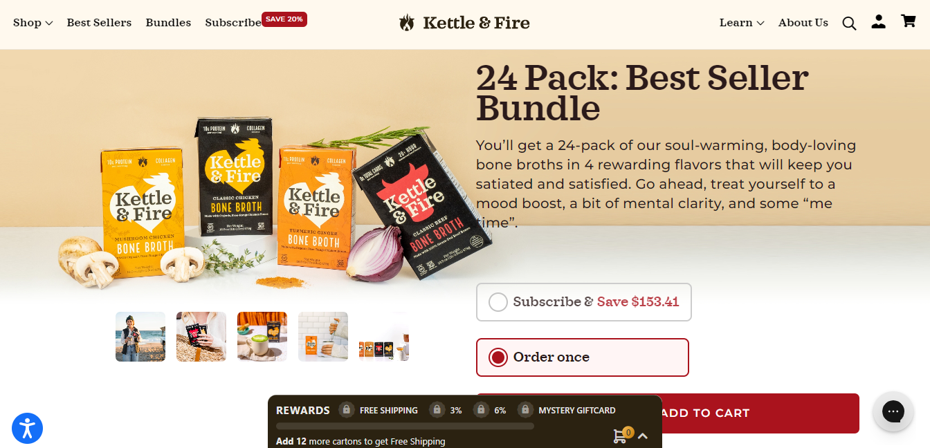
A carousel of various product photographs, including lifestyle photos, nutrition labels, "what's inside" infographics, and more, is shown on the product detail page, which first resembles essential elements of an Amazon listing page. Under the product name, customer reviews are highlighted, and information is shared in a clear, simple, and instructive manner using bulleted lists.
Kettle & Fire gives customers an easy approach to choose and add their things to the basket despite the fact that it offers a few different purchasing choices. In addition, it emphasizes its shipping and refund procedures underneath the Add to Cart call to action.
9. Luxy hair

(image source: luxyhair.com)
Adding this item to your bag is the obvious next step, but if you're still not convinced, there's a suggestion to watch an overview video above the buy button.
The fact that this product page is supported by a highly customized purchasing experience is its best feature. Customers are more likely to make purchases when using Luxy to assist them through the purchasing experience as opposed to searching through several collection pages for the right fit.
The page also discusses shipping fees and returns, two of the most common signs of abandoned carts. Additionally, knowing that Luxy's customer service team is accessible round-the-clock gives customers confidence that they may contact them whenever necessary.
10. Rocky Mountain soap
 (image source: rockymountainsoap.com)
Its product pages have succinct, clear descriptions that highlight major advantages: GMO-free, exclusively human, vegan, and all-natural. These are all factors that influence consumer decision-making and can increase sales and decrease abandoned carts for Rocky Mountain's body care items.
The incorporated customer reviews on Rocky Mountain Soap's product pages are another distinctive feature. You may quickly scroll and read recent reviews if you're on the fence about purchasing one of its products.
11. Manitobah

(image source: manitobah.com)
The words "free shipping" and "free returns" are shown next to the Add to Cart button on this product page in large, bold letters to allay the most frequent concerns about online purchases. People believe that they don't have to make their purchase permanently and that the price they see will be quite close to the final cost.
Without ever leaving the product page, the brand enables the hesitant buyer to read up on the business and its goals at their own pace.
The customer can find out about the company's Indigenous ownership (and what that entails) as well as the history of the artwork shown on the boots' soles.
[ecom-global-block]ecom-shopify-commerce-coach-block[/ecom-global-block]
Wrap up
In conclusion, Product pages are essential for generating sales and maintaining a great customer experience for any business. A product page that has been properly optimized will load quickly, be simple to use, and have all the vital details prospective buyers need to know about the item.
A quality product page will also offer customer feedback and ratings. You may increase your chances of turning website visitors into paying clients by optimizing your product pages.
Additionally, you may make sure that visitors to your website have a great experience, which may encourage them to return.
Hope that this blog will be helpful for you to create a high-converting Shopify Product Page for your online stores.







0 comments