How to Create a Product Quickview on Shopify
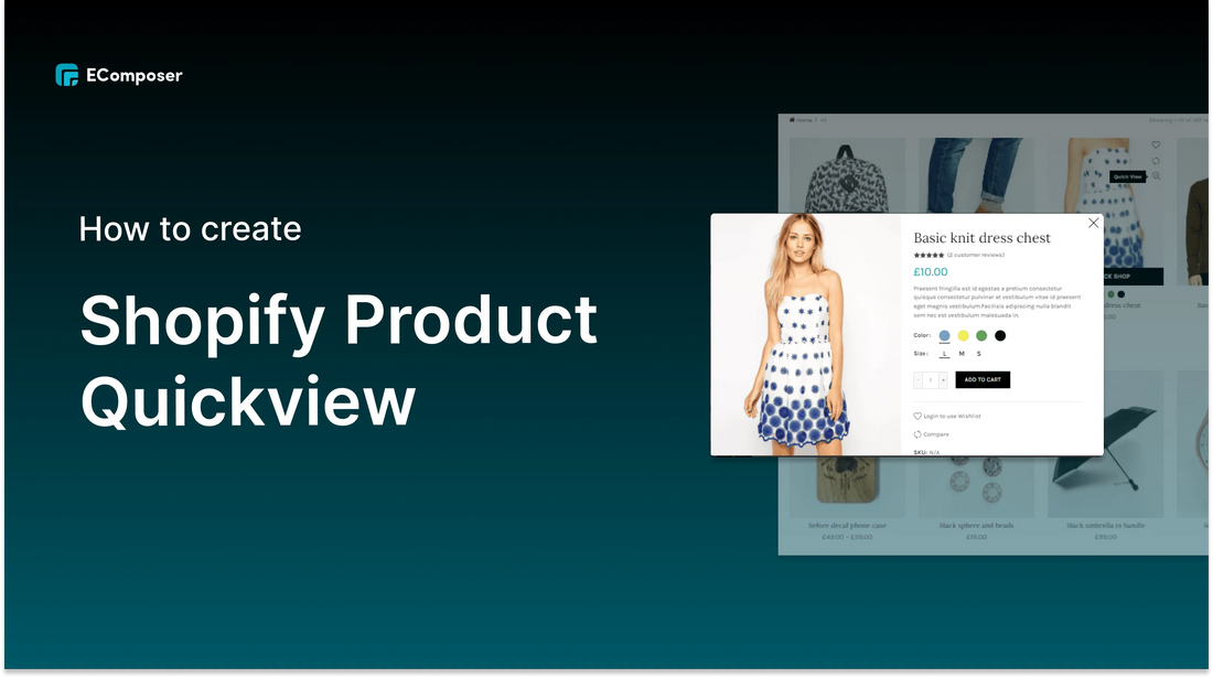
Table Of Contents
Do you own an online store? Are you looking for an attractive and easy way to display your products? Do you want customers to quickly be attracted to the product and purchase immediately? Now, EComposer brings you a feature that solves your problems. It's Product Quickview.
If you have/are/are going to open an online store on Shopify, you should “pocket yourself” How to create an distinctive Product Quickview.
What is Product Quickview?

Product Quickview is not a strange feature for both sellers and buyers. It is a landing page that allows your customers to have an overview of the products without going to the details page. This feature makes it possible for customers to view product summaries in a cascading or pop-up window.
By allowing you to customize the background, colors, fonts, etc.; allows you to preview Product Quickview before publishing. EComposer - Landing Page Buider makes it easy to create a Product Quickview.
What features does Product Quickview bring to Shopify store?
Why are so many famous brands choose to use Product Quickview? Let's see what features it brings!
2.1. View multiple images in a quick view popup
You can allow customers to view an image gallery with multiple images in a quick view popup without having to visit a product page.
This reduces customer search time and makes it easier for customers to choose the right product

The quick view pop-up supports image zooming, customers just need to point the mouse, the image will be zoomed in automatically so customers can see close-up versions of the product. This helps customers not need to go to the product's detail page and still be able to choose the product they need.

(Image source: anntaylor.com)
2.3. Increase average order valueWhen using Quickview Product, customers will see the necessary content not only of one product but also many other products. They will easily be attracted and click on more products than they originally intended. This can increase average order value by keeping customers on the product board page throughout the buying process, encouraging them to purchase more products

(Image source: havefunwiththehomies.com)
2.4. Show more product information and improve performanceYou can display more product information, such as a short description, in a quick view popup without taking customers to individual product pages.
Furthermore, you can improve performance by choosing Product Quickview over the add to cart column. Your sales page only needs to load the right product customers are looking for, instead of loading a long product table.

(Image source: wayfair.com)
For those without a Shopify account, take advantage of a special offer: just $1/month for the first 3 months.
How to create Product Quickview using EComposer - Landing Page Builder?
EComposer - Landing Page Buider is known as a next generation Shopify application that allows users to build professional online stores without coding knowledge. It provides a lot of templates and elements to help you build all kinds of pages, including pages not available in Shopify.
In this section, I will show you how to create a Product QuickView that few apps can do.
Please follow these steps:
Step 1: Install and open EComposer - Landing Page Builder
From your Shopify Dashboard menu, go to “App” and click “EComposer - Landing Page Builder”

Step 2: Go to EComposer “Quick View”
In Dashboard of EComposer, from the drop-down menu under "Action", select “Quickview” and click “Create Quickview”


Step 3: Customize your Coming Soon page
You will be taken to the editing page of EComposer, skip the template selection step and click on “start building” at step 2 - “Setup page info”
Then you will completely customize Quickview to your liking.

To take user experience a step further with images, we recommend using Nitro Lookbook app. This app allows you to display optimized images in engaging, shoppable galleries, including Product Quickview with pinned product on lookbook.
With an ease in product browsing, Nitro Lookbook encourages customers to spend more time browsing, making exploration intuitive and enjoyable. Fully customizable and easy to navigate, it helps create a seamless browsing experience that invites customers to explore your products, boosting both satisfaction and conversions.
3 common problems with Quick View to avoid
4.1. Quickview but not really “fast”
Fix: You should only put a sufficient amount of information on the Quickview overlays. Furthermore, when designing the Quick View overlay, you should leave enough room for the product list to be clearly visible and easy to tap when the user wants to close Quick View.

(Image source: wayfair.com)
4.2. Quickview is in the wrong place
The Quickview button needs to be placed in the right position so that customers do not confuse it with the product detail button. Things can get worse if customers really think of Quickview as a product detail page. They may assume there is a lack of product information on your site and decide to leave.
Fix: You should have a Quickview button at the top or bottom of the list item element or in the corner of the thumbnail and show the element only on hover. This button can be wrapped in an eye-catching icon instead of an icon of the same size as the “View Details” button.

(Image source: tsunsg.com)
4.3. Customer cannot turn off Quickview
Typically, online stores will design several different ways for users to exit the Quickview overlay, for example, clicking the Close button (x) or Back button, tapping the product listing. However, many websites do not allow them to do that.
Fix: To avoid misunderstandings, we recommend using the Close button (x) instead of the “Back” button. Also, you can allow customer to exit the Quickview overlay by clicking on the product listing in the background

Wrap-up
Each store will have its own Product Quichview design with exclusive styles and colors. Therefore, I hope this blog helps you to successfully create a Product Quickview for your Shopify store. If you found this blog helpful, please feel free to share it with who need it.
If you want more information or want to learn more about EComposer, follow us at ecomposer.io or click the notification icon located in the right corner of the screen.







0 comments