


Top Trending Shopify Website Design Ideas for eCommerce in 2026

Table Of Contents
"A user interface is like a joke. If you have to explain it, it's not that good." - Martin LeBlanc
No matter how fancy a design may be, good design is always self-explanatory. It's important to keep users' acceptance of new trends, methods, and solutions in mind when experimenting with them. As a result, be sure that other people can understand your concept as well as you can.
This blog will present the top trending Shopify design ideas with corresponding examples; besides, you can take design tips to make your website more professional and attractive to your potential customers.
Top Trending Shopify design ideas for 2026
To make decisions that support web traffic, engagement, and beyond, organizations must stick to website design trends and understand what matters to people today.
Keep reading for additional information on web design trends for 2026 below.
Nostalgia and the Y2K aesthetic

(image source: momandpopcorn.com)
Y2K (stands for the Year 2000), this style begins in the mid-'90s and early 2000s, during the dot-com boom, when the internet first gained popularity, and served as inspiration for the radically unique Y2K look. People were enthusiastic and concerned about the future and how technology could change lives as a result of the tremendous peak in technological growth.
Early 2000s fashion, music, home design, and even art have all had resurgences in recent years. Naturally, design and the web are seeing a spillover from that tendency.
Historically, nostalgia patterns follow a 40-year cycle. As social media has grown, it has become easier to accept and spread new trends, which has accelerated that cycle. And today, 23 years after Y2K, the styles of the early 2000s are once again in vogue.
Currently popular, we predict that in 2026, more designers will be motivated by fonts and text layouts of that period. Y2K-inspired designs are less minimalist and frequently employ dense text or a combination of fonts to produce an eye-catching look.
Early 2000s web design favored straightforward, text-focused layouts with lots of white space because graphics loaded slowly at that time.
Design tip:
Choose one design element and interpret it in a more modern manner that lets your designs evoke a certain era without coming along as overly themed.
Visible grids

(image source: acidleague.com)
The transparent, vintage appearance of the visible grid web design style gives the user a clear understanding of how the page should be structured. The advantages include control over where the viewer's attention is focused and parts that are simple to browse.
If you wish to use social media to promote your website, this style is effective. All of your design work serves two purposes it is simple to convert the material from each grid into photos for social media posts.
Interactive design
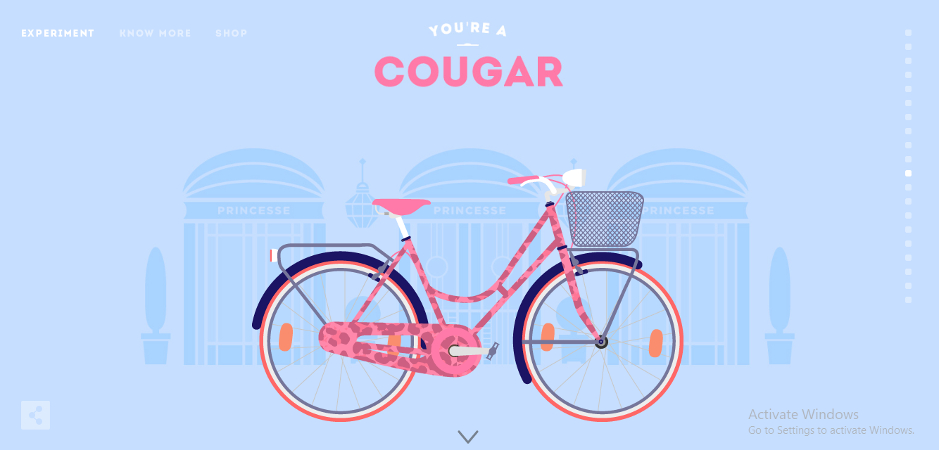
(image source: cyclemon.com)
The interactive design features increase engagement while adding curiosity to digital material. Meaningful interactions draw users deeper into the website while communicating the brand's identity.
Some examples of straightforward design principles that can promote deeper involvement are hover effects and interactive clickable and scrollable elements.
You can add various interactive components, such as color tones that change when you hover over images, numerous scrolling options, and many clickable buttons. Visitors can find themselves scrolling and clicking without even realizing it.
Minimalist Designs

(image source: finnovasrl.it)
According to a GoodFirm poll, 84.6% of web designers concur that congested site design is poor practice. Yet even ordinarily dense webpages these days are antiquated. They choose minimalist design instead. It helps your website with a sophisticated appearance and improves consumers' decision-making skills.
When there are limited options available to users, they tend to respond more quickly. In addition to being well-liked in internet design, minimalism also serves as a deft psychological factor.
These minimalist tenets are used in minimalist web design. Web design that is minimalist in many aspects is timeless, and timeless things never go out of style.
Modern design ideas stress simple, minimalistic layouts. A simple and convenient user experience is provided by minimalist web design, which also loads more quickly. You could assume that thinking is unnecessary because the minimalist design is so straightforward, yet this couldn't be further from the truth.
The design team must be well-organized and thoughtful when creating a minimalist site design. Members of the design team must cooperate during the design process.
With quicker download times, minimalist graphic designs improve user experience and productivity. Because of its functionality and classic style, this minimalist design approach will remain popular.
Gradients

(image source: takearecess.com)
In a gradient, two or more colors progressively meld into one another. In recent years, they have grown in prominence in web design.
This design was typical. Designers used gradients to add color and intrigue to their works of art. Nevertheless, when flat design gained popularity, it recently lost popularity.
But because they provide a means to enhance depth and complexity in a design without losing simplicity, gradients are once again becoming popular. They can also convey a sense of movement in the visual field. On landing pages that have parallax scrolling, this can be effective.
10 Inspiration Shopify website designs Ideas
Check out the professional website designs below for inspiration.
1. Nugget
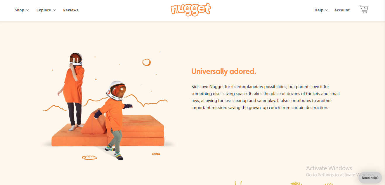
(image source: nuggetcomfort.com)
Nugget has a distinctive color palette burnt orange, sage green, and peach—to make its online store stand out, unlike the website design concepts we've featured thus far, which all use one theme color. To appeal to the intended audience of parents, it also employs original illustrations similar to those found in children's books.
Tips
- Choose a complementary color scheme with no more than three hues.
- To differentiate significant CTAs from supporting buttons, use two distinct hues of the same color.
- Employ subtle patterns as backdrops rather than solid colors to give your website more substance.
2. Magic Spoon
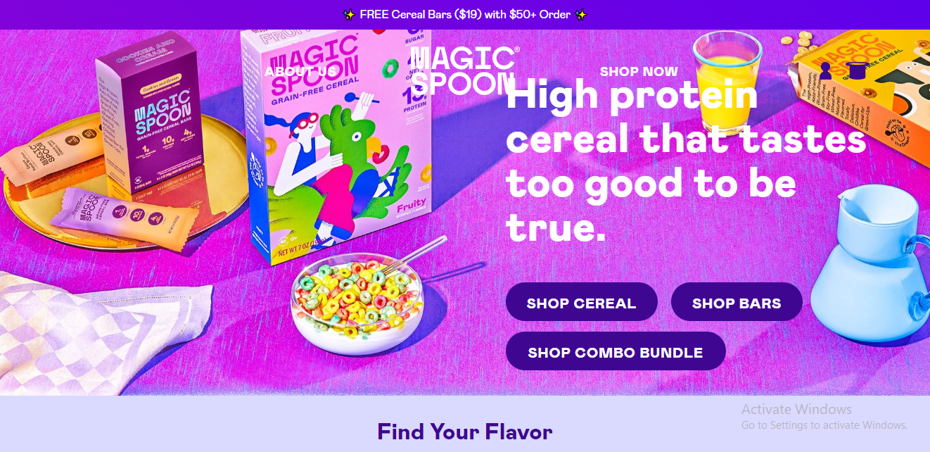
(image source: magicspoon.com)
While browsing Magic Spoon's website, one word immediately comes to mind: nostalgia, which coincidentally fits the company's USP (USP). The store matches the website's layout with the product packaging, making it cheerful, humorous, and colorful. Its reliability is what contributes to Magic Spoon's strong brand reputation.
Tips
- Create an identity based on your brand voice, beliefs, and packaging.
- Try utilizing emojis to give your brand more personality.
- Display all of your best-selling products in the background of the page header.
3. OLIPOP

(image source: drinkolipop.com)
The idea behind OLIPOP is to bring a novel soda with a low sugar level but high levels of dietary fibre to benefit your gut flora.
Their website has a fresh, lively, and welcoming feel about it. With Camila Cabello's endorsement, the text successfully employs social proof to highlight the advantages of soda. Also, the product page has a unique design and changes color according to the selected taste.
The website for OLIPOP is a great illustration of how to be innovative without detracting from the user experience. It also teaches you how to use social proof successfully without feeling overbearing.
Tips
- Simple and uncluttered design
- Stylish but simple design.
- Attractive product page
- Products and shopping carts are easily accessible.
- Logically arranged goods.
- Simple to use shopping and navigation.
- Uses social proof, such as endorsements from famous people, reviews, and studies.

(image source: coupletcoffee.com)
On its website, Couplet Coffee uses amusing comic book-style branding. There are a variety of ways for website users to assimilate information, along with moving components to draw attention (such as the free shipping bar and "About" images).
Tips
- Display your unique selling point above the fold.
- To increase accessibility, combine written, visual, and audio aspects.
- Try to use multiple typefaces in similar text to highlight specific words (like "fun").
5. Hauser

(image source: hausestores.com)
Hauser is dedicated to offering high-quality home furnishings for both indoor and outdoor use.
The website contains a drop-down menu that clarifies several categories and greatly improves browsing. Due to the size of Hauser's catalogue, having this kind of arrangement makes the difference between a visitor who leaves after becoming overwhelmed and one who makes a purchase.
In addition, the design is as simple as the goods they are attempting to sell. The website makes browsing fun with high-res photographs, succinct language, and lots of white space, which makes sense considering that most homeowners want their area to feel pleasant.
This is the best illustration of how to categorize your products and improve the browsing experience for your customers if you have a large catalogue. How its visuals, fonts, and categories are arranged. These are all crucial factors that will affect the result.
Tips
- The drop-down menu is excellent and makes shopping simple.
- Photos that are high-resolution and full-width.
- Strong, large typefaces and tasteful typography.
- Beautiful CTA buttons.
- Simple checkout procedure.
- Messenger for live chat.
- A simple layout with adequate white space
- Presents the goods at the appropriate time and location.
- Encourages examining categories rather than specific products.
6. La La Land

(image source: lalalandshop.com.au)
La La Land is an online retailer that offers furniture as well as wall hangings, stationery, home accents, and even clothing from independent brands.
The store's vibrant aesthetic is appealing to younger customers. Despite having an excessive number of categories, La la land's collections are simple to navigate, and the main header's prominent placement makes navigating the website a breeze.
If you believed that the home decoration market was dull and uninteresting, La La Land will show you how to breathe life into it and sell a variety of goods without losing your brand identity.
Tips
- A vibrant, contemporary design.
- A drop-down menu with tasteful fonts.
- Simple access to a variety of collections and goods.
- Blog posts that are entertaining and educational encourage readers to interact with products.
- A white background that draws attention to the brightly colored goods and artwork.
7. Great Jones

(image source: greatjonesgoods.com)
Great Jones maintains consistency in website design. Call-to-action buttons are also made of the same color of green, and depending on their priority, they are either highlighted or block-colored. There is also a background that is more muted than pure white. The font used in the logo is carried over to other headers on the website.
Tips
- Employ transparent backgrounds for product images
- To communicate exceptional offers, use an announcement bar with a solid contrasting color.
- Stick to a single typeface for headlines on your website

(image source: maybellstudio.com)
Consumers will want to see the products as quickly as possible; therefore, this design provides them with what they immediately away. This is a great website design to show how a layout can be created entirely out of large pictures.
They keep simple header navigation, like the majority of online clothing retailers, which makes it easy to browse categories and motivates customers to focus on potential purchases.
Even a product slider is used in this design to increase the exposure of the things being displayed.
Tips
- Simple navigation design
- Eye-catchy images
- Good website structure
9. Western Rise

(image source: westernrise.com)
Men's apparel retailer Western Rising focuses on wearing adaptable outfits that work for every situation.
A vibrant full-width image on the site creates a strong first impression. As you begin scrolling, it begins showcasing some of the products, outlining their features and more intriguingly their applications.
Also, their catalogue has clear categories that are easy to navigate. The journal also includes in-depth posts that inform guys about what to wear. Western Rising excels at presenting goods in the ideal light. That makes it simple for a customer who just wants to look at more possibilities to view more choices.
Tips
- A timeless, understated design that makes good use of typography.
- Providing beautiful images for each item.
- A picture that fills the entire hero page.
- Displayed product photos from various perspectives.
- Simple payment and product access.
- Excellent and beneficial web posts.
- Well-designed layout and product collections.
10. Sunglass hut

(image source: sunglasshut.com)
Another firm that specializes in selling sunglasses on the Shopify platform has a design that works well with its items. It has a big hero image, a simple layout, and a contemporary look with lots of white space.
Users can find products very fast with what they want thanks to the header navigation bar's links to various categories. They also can get a brief look at items by hovering over them and seeing different photos; they are not required to view the entire item to get additional detail.
Tips
- Website is easy to access
- Simple layout, big hero image
- Adding interactive factors
BONUS TIPS
If you are struggling with the website design, or you need a third party for building a professional online store which catches up with the trends, install EComposer Landing Page Builder now.

EComposer is the next-generation page builder, one application in the Shopify store. You can apply a ton of beautiful EComposer templates in various industries for your eCommerce store.
Moreover, you also can utilize the elements to custom your pages fast and easily just with a powerful drag-drop editor. Last but not least, the support team is always ready to assist you whenever you need help.
Must-have components when designing a Shopify store

Every company aspires to have a website that loads quickly, looks fantastic, drives excellent sales, and offers overall customer happiness. Here is a list of Shopify store essentials that you need to take into account.
Responsive design
According to ComScore, mobile devices account for over 70% of all time spent with digital media.
There are many devices out there with various screen sizes. Regardless of the device being used to view it, your website should be designed to offer a uniform user experience. Instead of putting a lot of effort into overly complex animations and hover effects that might not work on all platforms, it is preferable to use that time to improve the UI and UX.
Your website's ability to create a fluid user experience across screens of all sizes is a simple yet crucial feature. Since that consumers now regularly switch between different types of devices, the surfing experience must be consistent across all of them, particularly mobile ones.
It's crucial to personally test a mobile-optimized theme's usability before choosing it to make sure you're happy with the transactional flow. If you're not, there is a good chance that your consumers won't be either. When making your choice, you must take into account aspects like cart drawers and intuitive smartphone navigation.
Simple navigation
All of the UI components that users can use to reach particular information on your website are collectively referred to as "navigation." Examples of these include footers, filters, product category pages, header navigation menus, and on-site search engines.
Imagine that an e-commerce platform limits your capacity to design unique navigation routes. In such a situation, you'll have a functional but aesthetically pleasing website only a few visitors would want to utilize, which will lower your conversion rate.
A user's decision to browse vs buy on a website might be affected by its quality and usability.
Consider the following advice when you create your store: Start by keeping your menu headers to a minimum. Be straightforward and to the point when identifying these headings. Consider the following top-level navigation headers:
- Shop (Category of Products)
- About Us
- Blogs
- Contact Us
Quality visuals
The product photographs and videos are one of your website's most crucial elements, if not its most crucial one. Excellent product photographs that showcase every aspect aid in decision-making for your customer and decrease return rates. To assist the consumer in choosing a color, variety, or size, make sure your photographs are well-lit, tastefully designed, and finely detailed.
Videos can demonstrate your product in a real-world setting or instruct customers with how-to guides. Although videos are a fantastic tool for showcasing content, ensure they are scaled to load quickly and do not increase page load times.
[ecom-global-block]ecom-shopify-trial-block[/ecom-global-block]
Wise information
Because they are unable to touch or feel items when making purchases online, customers heavily rely on reviews and ratings from other customers to verify the information provided by brands and to help them make those judgments.
As a result, brands now have two crucial duties to complete: first, they must make sure that they enable and encourage customers to rate their goods and services; second, they need to make sure that these assessments and rankings are clearly shown on the website.
Connecting a brand's social media presence to its website is another excellent strategy for businesses to gain the trust of consumers and create a community of devoted followers. Presenting prior consumers who have trusted the brand and by showcasing model users of the product, adds a degree of credibility and motivates future buyers to share their experiences on social media.
Well structure & design
The basic definition of a website's structure is the way that its various pages are related to one another. Internal links can help with this because they show the hierarchy and structure of your website to search engine algorithms.
Users will want to spend more time on your website if it is engaging, informative, and easy to use, which will increase dwell time and decrease bounce time. This will show Google that your website is a great result to show for a search query, which will improve your ranks.
With a web design, the font must also convey a sense of consistency and order. Each page of a website must have a uniform layout for the headers, body content, links, and other elements. For a particular sort of content, padding, line spacing, size, color, and weight should all be the same.
Final words
In conclusion, a variety of fascinating Shopify design ideas are anticipated to explode in 2026. Without a doubt, not all of them need to be used on your website. Yet, you can make sure that your website is always current and new by staying on top of the latest trends.
Follow EComposer to update the newest design trends for your Shopify stores just by professional premade layouts.
Build your highest-converting page in 15 minutes


Blog Categories


0 comments