10 Best Shopify Product Pages Built by EComposer for 2026

Table Of Contents
Did you know that over 85% of online shoppers consider product pages vital to their buying decisions?
If you're looking to boost your sales and set your online store apart, customizing your Shopify product pages is the key.
In this blog, we will delve into real case studies of Shopify product pages built by EComposer. Then, we will give you some insights and key takeaway tips for combining EComposer elements and tools and building sale-driven product page templates.
What is the Shopify Product Page?

(Source: Free plant webpage template)
A Shopify product page is a webpage that displays a single product in your Shopify store. This page provides customers with more information about a specific product and helps them make a purchase decision.
This page type usually includes essential elements, like the product title, description, images, price, variants, add to cart button, reviews, social proof, and more.
A Shopify product page is essential for your eCommerce success because it can:
- Attract and engage customers with compelling product information and visuals;
- Highlight the advantages of your product or service clearly and accurately;
- Persuade customers to buy your product by addressing their pain points, objections, and questions;
- Optimize your product page for SEO and conversions using keywords, headings, bullet points, call-to-action buttons, etc;
- Build customer trust and credibility by displaying reviews, ratings, testimonials, guarantees, etc.;
What makes a good Shopify product page?
A good Shopify product page is the cornerstone of a successful e-commerce store, enticing customers to explore, engage, and ultimately purchase. While the basics of a product title, description, and call-to-action are essential, several vital elements elevate a product page from functional to phenomenal.
1- Eye-Catching Product Images
Compelling product images that showcase your offerings from multiple angles and in different settings can captivate visitors and create a desire to own the product.
2- Detailed Product Description
A well-crafted product description goes beyond listing features and specifications. It tells a story, highlighting the product's benefits and addressing potential customer concerns.
3- High-Quality Product Videos
Incorporating product videos offers an immersive experience for customers, enabling them to visualize the product in action and build confidence in their purchase decisions.
4- Shipping and Returns Information
Transparency about shipping costs, delivery timelines, and a clear returns policy build trust and reduce cart abandonment.
5- Ample Customer Reviews
Genuine customer reviews serve as social proof and help potential buyers feel more confident purchasing.
6- Frequently Asked Questions (FAQ) Section
Anticipate and address common customer queries, making it easier for visitors to find relevant information and reducing friction in the buying process.
7- Clear Add-to-Cart Call-to-Action (CTA)
A prominent and visually appealing CTA encourages immediate action, guiding customers toward the checkout.
8- Mobile-Responsive Design
With the increasing number of mobile shoppers, a responsive design is essential to provide a seamless shopping experience on all devices.
9- Personalization for Target Audiences
Customizing product pages based on customer segments or preferences can enhance relevance and engagement.
10- User-Friendly Navigation
An intuitive layout and navigation help customers find what they need quickly and effortlessly.
Integrating these critical elements into your Shopify product pages creates an exceptional shopping experience, driving conversions and building strong brand connections.
Remember, every detail influences the customer's decision to click "Add to Cart." Invest time and effort to craft product pages that showcase your products in the best light, leaving a lasting impression on every visitor.
How can you anticipate and offer your visitors the same attention and care? You can start with EComposer.
How to improve Shopify Product Pages with EComposer
Page Builder Apps is the best choice to customize your eCommerce pages, including product pages, fast and efficiently.
EComposer is the state-of-the-art Shopify page builder, empowering merchants to create captivating landing pages effortlessly. With a wide range of stunning layouts designed for various page types and a lively drag-and-drop editor, this app makes customization a breeze, eliminating the need for complex coding, even for beginners.
Let's dive into the step-by-step journey of utilizing EComposer to craft and customize product page templates that resonate with your audience and bolster conversions.
Step 1: Install EComposer free

Step 2: Select the product page template
On the EComposer App Dashboard, choose to customize the “product page.” You have two options: start with a blank template or select from existing layouts.

Name your template.

Step 3: Customize product page template and publish
Going to the editor. EComposer's user-friendly drag-and-drop interface becomes your canvas.

Simply drag the elements you want onto the page, rearranging them effortlessly to match your vision.
No coding prowess is required! The interface caters to beginners and experts, ensuring a seamless customization process without code complexities.
Once satisfied, hit the publish button and watch your meticulously designed product page go live, ready to captivate your audience.

There are three options for you to assign:
- None: The product template won't be applied to any products; it will only be preserved as a page.
- Apply for all products: This option will apply the template to all goods if you choose it. Moreover, it will replace the default Shopify template. The design of all app offerings will be the same.
- Apply for specific products: The template can apply to some products.
- Apply for all products in a collection: The template will be applied to all the goods you choose here.
EComposer's prowess resides not only in its technical capabilities but also in its ability to democratize the art of crafting captivating product pages. With its intuitive drag-and-drop interface, customizable layouts, and widgets, EComposer empowers every Shopify merchant to create engaging product pages that resonate and convert.
Here, we made a detailed tutorial to make your product page creation with EComposer effortlessly. Check it out:
10+ Inspired Product Pages for Shopify Store
Get inspired to create your incredible product pages!
We would love to give you ten standout EComposer-built product pages in different niches. What are they?
1- Vertu
Vertu is a luxury mobile phone brand known for its high-quality craftsmanship and exclusive designs.
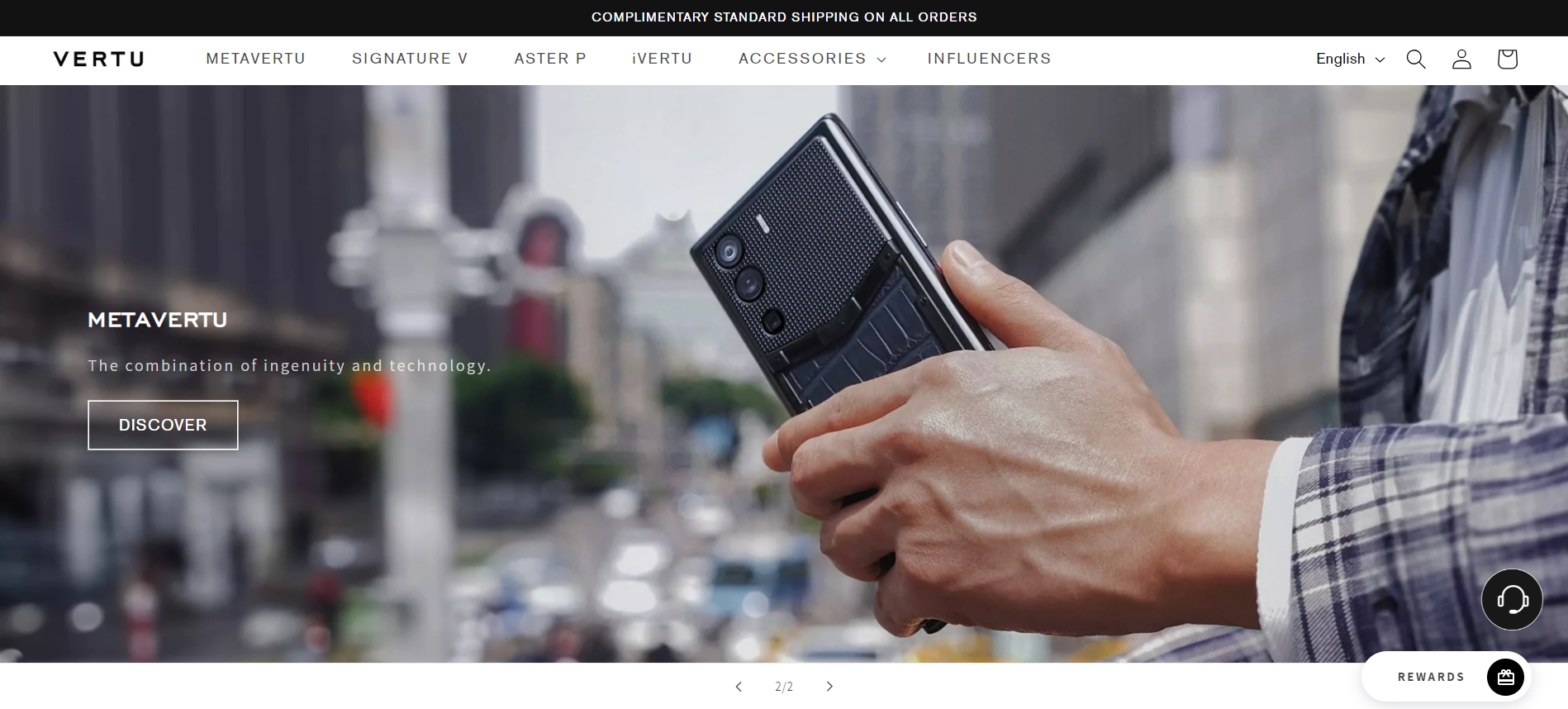
Let’s take a look at how EComposer transforms Vertu’s product page.

Vertu team uses the EComposer standard product page to showcase their items to customers, consisting of basic customizations and components.
What’s more? They choose to present product variants and brand services shortly and visually. In the detailed description, Vertu uses eye-catching banners to depict their items' unique selling points.
One notable thing on Vertu’s product page is applying two visual CTA buttons, which are “Add To Cart” and “Buy with PayPal,” along with the 3rd button about “more payment options” that leads to Vertu’s checkout page directly.
What we can learn
Here are some tips that you can learn from Vertu’s Product page
- Customize the product page to fit your brand and products: Add your branding and content and highlight your products' unique selling points.
- Use eye-catching banners to highlight your product's unique selling points. This is a great way to grab attention and make your products stand out from the competition.
- Use clear and concise calls to action: Tell customers what you want them to do, whether adding an item to their cart or making a purchase.
- Diverse options to navigate your customers to checkout fast and efficiently.
2- Mymanu
Founded in 2017, Mymanu is a United States company that makes translation earbuds that help people communicate with each other in real-time, regardless of their language barriers.

The success of Mymanu comes from its intuitive product page.

Using EComposer, Mymanu optimized its product page, which became more accessible to navigate. Visitors can quickly go back to shop to purchase more.
The first impression of Mymanu’s detailed product page is that this business clearly and trustfully highlights its product features and benefits.
Mymanu presents its product descriptions on the grid layout appealingly through photography and branding video.

There are many social proofs and sale-boosting components on Mymanu’s product page design, such as a review widget sticking on the left side,...

… a complementary offer for the main product….
Besides, the Mymanu team created a Frequently Answer Questions section that collects general and joint customer problems and questions.

What we can learn
Here are some key things that new users can learn about Mymanu's product page creation:
- Focus on product features and benefits: What makes your product unique and valuable to customers? Highlight these features and benefits prominently on your product page.
- Use sale-boosting components: Limited-time offers, discounts, and free shipping can encourage visitors to buy.
- Address common customer questions: Create a Frequently Asked Questions section to answer potential customers' questions about your product.
3- Blomdahl
Blomdahl is a Swedish company specializing in medical piercings and accessories. They are known for their high-quality, nickel-free, and hypoallergenic products.

Blomdahl Australian team chose EComposer Next Generation Page Builder to revamp their product page more visually.

Besides showing eye-catching product images, BlomDahl displays its product color swatches through variant photos so customers can easily imagine their choice.
Moreover, BlomDahl offers the “After pay” service, along with guaranteed safe checkout badges.
This brand highly considers its customer experience. Therefore, BlomDahl provides sale-boosting sections for its product pages, such as Frequently Bought Together….

And related products integrated with the wishlists function allow shoppers to save their favorite items to purchase later.

What we can learn
Here are some key things that new users can learn from Blomdahl Australia’s product page:
- Use high-quality visuals, such as eye-catching and model-wearing images and variant photos.
- Present trust badges on products (like Safe checkout badges, etc.) to increase customer trust and sales.
- Integrate a wishlist function to allow customers to save items easily.
4- Conatural
Let’s look at another EComposer merchant, Conatural, to explore how they can build their product page visually, including the above powerful elements.

Conatural is a Pakistani natural and organic hair and skin care company that provides high-quality products made with natural ingredients.

You can see that Conatural uses a visual product image and a clear and vibrant “Add To Cart” button.
They mainly provide a clear product introduction via strong product titles, product tags mentioning the product characteristics, and brief and detailed descriptions.

They have special offers for their customers through the Frequently Bought Together list,...

And their brand reward section that was created by Joy Loyalty. Explore more Affiliate & Loyalty apps that are 100% compatible with EComposer now.

Conatural highly concerned about their customer experience. So that they generate a lively helpdesk, presenting categories and featured FAQs created by PushOwls.

Moreover, when you scroll down, you will see Conatural’s written and video reviews sections.


Remember that even the tiniest things can significantly impact brand loyalty!
What we can learn
CONATURAL's product pages are a great example of using EComposer to create visually appealing and informative product pages. Here are some essential tips you can learn from them:
- Write clear and concise product descriptions, and use strong product titles and tags.
- Provide easy customer support by including a helpdesk or FAQ section on your product pages.
5- My Happy Moments

My Happy Moments is a German online store that sells personalized gifts for all occasions.
My Happy Moments is committed to providing high-quality products and fast shipping, making them an excellent choice for anyone looking for a unique and personal gift.
Because this is a POD business, My Happy Moments’s product page has special and unique components. Stay and explore more about how EComposer transforms My Happy Moment’s product page.

You can easily see that Product images on the My Happy Moments product page's main area are all zoomable when hovering.
This typical POD site allows customers to design their items' skin with existing variants comfortably. So that all changes that customers want on their items are presented lively. This POD business also provides a preview option once its customers finish their design.

We will see My Happy Moments provides the necessary information about their product, like short but clear product description, delivery estimation, and transparent payment methods.
Moreover, various sale-boosting components are used in this brand’s product site, such as Countdown Timer, You May Also Like items, and Product Bundles. These all are EComposer’s most commonly used elements and extensions.
One thing that makes MyHappyMoments’s product page stand out is that this business builds customers' trust through product reviews….

… and eTrustedShop badge as the secured Buyer Protection guarantee.

What we can learn
New users can learn a lot from MyHappyMoments' product page, including:
- Use zoomable product images and preview option: This lets customers preview their interesting products more clearly.
- Present precise product details, including description, shipping estimation, and payment methods.
- Build customer trust through reviews, trustworthy badges, and certificates.
6- Overland Garage
Overland Garage is a one-stop shop for overlanders, offering various products and services, including vehicles, parts, accessories, and services.

Now, let’s see how EComposer revamps Overland Garage’s product page.

About navigation, Overland Garage applies breadcrumb on its product page. Moreover, at the bottom of its product page, there is a button inviting visitors to explore another product.
Product description and attributes are shown understandably and particularly.
On Overland Garage’s product page, you will see that they insert the Shipping policy and sample plans popup whenever customers choose the ShopPay payment method.

They also allow buying with other gateways, such as Google Pay.
One more thing: Overland Garage uses Store Locator - one of the EComposer Advanced elements, to show off this brand’s physical brands. It’s beneficial to convert internet traffic into offline customers.

What we can learn
Overland Garage's product page is a great example of how to create a product page that is both informative and persuasive. Here are some tips that new users can learn from their product page:
- Improving product page navigation by using breadcrumbs and an "Explore another product" button
- Support multiple payment gateways: This gives customers the flexibility to pay for their purchases using their preferred payment method.
- Provide additional information like shipping policy, sample price, and available pickup branches.
7- Homecooks:
HomeCooks is a UK-based online food delivery service that makes mealtimes effortless and enjoyable. With a wide variety of ready-made meals cooked by independent chefs and recyclable packaging, HomeCooks offers healthy and delicious options for everyone, making it a convenient and sustainable choice.

Thanks to EComposer, HomeCooks redesigned its product page, becoming eye-catching and high-converting.

When choosing a specific dish, we can see HomeCooks' loyalty program created by Appstle℠ Loyalty & Rewards and stunning sign-up form with a special discount to encourage customers to stay engaged and make their first order.
The sign-up form helps HomeCooks get more leads and understand their insights.
In the product description section, this food-serving business presents its chef profile, the details of ingredients, allergens, and heating instructions.
Some dishes support single and double ordering bundles to boost sales.

One unique thing in HomeCooks’s product description is that its “Add to Cart” button applies to the Ajax cart, leading shoppers to a mini cart popup. You can click “View Cart” to see the whole order in HomeCooks’s Shopping Cart Page created by EComposer. If you want to create a high-converting cart page, tap to explore more.

Scrolling down, you can read your order reviews from HomeCook eaters, visual ordering guide, and other dishes.
What we can learn
Let’s learn tips to create informative, engaging, and persuasive product pages like HomeCooks:
- Having details and visual product details, notices, and guidelines
- Using the mini cart popup to make customer order confirmation more convenient.
- Implement First order discounts, product bundles, and loyalty programs,... to enhance customer engagement and drive higher sales.
8- Gigi & Olive
Gigi & Olive is a UK-based online retailer that offers stylish and affordable bridal, bachelorette, womenswear, and gift products.

This brand product page also has exciting tips that we can learn from.

Gigi & Olive decided to design their product page in a simple template that eases the experience with all customers.

Gigi & Olive allows “gift wrapping options” and additional gifts in some items to drive higher sales and stay engaged firmly with customers. Customers can customize that extra gift and add messages freely.
Moreover, this online retailer offers social share buttons encouraging customers to share their chosen items on their social feeds on Facebook, Pinterest, and/or Instagram.
Gigi & Olive also provides the essential information for each item, including:
- Description: Introduce briefly about the item
- Details & care: List items on a box and preserves guide.
- Delivery & Returns: Explain the shipping and return policy.
And it allows adding items to the wishlist.
What we can learn
- Offer gift-wrapping options and additional gifts. This is a great way to add value to your products and encourage customers to spend more money.
- Include social share buttons. This makes it easy for customers to share their preferred items with their friends and followers, which can help to increase brand awareness and drive sales.
9- Take Off
TakeOff Copenhagen is a Danish sneaker store that sells exclusive and limited-edition sneakers from popular brands such as Nike, Adidas, Jordan, and Yeezy. TakeOff Copenhagen is known for its friendly and knowledgeable staff and orientation to provide customers with the best shopping experience.

Because of that commitment, TakeOff Copenhagen chose EComposer to build its entire store, including the product page.

Takeoff Copenhagen organized its product page clearly.
They stick an “In-Stock” badge for items they are ready to sell.
Unlike several product templates, Takeoff Copenhagen shows brief information about each item’s variant, like Product name, price, size and size chart, scarcity, pick-up, and delivery status.

One thing that makes Takeoff stand out is its creative product details showcase. In particular, the Takeoff team uses an “accordion” style, separating product information into detailed descriptions, size guides, delivery & return policies, and authentic guarantees. They attach a FAQ link in the needed areas to invite customers to read more.
Scrolling down, Takeoff Copenhagen presents its commitments to customers visually and understandably and finally places a wishlist-addable related products section.

What we can learn
TakeOff Copenhagen's product page is well-designed and minimal but still informative. It includes all essential elements for customers to make a purchase decision.
Follow the below tips to build a stunning product page like TakeOff:
- Organize your product page clearly and highlight important information.
- Visually present your commitments to customers.
10- Ravpower
Established in 2011, RAVPower is a technology company that develops and manufactures portable power banks, chargers, and other accessories. RAVPower's products are known for their high quality, affordable prices, and innovative features.

Using EComposer, RAVpower transformed its product page in a few minutes.

Overall, RAVPower arranges their product details on their product page clearly.
They set up autoplay mode for the product images.
About the product description, RAVPower displays the real-time sold product quantity.
While some brands showout their product descriptions in the tab, RAVPower simply displays that section in bullet style, making it collaspable.
When scrolling down, we can see that RAVPower guarantees its services (about payment, delivery, and support) through badges and attached guarantee FAQs.


Lastly, the RAVPower product page uses the back-to-top button to simplify customer navigation.
What we can learn
RAVPower's product page is well-designed with all the essential elements for customers to make a purchase decision, plus additional features that add value and encourage spending.
Here are some key takeaways we can learn from the RAVPower product page:
- Use a clear and concise layout to make it easy for customers to find the information they seek.
- Use visuals to showcase your products more dynamically and engagingly.
- Highlight important information, such as product descriptions and guarantees, to build trust and credibility with potential buyers.
- Simplify navigation for customers by using a back-to-top button.
Start Building High-converting Shopify product pages Today.
Your competitors may have bland product pages that need more elements that drive shoppers to buy. To gain a competitive edge, you can improve your Shopify product pages by adding videos, FAQ sections, customer reviews, etc.
Using EComposer, creating great product pages is easier than ever.
Don't delay! Customize your pages today and start grabbing new conversions.
FAQs about Shopify Product templates
1- How do I create a custom single product page on Shopify?
After opening a new Shopify Store, you can create a Shopify product page within Shopify Admin or through professional Page Builder apps.
- On Shopify Admin, you have two options:
- Using Shopify themes: Choose an in-stock Shopify theme or import a 3rd-party one. Then go to Online Store > Themes > Customize to create your product templates
- Pros: Easy to customize for beginners
- Cons: This is no longer a flexible method because:
- The users have to follow the fixed theme layout. They cannot add a new section.
- To own a more functional product page, the merchants must install various apps in on-page marketing, order management, social proof, etc., which may reduce the page loading speed.
- Editing theme code is a more powerful option, allowing you to change your product page template. However, this method requires coding knowledge and is not recommended for beginners.
- Shopify page builder apps like EComposer are a great way to customize your product pages without coding. These apps typically use a drag-and-drop interface, making them easy for beginners. With a page builder app, you can add new sections to your product page, edit the layout, and change the styling—bonus hundreds of stunning pre-built templates.
2- How do EComposer product page templates work?
EComposer has developed various product page templates for diverse niches to help eCommerce businesses build product pages quickly.
There are three ways to assign a template to a product:
- Apply for all products: This will apply the template to all products and replace the default Shopify template.
- Apply for specific products: This will apply the template to selected products.
- Apply for all products in a collection: This will apply the template to all selected collections.










0 comments