


Top 10+ Must-Try Shopify Checkout Page Templates for High-Converting Stores
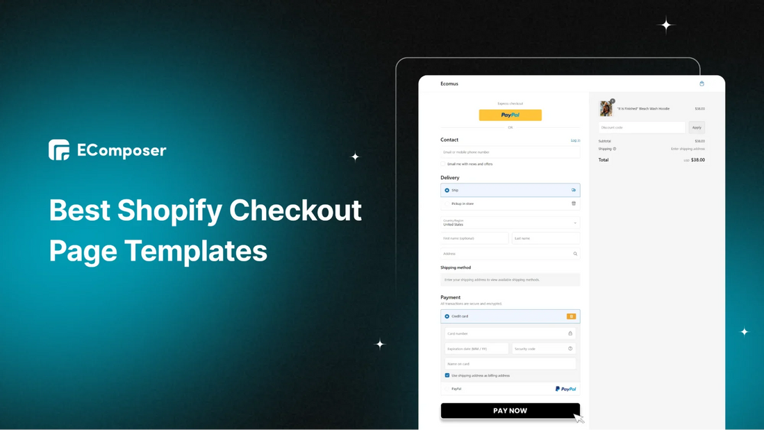
Table Of Contents
You’ve done the hard work – your customer has reached the checkout page, ready to buy. But sometimes, they abandon their cart, leaving you wondering what went wrong. Don’t worry, you're not alone.
This blog is going to be useful for you. We’ll show you how to transform your checkout page into a conversion machine using top 10+ Shopify checkout page templates. With the right tweaks and real-life examples, you'll boost your store's conversion rate in no time.
Ready to take your store to the next level and secure more sales? Let’s dive into the best templates for high-converting stores!
What is a Shopify Checkout Page?

Everyone knows that the checkout page is the final stop in an online shopping journey, where customers fill in their payment and shipping details to finish their order. But for boosting conversions, its role goes beyond that. It helps:
- Maintain Brand Consistency
- Reduce Cart Abandonment
- Increase Average Order Value
- Boost Conversion Rate
- Build Customer Trust
It may seem straightforward, but the checkout page is a crucial part of online shopping where visitors become customers.
At this point, they're ready to pay. This is your chance to make the experience smooth and memorable, turning customers into loyal fans. If they have a great checkout experience, they’re likely to return or recommend your store to others.
Since it’s so important, let’s find out key elements of a typical checkout page template to best optimize the customer journey.
Key Elements of a Checkout Page Template

Your checkout page is where customers complete their purchase, so it's important to get it right. Here are 6 key elements every checkout page template should have for a smooth shopping experience:
- Payment Method Logos: Display a variety of payment options (e.g., PayPal, credit cards) to cater to different preferences. More payment methods can reduce cart abandonment by accommodating more customers.
5 Best Practices for a High-converted Shopify Checkout Page
Data from the Họtar shows that nearly 70% of online shoppers abandon their carts. This happens for reasons like unexpected fees, complicated checkout steps, or limited payment choices.
To lower cart abandonment, try these simple tips to improve your checkout page.
1. Keep it simple and user-friendly
Your checkout process should be fast and simple, with no distractions or unnecessary steps. Only ask for the information needed to complete the purchase—everything else can be optional or removed.
Clear instructions are key. Use short, descriptive copy and show steps like:
- Step 1: Shipping Information
- Step 2: Payment.
If your checkout has multiple pages, add a progress bar to show buyers how far they are in the process.
Also, make your call-to-action buttons like "Proceed to Checkout" or "Place Order" easy to spot, so customers know exactly what to do next. Tools like Shop Pay can save payment and shipping details, making future checkouts even quicker.
2. Offer multiple payment options

Customers prefer having different payment options when shopping online. In fact, 42% of U.S. consumers said they would abandon their purchase if their favorable payment method wasn’t offered.
To meet different needs, provide a variety of payment methods like credit/debit cards, faster checkout options (PayPal, Shop Pay, Apple Pay), digital wallets, and buy now, pay later services.
When selecting a payment provider, think about where your business operates and where your customers are. This list of payment gateways can help you find available payment options in different countries and the currencies they support.
3. Provide Clear Shipping Information
Shipping details are essential for online orders, so include the necessary fields for customers to fill out their information.
It's also important to be upfront about shipping costs and any extra fees. Clearly list these to avoid confusion, as surprise charges can lead to cart abandonment and frustration.
Provide an estimated delivery time so customers know when to expect their order. Additionally, if you have a specific return policy, mention it on your checkout page. The aim is to make customers feel confident and informed throughout the process.
4. Provide Guest Checkout

Allowing guest checkout can increase sales. Some shoppers may not want to provide all their details right away, so making it easy to complete a purchase without signing up lowers the barrier.
You can also include a message explaining the benefits of signing up, but keeping the checkout experience smooth will likely lead to more successful purchases.
5. Test and Iterate
Creating multiple draft versions of your checkout lets you test different layouts, features, and app integrations without changing your live store. You can use the preview tool in the checkout editor to see how these changes will look to customers on different devices.
Try A/B testing to compare versions and find out which one works best. Regularly check your checkout analytics, listen to customer feedback, and monitor abandonment rates to spot areas for improvement. Don’t hesitate to make small updates regularly to keep improving the checkout experience.
10+ Trendy Shopify Checkout Page Templates to Try
1. Ecomus Checkout Page Template

(Image Source: Ecomus Theme)
The Ecomus checkout page demonstrates several effective elements that contribute to a positive user experience. Here are the most noteworthies:
- Organized sections: The page is divided into clear sections (Contact, Delivery, Payment) for easy navigation.
- Multiple payment methods: The page offers both credit card and PayPal options, catering to diverse customer preferences.
- Policy Displaying: These will help you show customers how you collect, use, and protect customer data.
These elements work together to make the checkout visually appealing and user-friendly, encouraging customers to finish their purchases and lowering cart abandonment rates.
2. Kalles Checkout Page Template

(Image Source: Kalles Theme)
The Kalles checkout page stands out for its clean design and focus on a smooth user experience. Here are the highlights:
- Minimal distractions: The design avoids clutter, focusing on essential information and actions.
- Security indicators: The presence of security badges and statements reassures customers about the safety of their transactions.
- Back and next buttons: These navigation elements allow users to move forward or backward, providing flexibility and control.
With minimal distractions, clear security indicators, and easy navigation, the Kalles checkout page ensures customers can confidently complete their purchases.
3. Ocolus Checkout Page Template

(Image Source: Oculus Theme)
The Ocolus checkout page excels in clarity and user-friendliness with its consistent formatting and helpful guidance. Top elements to note:
- Consistent formatting: The use of consistent typography, spacing, and alignment enhances readability.
- Clear payment information: The fields for card details are well-labeled and organized, reducing the likelihood of errors.
- Helpful tooltips or hints: Hoverable tooltips or hints can offer additional information or guidance when needed.
With clear payment fields and useful tooltips, the Ocolus checkout page ensures a smooth and error-free checkout experience for customers.
4. Unsen Checkout Page Template

(Image Source: Unsen Theme)
The Unsen checkout page stands out with its clear presentation of discounts and smart design choices that enhance the user experience. The standout points are:
- Discount information: The applied discount is prominently shown, highlighting the value proposition for the customer.
- Conditional fields: The "Apartment, suite, etc." field is only displayed when necessary, reducing clutter and improving the user experience.
- Progress indicators: A clear progress bar or steps can help customers visualize the checkout process and their current position.
The Unsen checkout page template makes it easy for customers to see their savings and track their progress as they complete their purchase.
5. Gecko Checkout Page Template

(Image Source: Gecko Theme)
The Gecko checkout page template shines with clear product details and a simple step-by-step process that guides customers smoothly through their purchase:
- Product details: The product name, image, variant (e.g., size, color), and price are clearly displayed, ensuring transparency.
- Step-wise process: The checkout process can be divided into multiple steps, guiding the customer through each stage without overwhelming them.
- Contact information: The availability of contact information (email, phone number) provides a channel for customers to seek assistance if needed.
With easily accessible contact information, customers feel supported and informed, making their shopping experience both transparent and reassuring.
6. Ellesi Checkout Page Template

(Image Source: Ellesi Theme)
The Ellesi checkout page template stands out by providing customers with multiple shipping options and a clear breakdown of all charges:
- Multiple shipping methods: The page shows various shipping options, allowing customers to opt for the most suitable method depending on their needs and preferences.
- Estimated tax calculation: Providing an estimated tax calculation can help customers plan their budget.
- Prominent Discount Field: The discount field is prominently displayed on the page, it helps customers easily apply any available discount codes.
With a prominently displayed discount field, shoppers can easily apply their codes, enhancing their overall shopping experience.
7. Ella Checkout Page Template

(Image Source: Ella Theme)
The Ella checkout page template keeps the brand's look consistent, giving customers a familiar and smooth experience:
- Consistent branding: The checkout page maintains the brand's visual identity of minimalism, reinforcing the overall shopping experience.
- Secure payment gateways: The page also utilizes secure payment gateways like to protect customer data.
- Breakdown of charges: The page clearly lists all applicable fees, including subtotal after applying code, shipping costs, and any additional charges.
With safe payment options and a clear list of all costs, customers can easily complete their purchase with confidence.
8. Minimog Checkout Page Template

(Image Source: Minimog Theme)
The Minimog checkout page is designed to be easy to read, using clear language that everyone can understand.
- Clear and concise language: The page uses simple and understandable language, avoiding technical jargon that might confuse customers.
- Mobile optimization: The page is designed to be responsive and user-friendly on mobile devices.
- Return and privacy policy: Clearly stating the return and privacy policy provides customers with peace of mind.
With a mobile-friendly design and clearly stated return and privacy policies, customers can shop with confidence on any device.
9. Ubone Checkout Page Template

(Image Source: Ubone Theme)
The Ubone checkout page makes the shopping process smoother by offering options to save customer details for future purchases.
- Saved addresses and payment methods: Providing options to save customer information for faster future checkouts.
- Various payment methods: The page offers a variety of methods like credit card, cash on delivery and bank deposit options, catering to diverse customer preferences.
- Additional billing address: It gives options for customers to choose between “same as shipping address” and “use different billing address” to meet different demands from buyers.
With multiple payment methods and flexible billing address options, it meets the different needs of customers, making checkout easy and convenient.
10. Mate Checkout Page Template

The Mate checkout page is designed to be user-friendly, with simple steps that guide customers through the process.
- Intuitive navigation: The checkout process is well-organized, with clear steps and easy-to-follow instructions.
- Estimated tax calculation: The premade template provides an estimated tax calculation that can help customers plan their budget.
- Focused Call to Action: The "Pay Now" button directly prompts the customer to proceed with the purchase, eliminating any confusion or hesitation.
With clear tax estimates and a prominent "Pay Now" button, it encourages a smooth and confident checkout experience.
3 Ways to Customize a Shopify Checkout Page
You can use the checkout and accounts editor to customize the look and functionality of your checkout, thank you, and order status pages, along with new customer account pages.
Standard customizations like adding your logo or changing colors are available on all Shopify plans, while advanced features are only for Shopify Plus users.
Please take a look at this table to understand the Shopify plans capabilities for Checkout page customization:
|
Checkout customization feature |
Basic Shopify plan or higher |
Shopify Plus |
|
Access to the checkout and accounts editor |
Yes ✔️ |
Yes ✔️ |
|
Eligible apps that customize the thank you page and order status pages |
Yes ✔️ |
Yes ✔️ |
|
Eligible apps that customize the information, shipping, and payments pages |
No ❌ |
Yes ✔️ |
|
Access to the Checkout Branding API |
No ❌ |
Yes ✔️ |
1. Use Shopify Themes
If you're on any Shopify plan except the Shopify Starter plan, you can make basic or visual changes to your checkout page using the theme editor. It's a good idea to customize the checkout page to match your brand.
Here’s how to do it step by step:
Step 1: In your Shopify admin, go to Online Store > Themes, and click Customize on your current theme.

Step 2: In the theme editor, click the dropdown for Homepage and select Checkout and new customer account.

*Note: Before you start customizing, please note that you can't use sections to edit the Checkout page.
Step 3: Use the options in the left sidebar (like Logo, Cover, Layout) to update the checkout page:

- Banner: Add a background image at the top of the page.
- Logo: Upload your brand's logo.
- Main content area: Choose a background image or color.
- Order summary area: Customize this with a background image or color.
- Typography: Change fonts for headings and body text.
- Colors: Adjust colors for links, buttons, and error messages.
Step 4: Once you’ve made your changes, click Save.
Finally, go to your website, check out a product, and review the checkout page to make sure it looks the way you want.
- Pros of using Shopify Theme: Shopify Themes already provides you with a basic checkout page that aligns with your branding. You just need to edit with existing elements right in Shopify Dashboard, no extra cost or coding required.
- Cons of using Shopify Theme: Although Shopify themes provide a great foundation, they can be limited when it comes to customization. You may find it difficult to create a highly specific or unique design for their checkout page.
2. Utilize Checkout Branding API for Advanced Customizing
As mentioned above, this method is only for Shopify Plus plans. It also might seem technical because it is, and you may need a developer to help. However, it offers limitless options for customizing your checkout page, allowing you to create a unique design for your brand.
Shopify Plus merchants can use the GraphQL Admin API to make advanced changes that aren’t possible with the standard checkout editor. For example, you can add a favicon or 9adjust design elements like button shapes for a more customized look.

(Image Source: Stacking Context)
- Pros of using Shopify Branding API: The Checkout Branding API gives merchants detailed control over the checkout page, letting them customize almost everything, like colors, fonts, layout, and branding. It allows for a unique and personalized checkout experience.
- Cons of using Shopify Branding API: It requires coding knowledge and development skills. Merchants without technical expertise may find it hard to make changes or fix issues.
Congrats! You've just improved your Shopify checkout page with this easy guide—making your first move toward creating a better shopping experience for your customers and growing your business!
To further edit your page, explore advanced tips to customize your own Shopify Checkout Page.
It also offers extra features for building home pages, product pages, and more, along with a variety of professional templates and built-in extensions.

If you don’t have a Shopify account yet, take advantage of a special offer: get your first month for just $1 on any plan and explore all the features Shopify provides.
3 Success Checkout Page Examples for Inspiration
- Molly Jogger
Molly Jogger, a camping gear brand, keeps its checkout simple by only asking for essential details.

The address fields use Google's autocomplete feature, so when customers start typing their street address, the city, state, and ZIP code automatically fill in. For optional info like phone numbers, there's a helpful note explaining why adding it can be useful.

Overall, Molly Jogger’s checkout page is straightforward and clear, making it simple for customers to enter the necessary details.
- Tentree
Tentree's checkout page combines convenient shopping with eco-friendly actions. You can easily review your order, and the highlight is the option to plant trees with your purchase, supporting Tentree's environmental mission. They also provide order protection, showing they value your order just as much as the planet. It's a thoughtful and responsible shopping experience.

Tentree’s checkout allows you to finish your purchase while offering options to protect your order and reduce your carbon footprint.

- Bubs Naturals
Bubs Naturals, a vitamins and supplements store, sets a great example with trust signals on their checkout page.

Security badges like payment logos and SSL certificates help reassure customers that their information is safe. They also display product reviews, secure payment options, and a 100% satisfaction guarantee.

These trust elements ease customer concerns, ensuring their payments are secure, the product is high-quality, and they can get a refund if unsatisfied. Bubs Naturals' checkout page also highlights star ratings, reviews, and total item costs to further build trust.

FAQs
- How do I simplify Shopify checkout page?
Here are some tips to simplify your Shopify checkout page:
- Minimize required fields: Only ask for necessary information to reduce friction.
- Use clear and concise language: Less jargon or overly complex terms.
- Provide progress indicators: Show customers where they are in the process.
- Offer guest checkout: Allow customers to purchase without creating an account.
- Optimize for mobile: Ensure your checkout page is mobile-friendly.
- How do I improve my Shopify checkout page?
Here are some strategies to improve your Shopify checkout page:
- Use A/B testing to experiment with different layouts to see what works best.
- Ensure your checkout page loads quickly.
- Display security badges and customer reviews to build confidence.
- Provide various shipping methods and estimated delivery times.
- Provide clear return and refund policies to inform customers upfront.
- What are most common Shopify checkout page customization apps?
Shopify checkout page customization apps offer tools to enhance your checkout experience. Some popular options include:
- EComposer: A drag-and-drop page builder for creating custom checkout pages.
- EcomRise: Adds upsells and bundles to increase average order value.
- BeSure Checkout Rules: Customizes checkout behavior with conditional rules.
These apps can help you create a more engaging and effective checkout page.
Conclusion
Utilizing Shopify checkout page template is a great way to increase conversions and boost sales. If both Shopify theme default and Branding API can not meet your demands, then Shopify Page Builder can fully customize their checkout for a better experience while no code needed.
To improve conversion rates, it’s important to run A/B tests by making one small change at a time and comparing results. Over the time, keeping what works and removing what doesn't will help you optimize your checkout.
Build your highest-converting page in 15 minutes


Blog Categories


0 comments