


15+ Impressive Shopify Homepage Examples to Learn From
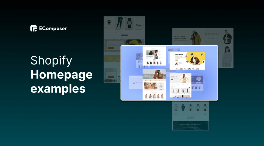
Table Of Contents
A first impression is something you can never get back. Because of this, your website's Homepage is one of its most crucial pages.
What features distinguish an impressive Shopify homepage design? It can't just look good, it must also function well. The most excellent homepages on this list; therefore, rank well in both content and design. This blog will show you an overview of 15 outstanding Homepage examples to learn from and analyze their key success factors for further enhancement. Let's explore now!
What is Shopify Homepage?

(image source: EComposer’s homepage layout)
“Homepage” is the first page when users visit your website. The purpose of the homepage on a website is to help navigate users to other pages by clicking on links or categories on the homepage or typing in the search bar on the site. From there, it will redirect the visitors to the landing pages.
How important is the Shopify Homepage?
The homepage is a must-have page for every website. It impresses customers who visit your website for the first time. From there, users go "deeper" to other pages on the website.

Navigate business information easily
The homepage makes it easy for users to evaluate the business or the unit providing that product or service through the homepage. Quickly find the necessary information and services on the page through simple operations.
Represent brand image
The homepage is considered the brand image of a business on the online platform where website owners provide specific information about products or services to customers functionally.
Promote the products
The homepage is like the best advertisement page for your product. When customers access your website, whether to buy or not depends on the homepage. The more attractive the homepage, the easier it is to persuade users to stay on your website longer.
Besides, the function of the homepage is to direct users to visit. This page gives you the page titles, images and sitemap. As a result, users can easily find information about the web's governing units through the name and image of the business, information about phone numbers or email.
[ecom-global-block]ecom-shopify-trial-block[/ecom-global-block]
15 Excellent Shopify Homepage examples
We have assembled the top 15 Shopify homepages that offer various products and amazing designs that make navigating and shopping a seamless and pleasurable experience. These eCommerce stores efficiently display their items on the Shopify platform, with everything from trendy layouts to personalized customer interactions.
These websites will impress you and give you a fantastic shopping experience, whether you're a shopaholic or simply seeking a specific item. In your search for impressive homepage examples, we hope they will be helpful.
1. PopSockets Home Page

(image source: popsockets.com)
Conversion rate enhancement and bold design trends are expertly balanced on the PopSockets homepage. Particularly, the target audience engages with the company through the compelling product picture and numerous calls to action.
2. Pura Vida Bracelets Home Page

(image source: puravidabracelets.com)
Pura Vida showcases awesome pictures to its visitors. When you initially arrive at their homepage, it appears well. Everything is structured in good shape and is from a well-known company with several high-quality photographs.

(image source: puravidabracelets.com)
They also use Social Proof on their homepage.
3. Ora Organic Home Page

(image source: ora.organic)
Ora Organic, a company that sells dietary supplements, has a simple but elegant homepage design that divides customers into two target audience groups: those who want product assistance while buying and those who wish to shop independently. As a result, it encourages consumers to look through every product or complete a quiz to assist them to decide which one is ideal for them.
The brand's value propositions are restated on the Homepage, after the options for customers to shop or take the quiz once more.
Ora Organic advertises its subscription-based option further down the website, followed by more support in the shape of details regarding product sampling and customer reviews.
4. BioLite Energy Home Page

(image source: bioliteenergy.com)
Appliances for portable cooking and lighting are available for purchase from BioLite Energy. It features lovely product photography and highlighted calls to action on its homepage.
Additionally, BioLite displays the effect it has on the neighborhood on its homepage. Users are inspired to purchase to support the cause after sharing this information.
5. Houseplant Home Page

(image source: houseplant.com)
The homepage of Houseplant presents products in a sophisticated, subtle manner. Because the site does not overburden you with pop-ups or information, browsing through products is simple.
By taking the questionnaire on the homepage, users can quickly identify products that meet their needs or preferences. This may be a fun approach to introduce customers to your items.
On its homepage, Houseplant just provides a piece of information about its products. Because it encourages buyers to click on things or browse your business to discover more, this risk can be worthwhile. Additionally, it is perfect for goods that clients want to access discreetly online.
6. Bear Walker Home Page

(image source: bearwalker.com)
Skateboards are the store's area of expertise. Its skateboards, however, are everything but typical. They provide a variety of patterns with topics like Marvel and Pokemon pictures, among others.
Despite the Bear Walker homepage's simplicity, the product display steals the stage. Customers are interested in testing the items and learning more about them through the photography, which captures and displays the artwork on the skateboards.
Shoppers are encouraged to move closer to purchasing decisions through follow-through cues. In this instance, Bear Walker dazzles potential customers with a preview of its boards and then nudges them to click through to learn more about them.
Instead of a drop-down menu, the Bear Walker homepage includes an accessible menu with icons at the top of the page.
7. All birds Home Page

(image source: allbirds.com)
All Birds does not sell actual birds or bird-related products, despite its name. It offers shoes for men and women that will make you feel as light as a bird by employing cutting-edge materials.
This store provides excellent lifestyle images that show clients how various shoes might appear on their feet. Because customers cannot try on the shoes, this is especially useful for online stores.
The highlights and descriptions of All Birds' products include references to birds. Their message becomes more engaging and memorable as a result.
Most companies limit their marketing efforts to the homepage. Nevertheless, All Birds stands out because it highlights its eco-friendly approach. This point is especially crucial since brand values are important to customers.
8. KIND Home Page

(image source: kindsnacks.com)
KIND Snacks have emerged from complete obscurity and poor performance with the powerful branding available.
KIND welcomes customers to dive in and look at the banner for wholesome snacks. The image-driven product categories have almost entirely taken the role of the old top navigation. Who can resist free goodies when their appearances are in vibrant colours and promotional copy?
9. Welly Home Page

(image source: getwelly.com)
An American startup requested the New York-based Illcreative studio to create a website. The sale of colourful first aid kits is the core goal of the startup. Users can personalize the colour and kits by themselves. The integration of such a disturbing area of activity and a commercial website into a stunning concept was successful for the developers.
A successful website with orange accents for targeted activities is the final result. Additionally, the Illcreative experts selected a polygonal style for their homepage, placing an animated movie at the top with a nicely designed layout of Welly's items. Additionally, the animation is employed in other presentation blocks, improving the user experience.
10. Mint Home Page

(image source: mint.intuit.com)
Everyone wants to work with experts and get a good night's sleep when it comes to managing their finances. The homepage of Mint conveys the message, "You can trust these guys with your budget planning," to the user.
The design is straightforward and laconic because it uses a block structure and few colours. The primary CTA button, "Sign Up Free," is the only contrasted component on the page, but it still fits in with the overall design.
The first scroll has a compelling headline and an explanation of the main points in the form of a question and answer. The use of the colours white and green, in particular, contributes to the homepage's calming and secure feel.
11. Partake Foods Home Page

(image source: partakefoods.com)
Partake Foods offers handcrafted vegan gluten-free cookies in lovely images.
Partake Foods has reached its goal while operating in a very narrow market because of its excellent design. It is bright, upbeat, and specifically designed to recreate your emotional experience when enjoying a flavoursome cookie. It serves as the ideal illustration of how the homepage of an online cookie store should look.
12. Ratio Coffee Home Page

(image source: ratiocoffee.com)
Ratio provides clients with distinctive coffee-making machines.
Ratio provides a straightforward and concise introduction to the features and benefits of its products. Thus, customers may look through Ratio devices knowing precisely about the company.
Customers can utilize a product comparison table on its homepage to assess the various machine models. Additionally, it is practical for individuals who might choose not to read each product in detail.
This retailer uses a banner to highlight alluring deals like free delivery and its unique "30-day Love It Guarantee”. It is a successful homepage strategy since the banner is difficult for customers to overlook, and incentives like this can increase conversion rates.
13. Common Heir Home Page

(image source: commonheir.com)
Common Heir designed an excellent homepage with outstanding design to attract visitors to purchase its skincare products on the online platform. The homepage has crucial components consisting of a straightforward navigation bar, easily readable contrast colours, and CTA buttons scattered throughout.
Along with large, stunning photographs, the homepage also promotes the brand's products, founders of small businesses, and value propositions. Customer reviews are a type of social proof.
14. Hunterhue Home Page

(image source: hunterhue.com)
Hunterhue is a bracelets brand which offers handcrafted, unique items. Its homepage has an uncomplicated design that emphasizes the artwork and merchandise.
Users can choose to browse the most recent featured collection or shop for accessories or paintings with ease. Users can access more goods, the website's About page, the contact form, or the shopping cart via the navigation bar.
15. Austin Beerworks Home Page

(image source: austinbeerworks.com)
On this website, the primary function of Homepage is to introduce the business and its products. So, mission accomplished. Everything is in its proper place: remarkable graphics, appealing typography, and brewing-related audiovisual resources.
The first thing a user sees when they visit the website that sells alcohol is a query regarding their age. This merchant displays white text and high-resolution photographs of beer in the opening scene on a transparent baby-blue background. Such a remedy directs attention to the crucial component: the beer.
It's impressive how well-chosen typefaces may be used; letters in various sizes, bold, italic, and dimensional styles harmoniously coexist. Users interested in watching videos can find links underneath the main image.
Overall, each kind of eCommerce store has different goals as well as distinctive products and target audiences; you can learn the key success factors of their Homepages to apply for your own Shopify Homepage to stimulate the customers.
What makes an Amazing Shopify Homepage?

Let’s examine the significant factors of an impressive Homepage that can help you to enhance your Shopify stores.
Quickly loading homepage
Users can complete their tasks and leave your website more quickly if it loads fast, which is advantageous for your company. Most visitors will leave your site quickly if they have to wait longer than ten seconds for it to fully loaded, which will hurt your bounce rate.
Always check to see if your store is moving at an acceptable pace. Any time your e-commerce store takes longer than 3-5 seconds to fully load on a desktop or 1-2 seconds on a mobile device will cause a sharp increase in bounce rates. Adjust all of the page elements to ensure the speed of your homepage.
Apply brand colours on your Homepage design
Make careful use of your brand's colours while developing your Shopify store. Colour may draw attention to specific elements of your page and help you stand out from competing merchants. Some well-known websites use only a single primary colour and two neutral tones. They can create a catchy and user-friendly website thanks to this combination.
Make categories easy to access
The menu is where customers begin their online store exploring. The menu bar aids customers in understanding the variety of goods the establishment offers. Many customers enter a store with an indisputable item in mind, and thanks to the menu bar, they may find the collection they're seeking with relative ease.
Your menu should be simple to navigate, including the home link, the link to your About page, and the extensive categories or collections you sell while configuring your menu. These will aid site visitors in finding the products they are looking for or learning more about your company.
Recommend featured product collection
Customers are curious about what makes you unique. Include a featured section to capture the customer’s attention with your best item or collection. This tip can make you stand out to new customers and convince them to choose your store over competitors
Many popular online retailers build up a featured section to highlight the advantages of their distinctive line by outlining the qualities that make it popular with their customers.
A different strategy to take advantage of featured sections is to draw attention to collections that are in demand or pertinent to your customers. For instance, brands produce Christmas collections throughout the holiday season and showcase them in their storefronts.
Express distinctive value proposition
A unique value proposition referred to as a unique selling proposition, is a claim that informs clients and potential clients about unique aspects of your goods or services and their advantages over those of your rivals.
Customers want to know why businesses want them to buy from them rather than the competition. Your Unique Value Proposition should be able to answer this question as concisely as possible.
BONUS: using Shopify page builder app
Using Page Builder applications on Shopify is one of the best solutions for creating an impressive Homepage fast and easily without coding knowledge requirements.
EComposer is a top-rated Landing page builder in the Shopify platform, it offers more than 40 premade Homepages and a lot of other kinds of pages for Shopify stores. Specifically, you can use this app conveniently with a powerful drag-drop editor. Besides, EComposer has live chat 24/7 to support the customers whenever you need it.

Final words
Shopify Homepage plays a dominant role in helping create the first impression to customers. Hence, focusing on building a beautiful Homepage is necessary. You can use EComposer - Landing page builder for making the best Shopify Homepage from available templates. We hope that you can also learn from the inspirational examples of other websites that go along with Homepage tips and tricks.
Related post:
Best design tips to make a professional Shopify store
How to Create a High-Converting Shopify Product Page
10+ Effective collection page templates in Shopify
12+ Amazing Shopify Contact Us Page Templates
How to design a Must-Click Landing Page in Shopify
Build your highest-converting page in 15 minutes


Blog Categories


0 comments