Top 16 Shopify Dropshipping Stores Designs + Tactics

Table Of Contents
According to Allied Market Research Report, the market for dropshipping, which was valued at $155.6 billion in 2021, is anticipated to increase at a Compound Annual Growth Rate (CAGR) of 27.1% from 2022 to 2031 to reach $1670.1 billion.
This type of business is a potential market in the future with a strong growth rate. If you intend to build your Dropshipping store, you cannot pass this blog. You can find the best tactics for Shopify Dropshipping store design with EComposer, and inspired by top successful Dropshipping stores in the eCommerce platform. Let’s check it out!
The importance of design in Shopify dropshipping store

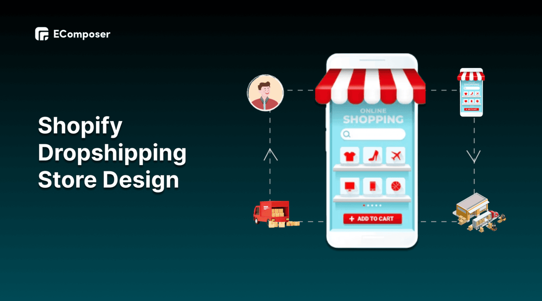
Dropshipping is a form of retail fulfilment strategy for online stores in which merchants sell goods to buyers, and transfer the sales order to a third-party supplier via the dropshipping fulfillment process, who then ships the order straight to customers on the merchant's behalf.
The unique point is there is no physical store for customers to come and select the products. All of the processes are conducted on the online platform. Hence, your dropshipping website is the official store where you can show your best to appeal to your target customers.
That explains why a well-designed website is a crucial component of the Shopify Dropshipping store. Follow these detailed points below:
First impressions matter
As visitors land on your website, you should present a pleasant front since first impressions count. Accessing a beautiful storefront draws visitors to look around for things they might be interested in.
An online store can operate in the same manner. They generate the tone for your store and may eventually increase your conversion rate.
[ecom-global-block]ecom-shopify-trial-block[/ecom-global-block]
Increase Credibility
It will be challenging for you to create customers’ trust if you do not have physical products displayed in retail stores. Your online store is essential to reveal your strengths and then make credibility. The design includes all of these things.
Thus, design can increase the business’s credibility. You need to build your Shopify Dropshipping store with consistent design and arrange social proofs that are factors to convince your customers to make decisions.
Optimize Customer Experience
Consumers today prefer an easy-to-navigate website to one with texts that strain their eyes. The design for responsiveness, attractive visuals and mobile friendliness are factors contrite to enhancing customer experience.
Moreover, you may improve conversion rates and online sales with the visual of a well-designed Dropshipping store.
Excellent tactics for dropshipping store design
You can consult the tactics which can make your Shopify Dropshipping store stand out from your competitors below.
Impressive landing pages

(image source: EComposer’s landing page layout)
The sales funnel's main component is its landing pages for online retailers. It is like a connection between customers who first see your advertising and those who visit and purchase from your online store.
Your brand, as well as the website that supports it, were expertly created by you. Making sure that your efforts result in sales is in your control. Landing pages are the way to go if you're looking for a strategy that will efficiently convert leads.
A well-optimized landing page may turn prospects into leads by gathering data that help you better comprehend your target, market to them, and enchant them. Landing pages are vital for conversions; thus, it's imperative to ensure they're planned carefully, produced, and deployed.
Landing pages direct readers to a specific product, service, or offer by enticing them to take action. You have a great chance to grow your customer base and generate leads by doing this.
A well-run dropshipping store will need a lot of effort, or you can rely on an agency and still make a lot of money. Your Shopify dropshipping site will be challenging to manage and run, especially at the beginning. Some people short-cut this process by buying an established dropshipping store that already has proven landing pages set up.
It would be fantastic if the Shopify page builder could help you create your landing pages as well as your website pages fast, conveniently, and economically.

EComposer is the top landing page builder application in the Shopify platform. This app provides you with a variety of premade pages for inspiration. Moreover, you can take advantage of its available extensions and elements. Another essential point is EComposer has 24/7 live chat to support you immediately whenever you need it. You won’t be disappointed when using this app because of its amazing functions.
SEO rankings and efficient marketing

Your capacity to attract visitors to your new website is yet another crucial component of success. For new e-commerce businesses, the most prevalent issue is a shortage of organic traffic. Too many Shopify businesses spend months perfecting their websites only to introduce them to a market that is out of their existence.
Effective marketing and traffic development are essential to the firm’s success, but they are challenging to outsource, especially if you're just getting started and have a limited budget. You must enhance your marketing, networking, and guest blogging skills.
Hence, when there are not so many people aware of your brand. You need to use your resources in marketing, SEO, and traffic development after your website goes online.
To optimize search results, the design elements in your online store are decision factors; from high-quality images, keywords, and theme colours to page loading speed. Therefore, you should pay attention to these points and enhance customers' experience to keep them stay longer in your store.
Excellent customer experience

Any of the top-earning dropshipping Shopify stores offer the same level of customer service. This makes sense given that, according to a survey, a poor customer experience will cause 80% of customers to leave your online stores.
Simple layouts, eye-catching visuals, pleasing colour combinations, and top-notch photography are all instances of aesthetics that improve user experience. Other beneficial factors to consider are the online browsing experience, the checkout procedure, straightforward navigation, the avoidance of unnecessary pop-ups, and chatbots that provide 24/7 support.
Generally, the best design tactic is one that focuses on customer satisfaction. Selling to an existing customer is frequently more profitable than persuading a new one to buy. If you serve your customers well, they will be more likely to tell others about you and spread the word about you. You may establish a brand and sell things where most of your revenue comes from recurring customers by providing excellent customer service.
Various customer testimonials and social proof

People prefer to buy products and services from businesses that have received favourable ratings. That is the thing why many people read product reviews on websites before making a purchase decision.
Customer reviews are a common way for top Shopify dropship shops to display their clients. Store owners have an opportunity to interact with customers and share the mission of their business.
To determine whether the products the shop provides will solve their problem, potential buyers may also look at other people's experiences. According to Science Direct, before making a final decision, 70% of consumers consult internet reviews, and 63% of consumers are more likely to purchase a product with better product ratings and favourable reviews.
Top 16+ best Shopify Dropshipping store examples
These examples of prosperous Dropshipping stores are already available to assist you in designing your stores.
1. Notebook Therapy

(image source: notebooktherapy.com)
Notebooks and other writing supplies are core products of Notebook Therapy.
The website looks neat and professional. The colourful, flashing lights, nothing to disturb the peaceful, healing atmosphere.

(image source: notebooktherapy.com)
Notebook Therapy follows all the standard procedures to create a profitable eCommerce store. They even have a frequently updated blog.
They run special sales and marketing over the holidays to entice customers to make purchases. Furthermore, as should be the case for this sector, their product pages are straightforward and concise.
2. Twinkling Tree

(image source: twinklingtree.co)
This dropshipping business offers a selection of items for decorating living rooms and bedrooms. They provide a great selection of lights in various styles in their product line.

(image source: twinklingtree.co)
When we visit their store, a popup promoting a 10% discount on sign-ups appears as part of their email marketing strategy. Sellers can use this technique to collect customer emails and use them to promote new products.
Customers can check the status of their orders without contacting us by using the website's order monitoring feature. Additionally, Twinkling tree promotes its products using green marketing strategies. On their product page, there are slogans like "Buy a Lamp. Plant a Tree."
In general, "green marketing" refers to a marketing strategy in which businesses pledge to protect the environment after customers buy their products. On the one hand, it increases customer loyalty to our brand. It does, however, increase overall profitability.
3. Mooshe Socks

(image source: mooshesocks.com)
Its goal is to "bring happiness without breaking the money," according to this sock company. Every month, it introduces fresh, entertaining, and remarkable designs, helping to make them a sort of cult, must-have brand.
MooShe Socks' straightforward business strategy is the key to its success. The website is well-designed, the product selection is clear, and each item is only offered in one size. This kind of offer may be set up very rapidly and affordably through dropshipping.
4. ColourPop

Due to their astonishingly attractive design and vibrant colours, which beautifully improve the consumer experience, ColorPop stands out among thousands of other cosmetic brands. This is an excellent illustration of how to draw clients' attention.
They have also become one of the most popular Shopify beauty stores as a result of their eye-catching colour scheme and thorough product ratings. To make it simple for readers to grasp and make comparisons with their skin types, it even includes the reviewer's personal information, including skin tone, age range, and skin type.
5. Meowingtons

(image source: meowingtons.com)
Meowingtons, one of the top Shopify dropshipping stores, specialized in selling cat-related products. What results when you mix a hilarious design with well-known cat products is this. Having said that, we humans can also choose from a wide variety of pet-related goods and accessories.
Another thing to note is that they use gif animations on their product websites. Occasionally, animated gifs outperform still images as a means of communication. These short videos are used to illustrate different elements of the objects, and this is the reason behind this.
This website uses gif animation to further explain and show how the product works. Videos perform a better job than images at showcasing the benefits of a product.
6. Little Trendsetter

(image source: littletrendsetter.com)
Little Trendsetter is known for lovely infant garments and accessories as well as clothing for older kids. One key advantage is the website's simplicity, which makes it simple for customers to swiftly narrow their search by size and age.
But this store's great product descriptions are its standout feature. Reading these descriptions, you get the impression that the shop owners are fairly knowledgeable about the products they are offering and the target market.

(image source: littletrendsetter.com)
These descriptions are thorough, and vivid, make each product seem unique, and can effectively compel people to consider the benefits of buying such goods.
Dropshippers who want to make this happen should use the goods they are selling to get a feel for what it's all about and how it might affect customers' lives.
7. Shop with Palo

(image source: shopwithpalo.com)
They are attempting to emulate some of the well-known top players with a basic black and white text look and feel. They know how to make you click in addition to having a modern, clean style. Every one of their goods has won awards in numerous categories. This dropshipping website seeks to display only the information that you need to view, without any extraneous decorations or details.
There is something for everyone, from concise product photos to product descriptions that clarify the goods. They even provide an "Overview" section with a list of the most important product features in bullet points. Their product pages are equally organized as their home page, and everything is kept in order by a fantastic colour scheme.
8. Warmly Decor

(image source: warmlydecor.com)
The ideal illustration of a dropshipping store that doesn't appear to be one is Warmly. Since they sell pricey home decor things, it should seem premium, which it does.
They generally make use of high-quality photos and beautiful typography. In addition, the website is organized well.
All the product categories are listed at the top of the homepage. There is a brief satisfaction guarantee farther down that reads, "Love your things or return them for a full refund, no questions asked." There are brief collection sections following that for each category.

(image source: warmlydecor.com)
The product pages are well-designed and include great product photographs, comprehensive product descriptions, and user reviews. But it's not flawless. For instance, all product photographs are vertically stacked; a gallery view would have made them seem much nicer.
9. Meowhiskers

(image source: meowhiskers.com)
Cat enthusiasts can shop at Meowhiskers, a speciality dropshipping store. They market adorable stationery, purses, jewelery, home goods, cat accessories, and more.
The website has soft pictures, adorable product descriptions with cat emojis, and other content that all fits the brand.

(image source: meowhiskers.com)
Additionally, the website's design is excellent. The homepage features many collections in a four-column grid, has few product titles, allows users to hover over an item to view more images, etc. The product pages likewise exhibit a minimalist aesthetic.
10. Rosamiss

(image source: rosamiss.store)
Rosamiss is a fantastic example of a Shopify dropshipping company that sells bed sets and shower curtains in various patterns.
First, the full-screen photo background on the store and product pages is eye-catching and stimulating. As a result, it offers a discount and its product selection!
Next, Rosamiss arranges the Home Page's content using the girds layouts, and call-to-action buttons in eye-catching red. The website's menu is also clearly labelled and simple to use.
Additionally, the Product Page has all the crucial details about the item, including complete product descriptions, prices, add-to-card buttons, photographs, etc. However, what grabs our attention are the ratings and comments left by customers on each product page.
11. Pet Boutique

(image source: petboutique)
The layout of the pet store is simple, and the decoration is pinkish-white. Their homepage shows top collections, featured products, and customer reviews.
Additionally, offering discounts to clients who purchase two or more of the same item, may increase the AOV (average order value). Multiple purchases are fun for buyers, especially if they enable you to score a deal.
Additionally, if your new business does not already have a strong brand, customers might be reluctant to purchase from you. Cart abandonment could happen as a result of this conduct.
Sales notifications can help boost sales and persuade visitors to make a purchase. Sales Pops don't require your visitors to take action, making them a "soft" kind of customer involvement. They rarely feature a CTA and do not disrupt the surfing session, making them significantly less intrusive than standard pop-ups.
12. Pura Vida Bracelets

(image source: puravidabracelets.com)
Pura Vida Bracelets is an example of taking an extremely competitive market and flourishing a specialty that allows you to stand out from the competition.
You will be struck by how effectively they have used photos in the hero banner as soon as you enter the store. It efficiently draws attention and establishes the store's tone.
The website's style, which includes plenty of white space and crisp, easy-to-read text, is appealed to Millennials because of its straightforward aesthetic design.
Specifically, new sellers frequently overlook the need for functional white space. Many details and sections are regularly crammed together by inexperienced salespeople, giving the impression that space is limited.
More significantly, each of their items has appealing, expertly captured product photos that blend in with the overall design.
13. Shop Kako

(image source: shopkako.com)
Shop Kako specializes in selling witty, cuddly things from a range of categories, such as women's clothing, household goods, shoes, hats, and purses.
The word "Kako" means a summer rainbow, and the atmosphere throughout the entire store is one of a summer rainbow. The products are all colourful and adorable, the font has lovely rounded edges, the product images are in square frames with curved sides, and the company's colour scheme of light blue and pink adds to its charm.
14. Sage and sill

(image source: sageandsill.com)
When browsing their website, you'll see that Sage & Sill uses a dark green colour as the theme colour. As a result, the store has a branded and homogeneous appearance. Their majority of products are green even.

(image source: sageandsill.com)
On their product page, they do an excellent job of utilising the "Frequently Bought Together" section to raise the average order value. In other words, they provide complementary goods that buyers can purchase in combination to save money.
15. Haus

(image source: haus.com)
Haus sources its goods from prominent European design companies and internationally acclaimed designers.
This company is unique among furniture websites because of their dedication to the contemporary style. They provide a wide range of stylish and distinctive furnishings for modern houses.
The website's UI is straightforward. However, there is a lot to learn about using neutral colours to attract customers. Customers can also easily find what they're seeking in this store.
16. Burga

(image source: burga.com)
This dropshipping store's language and strategically positioned product photos immediately explain what it is all about to visitors. As a result, clients can find what they need faster.
The website for Burga is also mobile-friendly. After the website detects the model, customers who access the site via a smartphone will immediately be filtered and presented with products suitable to their demands.

(image source: burga.com)
Furthermore, visitors can also read the website's reviews, warranties, promotion discounts, and FAQs. Burga goes so far as to attach a video of the item to clarify the facts.
[ecom-global-block]ecom-shopify-commerce-coach-block[/ecom-global-block]
Bottom line
This blog has shown you instances of the top 16+ most successful Shopify stores in various niches and dropshipping store categories. Hopefully, the list of Shopify dropshipping stores should have served as a fantastic inspiration for you.
If you want to build a dropshipping store on Shopify for outstanding accomplishments. EComposer is here to assist you in establishing an excellent Shopify dropshipping store design.


0 comments