21+ Best Shopify eCommerce Website Examples + Tactics

Table Of Contents
In today's digital age, eCommerce has become an increasingly popular way for entrepreneurs to start their businesses. Shopify is one of the most widely used tools for building online stores.
With its easy-to-use interface, powerful features, and flexible pricing plans, Shopify has helped millions of businesses to succeed in the competitive world of eCommerce. But with so many Shopify stores out there, how can you make yours stand out from the crowd?
In this blog post, we'll take a closer look at some of the most successful Shopify eCommerce stores and analyze the tactics they used to achieve their success. We'll explore their branding strategies, marketing techniques, and much more.
Whether you're a new entrepreneur just starting, or an experienced eCommerce store owner looking for new ideas, this post is packed with valuable insights to help you take your Shopify store to the next level.
So get ready to be inspired by some of the most successful Shopify stores out there, and learn how you can apply their tactics to your own business. Let's dive in!
What makes Shopify a preferred eCommerce platform?

Shopify is a preferred eCommerce platform with more than 3.8 million merchants in 2022 due to various reasons.
Firstly, it reduces the burden of creating an online store from scratch without the need for technical expertise.
Secondly, it is easy to set up and use, providing access to over 8000 Shopify apps for enhancing store functionality, with various options for SEO and marketing.
Thirdly, it offers scalability, robustness, cost-effectiveness, and upgradable features to cater to the needs of both small and large online stores.
Lastly, Shopify provides SSL-certified websites, secure checkout pages, 24/7 customer support, and built-in features to optimize the store's visibility and performance
21+ Best Shopify eCommerce Website Examples + Tactics
Most Successful Fashion Shopify websites
1. Taylor Stitch

(image source: taylorstitch.com)
Taylor Stitch is a well-known eco-conscious fashion brand that provides reasonably priced clothing made from recycled and regenerative fibers, as well as 100% natural materials.
The brand effectively employs lead generation pop-ups and other on-site messaging formats, such as a sticky bar with a countdown clock, to attract and retain customers. These non-intrusive and tasteful formats appeal to a broad range of customers and, when combined with reliable lead capture software, assist the brand in growing its customer database smoothly.
Tactics
- Using tasteful and refined popups.
- Dividing your customer base into segments and utilizing behavioral triggers to provide them with various options to choose from.
2. Rebecca Minkoff

(image source: rebeccaminkoff.com)
Rebecca Minkoff has established itself as a prominent player in the fashion industry, with one of the top-performing Shopify stores. The brand offers a wide range of products across various categories, including shoes, handbags, clothing, accessories, and fragrances. The store's appealing design is eye-catching and engaging for shoppers.
One of the key factors that set Rebecca Minkoff apart from its competitors is the brand's excellent product photography, which is aesthetically pleasing. Additionally, the brand provides customers with a delightful shopping experience.
Rebecca Minkoff also offers incentives such as referral rewards and gift cards to customers who refer a friend. They also feature new products prominently on the homepage, making it simple for customers to browse and discover new items.
Tactics
- Eye-catching visuals: product images, and video to capture customers’ attention
- Give disount and gifts for customers who express your products to friends
3. Posh Peanut

(image source: poshpeanut.com)
Posh Peanut is a fantastic blend of style and practicality, providing customers with high-quality and adorable products, along with a superb customer experience. Their selection of trendy clothes for kids, along with useful accessories and stylish matching outfits for the whole family, is impressive.
Posh Peanut stands out as an excellent example of a Shopify clothing store due to its modern, user-friendly, and clean design. The website features beautiful real-life images that allow customers to visualize how the clothes would look on their baby.
It is easy to navigate, making it simple for customers to find what they are looking for. While there are numerous Shopify clothing stores for kids and babies, Posh Peanut is a must-visit.
Tactics
- Well-designed structure of the websites
- Modern, user-friendly design
- High-quality images, excellent collections arrangements
4. Peppy Debs

(image source: peppydebs.com)
Peppy Debs, a vintage clothing brand with vibrant branding, employs a clean and user-friendly website homepage design that facilitates easy navigation. Instead of using its logo's font, the brand opts for a simpler and more approachable font.
The brand's color palette is incorporated into design elements such as buttons and font colors, providing consistency throughout the website. Despite its bold branding, Peppy Debs' website is designed for accessibility and ease of use, with a well-organized layout and a simple yet effective design.
Tactics
- Ease of use
- Consistency throughout the website
- Vibrant branding, clean website homepage design
Most Successful Food & Beverage Shopify websites
1. Partake Foods

(image source: partakefoods.com)
Partake Foods offers handcrafted vegan gluten-free cookies. It has achieved success while operating in a very narrow market because of its excellent design. It is bright, upbeat, and specifically designed to recreate the emotions you have when enjoying a mouthwatering cookie. It exemplifies the ideal design for an online cookie business the finest.
Tactics
- Consistency between products and design
- Colorful and catchy visuals
- Highlighting unique selling point
2. Magic Spoon

(image source: magicspoon.com)
Magic Spoon is a healthy cereal brand that is high in protein, low in carbs, grain-free, keto-friendly and contains no added sugar. Despite being a breakfast staple, Magic Spoon's unique branding and marketing strategies appeal strongly to young consumers, particularly millennials and Gen Z.
(image source: magicspoon.com)
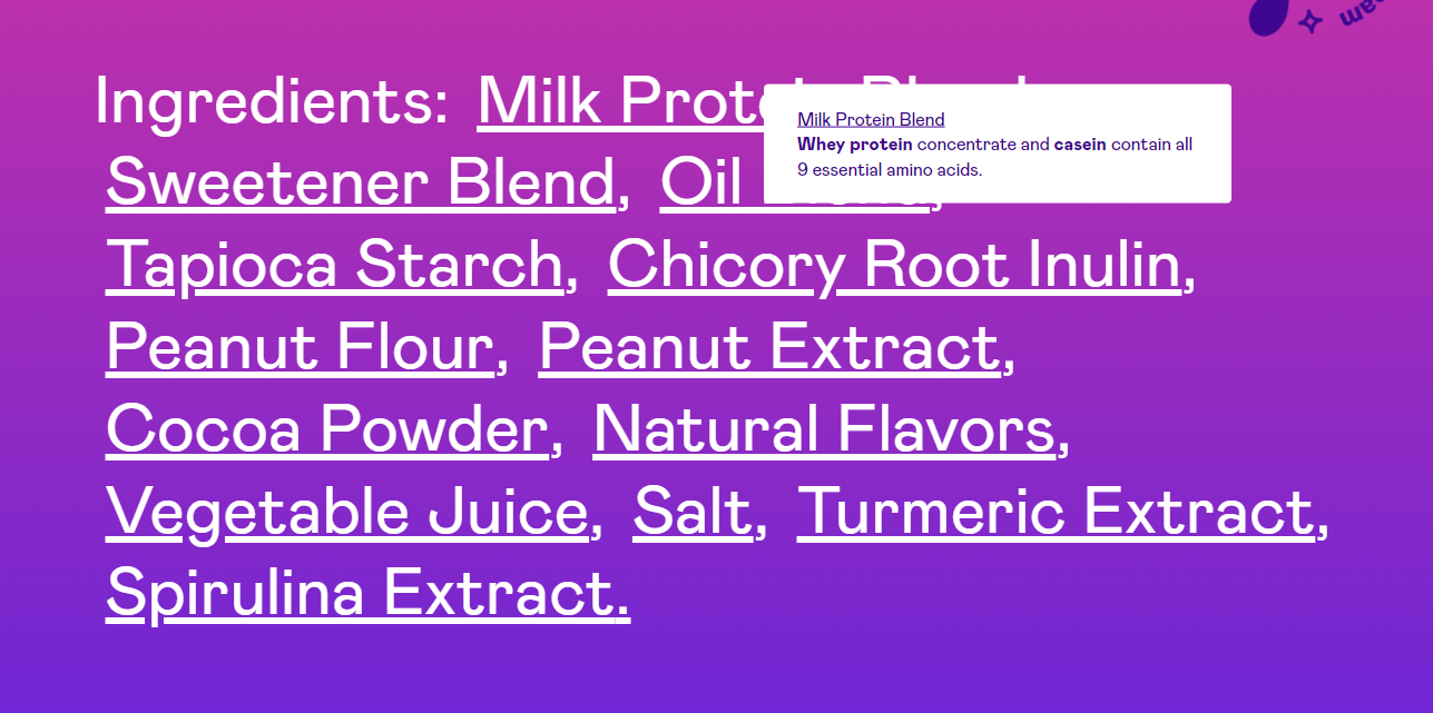
The website's product pages avoid clutter by displaying ingredient details only when you hover over each item.
(image source: magicspoon.com)
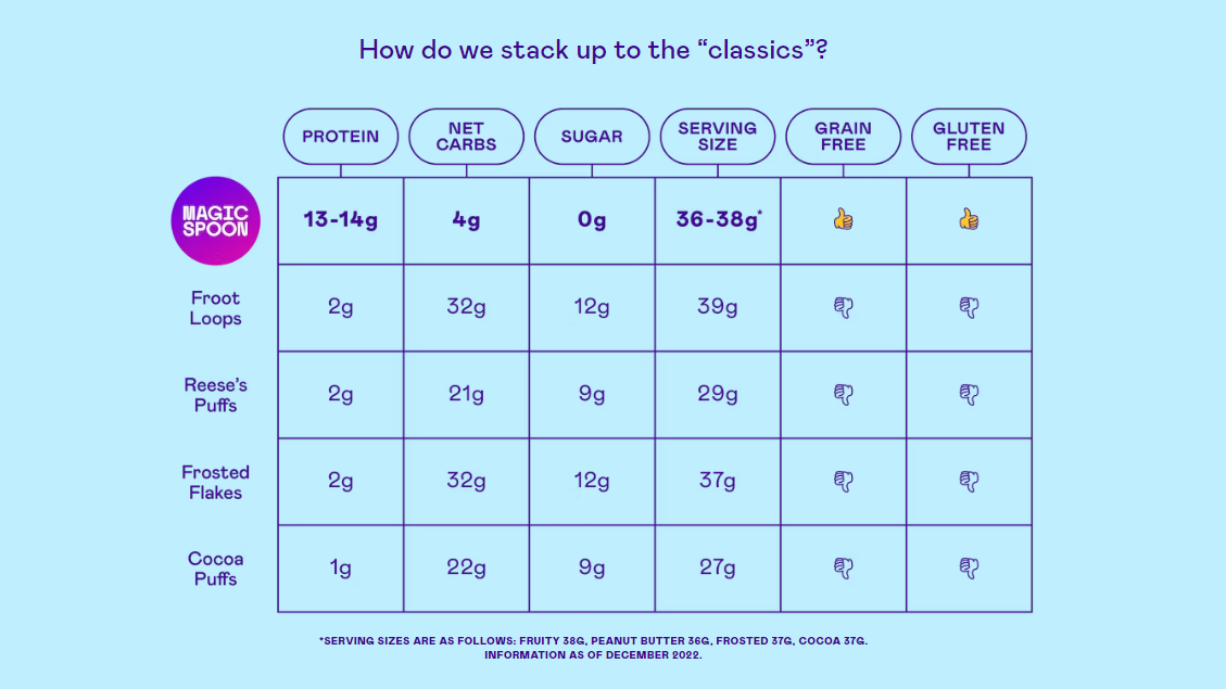
Additionally, the website features a page dedicated to comparing Magic Spoon's product to other similar items on the market, showcasing why their product is superior to competitors. While Magic Spoon can be a viable part of a healthy diet, it is recommended to be consumed occasionally, rather than daily.
Tactics
- The fascinating and appealing design
- well-structured content
- Attractive images
3. Ka’Chava
(image source: kachava.com)
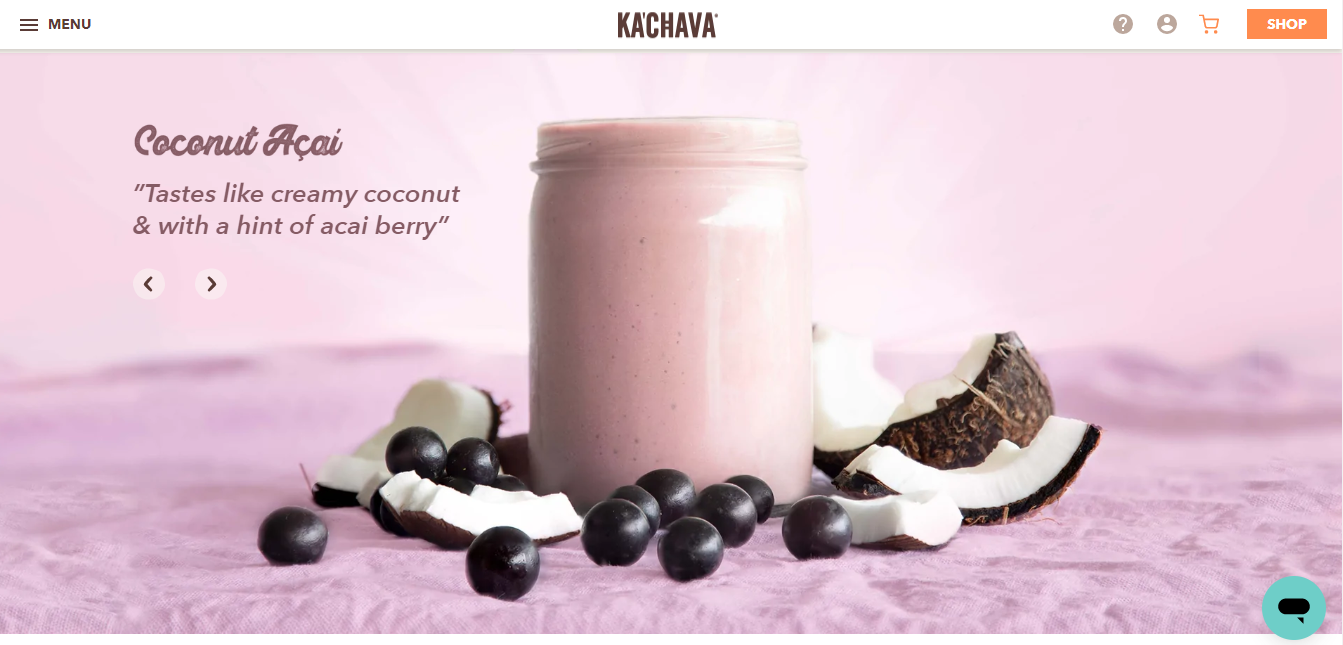
Ka'Chava is a plant-based full meal replacement shake that was first introduced in 2014. The brand emphasizes that this superfood meal contains a complete range of vitamins, minerals, and other essential nutrients.
The Ka'Chava website is equally impressive, showcasing the brand's dedication to promoting a healthy lifestyle. The website features numerous product shots that highlight the ingredients and nutritional value of their shakes.
Tactics
- Simple and user-friendly website
- Showing the key quality of products through all pages
4. I Love Mole

(image source: store.ilovemole.com)
I Love Mole is a Mexican sauce brand that offers a diverse selection of sauces, including the popular guacamole sauce and various spicy condiments that are sure to entice fans of spicy food.
The website features a design and color scheme that effectively highlights the product uniquely and compellingly, setting it apart from other Shopify stores. The quality of the pictures and content on the site is exceptional, further enhancing the overall appeal of the store. It is hard not to appreciate and love the I Love Mole store once you experience it firsthand.
Tactics
- Mix and match color scheme smartly
- Highlight core products to capture customer’s attention
5. Sakara

(image source: sakara.com)
Sakara is a premium meal delivery service that specializes in providing healthy, nutrient-dense meals to its customers. Their meals are prepared by professional chefs and delivered straight to customers’ doors in coolers to keep them fresh. Unlike other food brands, Sakara has a more elegant and refined aesthetic, with a subdued color palette and carefully chosen typefaces.
Upon entering their website, the site automatically detects your location and provides further information about the company. Even if you reside outside of the United States and the service is not available in your location, the welcoming message still encourages you to learn more about the company.
Sakara offers a range of healthy meal delivery programs, including plant-based, organic, and superfood ingredients. The meals are delivered in recyclable and sustainable packaging and come with support materials promoting overall wellness.
Tactics
- Sophisticated and polished appearance, using a gentle color scheme and meticulously selected fonts to create an overall elegant aesthetic.
- Display the differentiation of products: healthy food
Successful Skincare & Beauty Shopify websites
1. NCLA Beauty

(image source: nclabeauty.com)
NCLA Beauty's homepage is a visually appealing and engaging experience that captures the viewer's attention. The use of vibrant colors and imagery makes scrolling through the page an enjoyable experience.
Their product images not only showcase the products themselves but also the natural fruits and flowers used to create them, emphasizing their commitment to all-natural ingredients. Although customers cannot physically smell the products when shopping online, NCLA Beauty cleverly provides a sensory experience through the screen by including images of raw ingredients alongside their corresponding products.
Tactics
- Utilizing bold and vivid colors and imagery
- Highlight their dedication to using only natural ingredients in their products.
2. Credo Beauty

(image source: credobeauty.com)
Credo Beauty is a purveyor of clean beauty products, offering an extensive range of items that can be easily filtered by product types, such as hair care or skincare. Additionally, customers can browse through categories like bestsellers and new products, or utilize the search feature to find specific items.
The website also features additional pages for customers to explore, such as a blog, details about the company, and information on the benefits of clean beauty. With its user-friendly interface and ample resources, Credo Beauty is a go-to destination for those seeking clean and natural beauty products.
Tactics
- Simple navigation
- User-friendly interface
3. Lumin Skin

(image source: luminskin.com)
Lumin is a newcomer to the men's skincare industry, having been established in 2018 with a focus on skincare subscriptions, and has since experienced rapid growth. The company's branding is stunning and sophisticated, incorporating mint green and matte black accents.
For those seeking a visually appealing e-commerce site, Lumin is highly recommended. Their homepage is sleek and refined, while their product pages are easy to navigate and beautifully designed. With a diverse product range and modern branding, Lumin has successfully created an exceptional shopping experience for its customers.
Tactics
- Easy to navigate product page
- Modern branding
- Exceptional shopping experience
Most Successful Sports products Shopify websites
1. Alo Yoga

(image source: aloyoga.com)
Alo Yoga's professional and dynamic appearance immediately captures the attention of yoga enthusiasts. Despite its simple layout, the website is expertly customized and showcases numerous photographs of practitioners executing yoga poses. Navigating the site is effortless, thanks to its well-organized layout.
This store has effectively utilized the platform's capabilities by providing stunning visuals that elicit a sense of amazement among visitors, featuring photos and videos of advanced yoga postures. By employing such an approach, Alo Yoga has successfully established itself as a leading brand in the yoga industry.
Tactics
- Dynamic appearance, simple and well-organized layout
- Beautiful visuals such as images and videos
2. Gymshark

(image source: us.shop.gymshark.com)
Gymshark utilizes numerous clean and detailed photographs that provide customers with a clear understanding of product materials and quality. The website allows customers to view the available sizes for each product without having to navigate to the product page, streamlining the purchasing process.
Additionally, shoppers can quickly add items to their shopping carts. Gymshark's website design effectively enhances the customer's shopping experience by providing ample visual information and simplifying the purchasing process.
Tactics
- Optimize customer experience
- Clean and detailed images
- Simple purchasing process
Successful Household goods Shopify websites
1. Floor Plan
(image source: floorplanrugs.com)
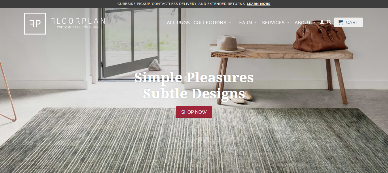
Despite specializing only in rugs, Floorplan's stunning online store design effectively showcases the high quality and value of its products. Their use of a vibrant color scheme, paired with clean and visually appealing product images, enhances the customer's shopping experience.
The user-friendly drop-down menu and meticulously organized product page further contribute to the seamless purchasing process. Floorplan's website is solely dedicated to selling rugs, and it excels in doing so by providing an exceptional shopping experience for customers.
Tactics
- High-quality product showcase
- User-friendly drop-down menu
- Vibrant Color Scheme
2. Poly & Bark
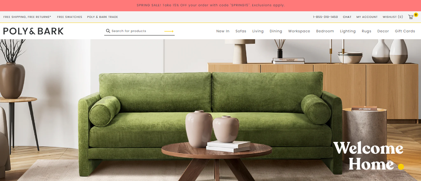
(image source: polyandbark.com)
Poly & Bark's store boasts high-quality product images that beautifully showcase the intricate details and exceptional craftsmanship of each item. The product pages feature large, visually appealing imagery and thorough descriptions of the product.
Overall, this Shopify store stands out as a prime example of exceptional storefront design, with a strong emphasis on visual appeal and comprehensive product information.
Tactics
- Stunning visuals with high-quality product images
- Informative product descriptions
3. Made in Cookware

(image source: madeincookware.com)
With an impressive Alexa ranking and simple navigation on every page, Made in Cookware is a successful Shopify site example in cookware and kitchen essentials. When first open the store, you'll see a striking hero video with consumables and alternative CTAs encouraging you to "shop now”.
High-quality materials and craftsmanship are emphasized in this online store to establish credibility, and expert chefs and periodicals provide social proof.
Tactics
- Use video to impress the visitors at the first glance
- Provide social proof to create credibility for customers
4. La La Land

(image source: lalalandshop.com.au)
La La Land offers a diverse selection of home products, with a design aesthetic that is modern and appealing to a youthful audience. Although the website appears to cater predominantly to female visitors, it does not exclude potential male customers.
The website's fantastic content, vibrant design, and seamless functionality have proven successful for all visitors. La La Land's website design effectively caters to a youthful demographic, without alienating other potential customers, resulting in a positive user experience for all.
Tactics
- A contemporary, youthful audience-pleasing design aesthetic
- Dazzling design, colorful content, and slick functioning
Other Shopify websites Successful Examples
1. Bebemoss

(image source: bebemoss.com)
Bebemoss has established itself as one of the leading Shopify stores thanks to its heartfelt brand message and personal narrative. The website features engaging, SEO-friendly, and genuinely informative content that effectively puts shoppers at ease.
The founder's story is further enhanced by images of the real family behind the company, adding a personal touch. Bebemoss' website design successfully combines compelling storytelling with informative content, resulting in a welcoming and positive user experience.
Tactics
- Strong brand message
- Authentic information that is also SEO-friendly
- Attractive storytelling
2. IDRAW

(image source: idraw.co)
IDRAW's integrated Instagram feed and stunning imagery align seamlessly with the store's central theme, showcasing an ingenious design choice. The website's aesthetic is intentionally crafted to complement the high-end sketchbooks the store offers, providing a cohesive and visually pleasing shopping experience.
IDRAW's website design is thoughtfully curated to support its premium product offerings, with every aspect of the design working in harmony to create a stunning and cohesive user experience.
Tactics
- Clever design decision
- The utilization of harmonious design results in a beautiful and seamless user experience.
Key success components of the best Shopify eCommerce stores
Check out the key success components below to get the Shopify store ideas for your online stores.

Well-designed and user-friendly website
A well-designed and user-friendly website is essential for an eCommerce store to stand out in a competitive online marketplace. The website should have an intuitive navigation system, visually appealing layouts, and effective design elements that can enhance the user experience. This can make it easy for users to find what they are looking for, and create a positive impression of the brand.
Additionally, clear calls to action can improve the user experience and encourage users to take action, such as making a purchase, signing up for a newsletter, or contacting the business.
To make it easier and faster in designing a website with an amazing look. You can install the Shopify landing page builder without much effort. EComposer is one of the best Shopify page builders. This app enables you to customize any type of page such as a homepage, landing page, about page, contact page, policy page, thank you page, etc. Moreover, it does not require any coding knowledge.
With the drag-drop editor, a large library of premade layouts and excellent customer support service, you can build your ideal store easily. Sign up Shopify account then install EComposer today to get the special deals: start using Shopify with only $1/month.
Clear and concise product descriptions
Having clear and concise product descriptions is crucial for eCommerce stores. Customers need to have all the information they need about a product to make an informed purchasing decision. High-quality images and videos can also help customers visualize the product and make a better purchasing decisions.
Exceptional customer support
Offering exceptional customer support is key to building trust and credibility with customers. Customers should have access to various channels such as email, live chat, and phone for quick and efficient customer service.
Efficient marketing strategies
Implementing efficient marketing strategies can drive traffic and increase sales for eCommerce stores. SEO optimization, social media marketing, email marketing, and paid advertising are just a few examples of marketing strategies that can be used to promote the store and reach potential customers.
Eye-catching visuals
Using high-quality images on Shopify websites is crucial as it directly impacts the user's perception of the product and brand. Clear and detailed product images can help customers make informed purchasing decisions, while eye-catching visuals can enhance the overall aesthetic of the site.
Investing in professional photography or utilizing high-quality stock images can significantly improve the website's visual appeal and boost sales.
Similarly, don't overlook the opportunity to customize your business card, which can serve as a tangible reminder of your eCommerce brand and leave a lasting impression on customers.
Mobile compatibility
Having a website that is mobile-friendly is crucial given the rise in popularity of mobile devices. This means that the website should be responsive and able to adapt to different screen sizes, ensuring that users can easily navigate and interact with the website on their mobile devices.
Fast load times
Fast load times can improve the user experience and reduce bounce rates. Users are more likely to stay on a website that loads quickly and is responsive. You can optimize the images, videos and other components of the websites to increase the loading time of the pages.
Browser consistency
Browser consistency means that the website looks and functions the same across different web browsers. This can ensure that users have a consistent experience, regardless of the browser they are using.
By focusing on these key components, Shopify eCommerce stores can achieve success and stand out in the competitive online marketplace.
Final words
In summary, to create a successful Shopify eCommerce store, businesses need to prioritize the user experience. This means having a user-friendly website, clear and informative product descriptions, excellent customer support, etc. By focusing on these key components, your businesses can increase their chances of success and stand out in the crowded online marketplace.
We hope that the successful Shopify eCommerce store examples above can help you with inspiration and Shopify store ideas. Getting started with Shopify today to grow your brand and achieve long-term success.








1 comment