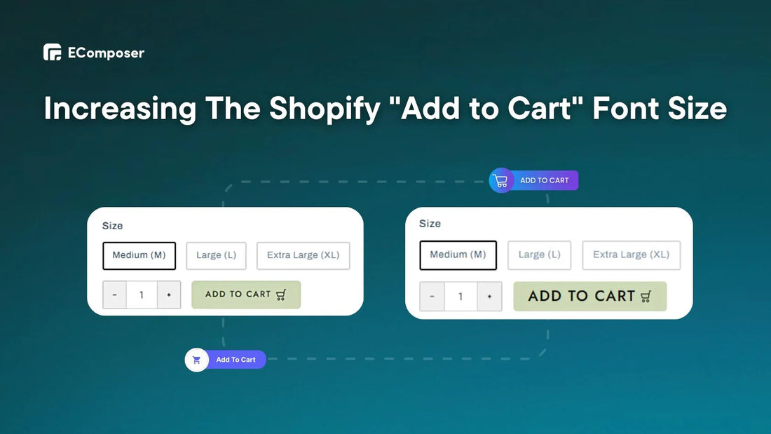
How To Increase The "Add to Cart" Button Font Size In Shopify?

Table Of Contents
Did you know increasing the "Add to Cart" button font size in Shopify can nudge customers toward that final purchase click? Studies show that the average add-to-cart rate hovers around 4%, with roughly half of those shoppers continuing to checkout.
Whether you're a coding master or prefer a no-code approach, this post will show you how to increase the font size of Add-to-Cart buttons. We'll also review recommended practices for creating a balanced and visually attractive design.
Why Do You Need To Change The Font Size Of The Shopify Add To Cart Button?
On your Shopify shop, the "Add to Cart" button takes priority. The digital handshake turns interested visitors into committed customers. No wonder Shopify entrepreneurs worry, "Should I make my 'Add to Cart' button bigger?". Yes, but with a strategic strategy.
Here are two main reasons why adjusting the size of your "Add to Cart" button may drastically increase conversion rates:
Visual Hierarchy:
Nielsen Norman Group research shows that people scan websites in an F-shaped manner, concentrating on the top and left portions.
That means a bigger button with a well-chosen font size naturally attracts more attention, leading visitors to the intended action (adding items to their cart).
Mobile Optimization:
By 2024, there are expected to be over 187 million active mobile users in the United States alone. Larger buttons with suitable text sizes make tapping simpler, decreasing inadvertent misses and irritation, particularly on smaller displays.
Remember that a well-sized button does not have to be overpowering; a little increase may significantly impact directing customers to that critical click.
2 Ways To Increase The Font Size On Add-To-Cart Button
Making the font size bigger is an excellent technique to capture attention, but how do you do it?
The good news is that there are two significant ways to increase the font size of your Shopify "Add to Cart" button, appealing to both code-savvy users and those who want a no-code solution.
Method 1: Larger Shopify Add-To-Cart Button Font (Without Code)
Don't worry if you're uncomfortable editing code. There are tools available that allow you to raise the font size of your "Add to Cart" button without requiring any technical skills.
EComposer Page Builder is an excellent solution. It provides a simple drag-and-drop interface for visually customizing your Shopify store's pages and sections, including the "Add to Cart" button.
Here's how to utilize the EComposer to raise the text size of the add-to-cart button:
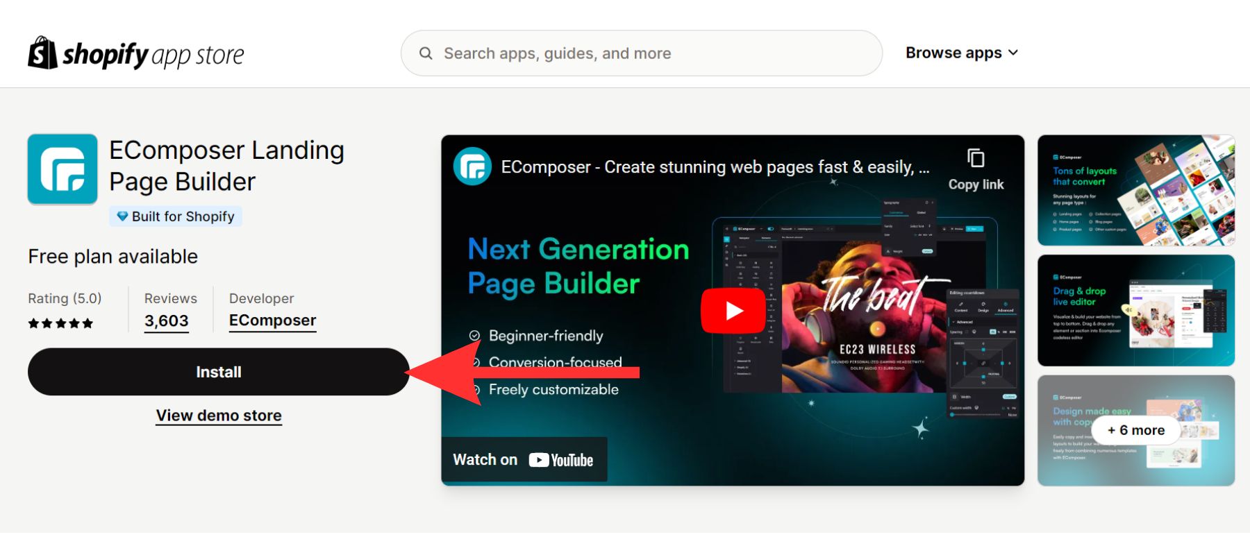
Step 1: The Shopify App Store is where you can find the "EComposer Builder Page." You can install the app from your store by clicking the button.

Step 2: Now that it's installed, launch EComposer. We'll use the "Product" page template here.
Step 3: Within the EComposer editor, locate the "Add to Cart" button. Click on it to start modifying.

Step 4: You may access the menu on the editor's right-hand side. Select "Design" from the menu that extends vertically.

Step 5: Find the "Design" tab and choose "Typography." To change the font of the "Add to Cart" button, go to this page and select the "Customize" tab.
Step 6: To change the button's text size, find the "Size" box and enter the size font add to cart.

Step 7: To preserve your freshly changed font size for the "Add to Cart" button, click the "Publish" button.
For instance, we'll make the text size of the "Add to Cart" button 25 pixels instead of 16 pixels.

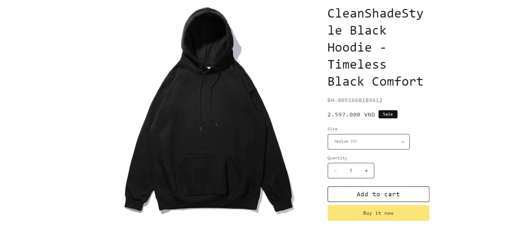
Please refer to the article on how to include a "Add to Cart" button on your product page if you are unable to see one.
Method 2: Editing Code To Change Font Size On Add To Cart
This method involves editing your Shopify theme code. While it works, it might be dangerous if used wrongly. We strongly recommend utilizing EComposer (as previously indicated) to alter your button size more safely and simply.
However, if you are experienced with programming and prefer this technique, here are some step-by-step instructions.
Step 1: Access Your Theme Code
Go to your Shopify control page and log in.
Then, click on "Online Store" on the main page. Select "Themes" from the drop-down box.
Next, click on "Actions" next to the theme you want to change. Pick "Edit code" from the list.

Step 2: Locate The Button CSS
Look in the theme code editor for the "base.css" file (or a comparable file that governs button styles). This file could be in the "Assets" folder.

Now, scroll to the bottom of the "base.css" file. Copy and paste the code snippet below precisely as indicated.
|
product-form .quick-add__submit, .product-form .product-form__buttons .product-form__submit{ font-size: 1.8rem !important; } |
NOTE: You may change "1.8rem" to any desired add-to-cart font size or use the size in pixels.
When copying the code, ensure no extra spaces or errors exist.
Step 3: Save Your Changes
After you've pasted the code snippet, you may either click the top or bottom "Save" button on the code editor window to save your changes.
For example, this code snippet will increase the font size of your "Add to Cart" button to 2rem (approximately 32 pixels).

Remember that editing theme code directly might be dangerous. Before making any changes to your theme code, back it up.
Tips For Customize Font Size Add To Cart Button On Shopify
You have raised the font size of your "Add to Cart" button, which is excellent! Now is the moment to fine-tune your design so that it blends smoothly with the overall style of your Shopify business. A prominent button should not exist in isolation; it should work with the other components to produce a unified user experience.
This section provides helpful advice for customizing your bigger font "Add to Cart" button while maintaining a balanced and visually pleasing storefront.
Recommend Suitable Font Size For Shopify Add To Cart Button
Selecting the best font size for your Shopify "Add to Cart" button necessitates balancing readability and visual impact.
Here are research-based recommendations:
- Starting Point (16px-20px): This range provides a solid foundation for most Shopify companies. It is easy to read while still being prominent on the page.
- Industry Standard (18px): Based on FasterCapital, a user experience research leader, suggests 18px as a standard and effective "Add to Cart" button font size across various industries.
To determine which size generates more clicks and conversions, you may do A/B testing with minor changes between 16px and 20px (or up to 18px as a benchmark).
Once you've determined the best font size via testing or based on the guidelines above, ensure it's used consistently across all your product pages to create a unified user experience.
Brand Consistency Matters
Journal of Business Research articles state that if a product's font fits how people think it will work, they are more likely to buy it.
While selecting the appropriate font size is critical, don't overlook the value of brand consistency. Regardless of its purpose, your "Add to Cart" button should be consistent with your brand identity.
For example, MVMT, a high-end watch retailer with a minimalistic style, uses a slightly smaller, clean font size for the "Add to Cart" button to match the rest of the minimalist design.

MVMT's product page.
Read more:
PRO TIP:
Do you want to make your Shopify store look even better? Look no further than Fontify: Google & Custom Fonts. This simple tool lets you change your store's typefaces without affecting any code.
Also, Fontify lets you use many fonts for each language and device in your shop.

Fontify provides advanced bespoke font.
Try Fontify now!
Combine A Larger Font Size Add To Cart With Other Design Elements
While a static button might work well, some motion can further draw consumers in and enhance the visual appeal. Consider tiny animations, such as a small hover effect that raises the button size or changes color. This offers a sense of energy without overpowering the user.
This button is well-spaced, making a clear call to action without being too much for the user to handle. Combining these design aspects can make the button work much better.
Traditionally, developing an eye-catching animated "Add to Cart" button necessitates delving into the realm of CSS. While this strategy provides complete control, it might be scary to non-coders. Thankfully, the EComposer Builder Page has an easy create animation button.

In addition, EComposer allows you to alter the font color and style of your "Add to Cart" button a few clicks.
Read more: Expert tips for changing text colors on Shopify.
FAQs
1. Can I Use A Different Font For The Shopify "Add to Cart" Button?
Yes, you may change the font on your Shopify store's "Add to Cart" button, but there are a few things to consider to keep it practical.
The fundamental purpose of the "Add to Cart" button is to increase conversions. Ensure your typeface is clear and straightforward on all platforms, particularly mobile. Don't give up readability for a distinctive font choice.
2. Are Any Risks Associated With Increasing The Add-To-Cart Font Size?
Yes, there are a few things to remember when you want to make your Shopify "Add to Cart" button bigger.
- Layout Disruption: A too-big button might push other elements out of the way, making the experience look crowded and bad.
- Mobile Responsiveness: On a mobile device, a button that looks great on a desktop computer might be too big and complex to click.
- Hierarchy Issues: A too-big button may obscure some important parts of your page.
So, ensure your theme is adaptable and that the button sizes change to fit different screen sizes. Many Shopify themes come with flexible design features already built in.
3. How Can I Ensure My "Add To Cart" Button Is Mobile-Friendly?
Test your shop layout, including the "Add to Cart" button, on various mobile devices (phones and tablets) or with mobile emulators on your PC. This lets you discover any sizing or functionality concerns impacting mobile consumers.
Once you've made your changes, try A/B testing alternative button sizes and styles on mobile devices to determine which version performs better in terms of click-through rates.
Key Takeaways
To conclude, a well-designed "Add to Cart" button with a bigger text size may improve Shopify user experience and sales. By following the advice in this blog article, you may raise the size of your buttons while retaining a beautiful and mobile-friendly design.
Using tools like EComposer, you can easily change the font size using the add-to-cart button. Furthermore, tools like Fontify provide many typefaces to include in your "Add to Cart" button without changing the code.
By following these steps, you can transform your "Add to Cart" button from a passive element to a convincing call to action, resulting in more conversions and boosting your Shopify shop's success.


0 comments