Top 20+ Shopify Password Page Templates & Examples to Secure Your Store

Table Of Contents
With a 72% increase in data breaches in 2023 compared to 2021, safeguarding store information has never been more important. A Shopify password page is a simple yet effective way to secure your store and control access to specific pages or collections.
In this guide, we'll show you the best Shopify password page templates and walk you through the steps to activate and customize a password page. We'll also cover key elements and techniques to create a high-quality password page that boosts security while giving customers an exclusive experience.
What is a Shopify Password Page & Why you Need it?

Shopify password page is the first page customers see before entering your store using the password you provide. When this page is active, search engines will only show the password page in search results, keeping all other pages like product listings hidden from view.
Store owners often use this feature to limit access to certain areas of their store. When visitors try to open a password protected page, they'll be asked to enter the correct password. If they get it right, they can see the content, but if not, access is denied.
So why would you need it?
- Access Control: Password-protecting a number of key pages in your store helps you control access to exclusive products, promotions, or sensitive information, keeping them reserved for selected customers.
- Creating a Membership Platform: With Shopify’s password protection, you can create a membership platform where customers sign up to access premium content or services. It will add value and generate a steady revenue stream.
- Building Customer Trust: Using passwords helps keep your store private and secure. It prevents unauthorized access to sensitive pages, protecting your customers' personal information and your store's reputation.
- Boosting Sales: Password-protected pages are perfect for exclusive, time-sensitive promotions. When you limit the access, you create urgency and excitement, driving sales and interest in your store.
Best 20+ Impressive Shopify Password Page Templates & Examples
1. Multi-purpose Password Page

This password page template features a vibrant look to create excitement for a new product announcement that can be designed to suit any niche and products.
- Simple Login Option: It’s a fantastic example of a password page—you can swap out the email sign-up for a password section, allowing customers to log in easily.
- Exciting Countdown Timer: The countdown timer not only creates excitement for a product, service, or website launch but also sparks curiosity about new offerings from your brand.
- Social Media Icons: Social media icons let customers easily find more information about your brand if they want to learn more.
- Colorful Background: Plus, the bright background color adds a sense of excitement, making the announcement of new information even more thrilling for customers.
2. Yoga Password Page

This healthcare password page template shows how using diverse images can really enhance the pre-launch of a business website.
- Countdown Timer: The brand effectively uses a countdown timer at the top, and remember to set it to count down in seconds for a continuous ticking effect.
- Trust-Building Imagery: Featuring a popular yoga coach in the images builds trust for the brand.
- Well-Designed Layout: The layout is well-designed, with a striking image on the left side and important information on the right.
- Essential Elements: It also includes all the essential elements: an eye-catching heading, a brief description, a password bar, and social media links.
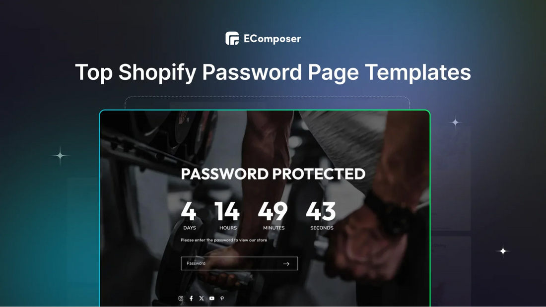
3. Gym Password Page

This password page template features a countdown timer that builds a sense of urgency, encouraging visitors to quickly enter their password and log into the Shopify store.
- Exciting Marketing Message: This workout business nails its marketing message with “We are working hard to bring you a new experience,” which creates excitement about the improvements customers can look forward to whenever they log in.
- User-Friendly Design: The page is user-friendly, using straightforward language to explain why the inconvenience of inserting password is worthwhile.
- Clear and Direct Content: The content is concise and direct, making sure the message is clear.
- Simple Password Bar: Adding a password bar call-to-action is straightforward to simplify the process as easiest as possible.
4. Home Decor Password Page

The furniture password landing page template stands out with a bold, straightforward headline, creating a strong first impression and clearly sharing their message.
- Exciting Sneak Peek: The eye-catching headline builds excitement, giving a sneak peek of what’s behind the password logging.
- Easy Password Entry: A well-crafted lead capture bar invites visitors to fill in the password right away.
- Vibrant Call-to-Action: The call-to-action (CTA) pops with a contrasting color, making it easy to find and encouraging users to take action.
- Clean Design: The clean, minimalistic design of furniture picture keeps the page focused and free from distractions, emphasizing the important elements.
5. Men’s Clothes Password Page

This Shopify password page template showcases a stunning background image of the cloth they specialize in. Right in the center, there’s a password message that informs visitors about the upcoming logging in.
- Strong Marketing Copy: The password message is paired with a strong marketing copy that urges customers logging in to see the new launching.
- Minimalist Design: The website also has a minimalist design with black focus, highlighting the model with the product and keeping the look clean and simple.
- Urgent Countdown Timer: The countdown timer of this page makes a difference that it also provides the information on “Week” left, you can also utilize this if the preparation for launching happens in a few weeks.
6. Shopify Theme Default Password Page

(Image Source: bluepeach-vn.myshopify.com)
If you're using a basic Shopify theme, this is the default password page template.
- Clear Focus on Announcement: The focus is on a "coming soon" announcement placed front and center, while the password submission bar is tucked into the right corner for customers to log in and access the store.
- Customization Options: Shopify themes also offer customization options, so you can make this page your own. You can adjust the background, text, fonts, colors, and more to fit your brand’s style.
- Balanced Design: This page effectively balances an eye-catching announcement with a secure login option, and the customizable features let you create a unique, branded look while keeping things functional.
7. Scent Lounge Password Page Example

(Image Source: scentlounge.com)
This password page for a candle brand is visually striking, using a beautiful brand image as the background.
- Prominent Branding: At the top, the logo is prominently displayed, followed by a welcoming heading that invites visitors in.
- Engaging Sign-Up Bar: Below, a friendly sign-up email bar encourages customers to stay updated on exciting news.
- Hidden Login Option: What sets this brand apart is that the "Enter using password" option is tucked into the upper right corner. While it’s a bit hard to spot, it still gives customers the choice to log in.
Overall, this page combines appealing visuals with essential features, creating a warm and welcoming feeling for potential customers.
8. Everest Password Page Example

(Image Source: wholesale.everestbands.com)
This password page has a unique layout that blends functionality with a great user experience.
- Dual Sections: The password section is on the left, and an information form is on the right, making it easy for users to navigate.
- Login and Sign-Up Options: Customers have the option to log in or sign up for updates from the brand, making it easy to stay connected.
- Easy Login Box Creation: Thanks to a Shopify Registration form helper, creating a login box in Shopify is a breeze if needed.
- Customizable Error Messages: Additionally, this page includes clear error messages for any form-related issues, and you can customize how these messages appear.
Overall, this design effectively balances functionality and user-friendliness, ensuring a smooth experience for visitors while keeping them informed.
9. Wholesale Price Password Page Example

(Image Source: vulpes-yagi.myshopify.com)
This password page is a great example for Shopify stores that want to protect their pricing details.
- User-Friendly Design: It features a simple, easy-to-use password submission bar, allowing customers to enter and view wholesale prices.
- Email Subscription Option: Below the password bar, there’s an option for visitors to subscribe to the brand's emails, making it easy to receive updates and stay in the loop.
- Clean Layout: The layout is clean and functional, focusing on the essentials while providing a smooth user experience.
This page effectively combines security and customer engagement, ensuring only authorized users access the pricing while building an email list for future updates.
10. Keir’s Password Page Example

(Image Source: keir-test-shop.myshopify.com)
This password page for a skincare shop makes a great impression with its clean, simple design.
- Clear Instructions: At the top, a clear message says, "Enter store using password," making it easy for customers to know what to do.
- Friendly Assistance: Below that, there’s a friendly note asking, "Are you the store owner?" with options to "Log in here" or "Change your password settings”. These elements work well together to create a user-friendly experience.
- Easy Access: The straightforward password bar ensures visitors know how to access the store, while the additional options provide helpful guidance for the store owner. Overall, this page is both functional and inviting.
11. Vintage Supply Password Page Example

(Image Source: vintagesupply.com.au)
A Shopify clothing store, Vintage Supply, uses its password page on the right corner of the page to engage customers by promoting its next product drop through a giveaway.
- Focus on Giveaway purpose: The first customer to make a purchase can win a free cap as Giveaway reward. To join, visitors simply enter their email addresses to join the waitlist.
- Early Access Opportunity: Once signed up, they’ll receive an early access password, giving them a better chance of being the first to claim the prize. This is a smart way to build a mailing list before the launch.
- Countdown Timer: Additionally, the brand includes a countdown timer, which adds excitement and urgency. It's a great example of combining engagement with exclusivity on a password page.
12. Birdy + Ember Password Page Example

(Image Source: birdyember.com/password)
By including social sharing buttons on your Shopify password-protected page, visitors can easily spread the word about your brand across various social platforms.
- Engagement Boost: You can boost engagement by offering an incentive for shares, leading to increased traffic and potential conversions—similar to how brands like Birdy + Ember have done.
- Mobile Responsiveness: Additionally, ensuring the page is mobile-responsive is crucial to provide a smooth experience on all devices.
- Integrated Marketing Elements: The brand makes full use of email marketing, social media sharing and password protection up above the right corner, all elements take charge in its place.
13. Hannie Password Page Example

(Image Source: House of Hannie)
This password page is designed to offer $25 gift cards to allow selected customers to log in using a password.
- Organized Layout: The layout is well-organized, starting with the logo at the top, followed by a clear message, and a call-to-action (CTA) inviting users to enter their email and claim the gift card.
- Easy Access: For those who already have the password, they can click "Enter using password" located in the right corner to access the page directly.
- Engaging Structure: The structure keeps things simple and engaging, encouraging users to take action while maintaining a clean and user-friendly design that boosts customer interaction and excitement.
14. Semplice Password Page Example

(Image Source: semplice.com)
This straightforward design of the Semplice password page makes it easy for customers to understand and navigate. The simplicity ensures there are no distractions, letting users focus on accessing the page.
- Clear Focus: The Semplice password page keeps it minimal with just the essentials: a lock icon, a bold headline, a guiding message, and the password entry section.
- High-Contrast Colors: The use of only two colors—black and white—creates a clean, high-contrast look, enhancing readability while maintaining a modern, professional feel.
- User-Friendly Experience: This minimalist approach effectively highlights the important elements and delivers a smooth, user-friendly experience.
15. Jen Maher Password Page Example

(Image Source: jenmaher.com)
Jen Maher's password page keeps things simple while showing off the brand’s unique personality.
- Brand Trust: The page features the brand logo at the top to build trust, followed by a clear "Password Protected" heading.
- Playful Messaging: What makes this page stand out is its fun message. It jokingly lists password rules, then says "Just kidding!"—adding a playful touch. After that, there's a helpful note offering to email her if you forget the password.
- Helpful Reminder: The background color matches the brand, keeping everything consistent. It's a straightforward yet memorable page that connects with visitors in a fun, friendly way.
16. Sesame Password Page Example

(Image Source: webflow.com)
Sesame’s Password Page is really unique with word playing that makes customers feel excited and attracted.
- Playful Prompts: Words like "Psst...what's the password?", “Say the magic word…” are really funny and different, it also instantly tells users what’s needed.
- Visual Security Indicator: The padlock icon gives a strong visual hint that the page is secure and password-protected.
- Unique "Take Me Back Home" Link: The "Take me back home" link is also a different point from others that we can learn from, it provides an easy way for users to leave the page if they change their minds or run into issues.
17. IsItWP Password Page Example

(Image Source: semplice.com)
This page combines a sleek design with features that improve both security and the overall user experience for password entry.
- Simple Prompt: The message "Enter Your Password!" is clear and lets users know exactly what’s required.
- Visual Appeal: A colorful background and eye-catching visuals make the page more engaging and welcoming, easing any sense of intimidation.
- Helpful "Contact Us" Button: Including a "Contact Us" button offers users a quick way to ask for help or report issues related to password recovery or accessing their account.
18. HelpKit Password Page Example

(Image Source: helpkit.so)
Helpkit’s password page has a clean and simple design that makes it easy to use while keeping things secure.
- Clear Message: The heading and the message “To visit, please enter the password” directly tells users exactly what the page is for.
- Security Icon: The padlock icon also shows that the page is safe and requires a password.
- Minimal Design: The simple layout helps users focus on entering their password without any distractions.
19. Nicepage Password Page Example

(Image Source: nicepage.com)
This password page stands out with a unique two-step approach that keeps things interesting for visitors.
- Hero Banner Page: The first page features a striking hero banner that offers extra context about the protected content, making it more engaging for users.
- Product Highlight: It showcases a man in the store outfit, drawing attention to the products and inviting customers to explore.
- Navigation Clarity: The option to click "Password Protected" is clearly marked, guiding users to the password entry section.
- Familiar Design: Once users click through, they see a standard password page with a padlock icon, a clear heading, and a "Submit" button, ensuring a smooth transition.
20. Evening Brewing Password Page Example

(Image Source: safeasmilk.co)
The password page presents a visually appealing interface, some elements can be analyzed in terms of their potential effectiveness for a password page:
- Clear Message: The "OPENING SOON" notice is simple and lets visitors know what’s happening with the page.
- Engaging Visuals: A striking background image and a beer can help establish the brand’s identity and keep users interested.
- Encouraging Action: The "SIGN UP" button invites users to enter their email for updates, which is a smart way to build a mailing list.
- Connect on Social Media: By including links to social media, users can easily follow the brand and stay in the loop about its progress.
That’s all about the best Shopify Password Page Templates and Examples to learn from. Now, let’s figure out how to enable your store password page.
How to Activate & Edit a Shopify Password Page?
1. Edit Password Page through Shopify Dashboard
Step 1: Go to Shopify Preferences
- Open your Shopify admin and click on Online Store, then select Preferences.

Step 2: Enable Password Protection
- Find the Password protection section and check the box that says Restrict access to visitors with the password.
- If your store is still at free plan, then this step can be passed.
Step 3: Create a Password
- Set a unique password for the customers you want to allow in—make sure it’s different from your admin password.
Step 4: Customize Your Message
- Write a message for visitors on the password page, or leave it blank if you don’t want any message.
Step 5: Save Your Changes
- Remember to opt for the Save button to keep your changes.

2. Edit Shopify Password Page using Shopify Theme
The default Shopify password page can be a bit plain. If you want to make it more personalized, you can change its look by following these steps:
- In your Shopify admin, go to the Online Store and then Themes.
- Opt for the theme you want to edit and click on Customize.

- At the top of the page, click on Homepage, then scroll down and select Others > Password. If you don’t see the Password option, you may need to enable password protection for your store.

To modify sections on the password page, do the following:
- Click on the section you want to change. Most themes have sections for the header, content, and footer.
- Make your adjustments to the section settings.
- Click Save.

You can also change theme settings like fonts, colors, social media links, and the favicon to personalize your password page. These settings will also affect the rest of your theme. To change theme settings:
- Click on Theme settings.
- Choose the category you want to edit.
- Make your changes.
- Click Save.
3. Utilize Shopify Page Builder
EComposer - Landing Page Builder is a Shopify app that makes it simple to create a Coming Soon Page, offering many free templates and additional features. Here’s how to get started:
Step 1: Open EComposer - Landing Page Builder
- Go to the Shopify App Store and search for “Page Builder.”
- Download EComposer - Landing Page Builder, which should be at the top of the list.

Step 2: Choose a Page Template
- Click Next, fill in the general page information, and then click Start Building.
- Click Explore Library to pick a template.
- Choose the "Coming Soon/Password" page type and a niche if needed. You’ll see a variety of options.

- Just select a template and click Insert Now to get started!
Step 3: Customize Your Page
- Begin designing your Coming Soon Page by adding elements like headings, countdown timers, text, newsletter sign-ups, and social media links. You can also change the background and colors to match your style.

Step 4: Save your Page
- Click "Publish" in the top right corner and select "Save and Publish."
- To check how your page looks, click "View."
Congratulations! You've just secured your Shopify store with this easy guide—your first step in protecting your business in the exciting world of e-commerce!
To further edit your page, explore advanced features of EComposer to customize your own Shopify Password Page.
It also offers extra features for building home pages, product pages, and more, along with a variety of professional templates and built-in extensions.

If you don’t have a Shopify account yet, take advantage of a special offer: get your first month for just $1 on any plan and explore all the features Shopify provides.
Key Elements of a Shopify Password Page

Creating a solid password page on Shopify is crucial for keeping your customers' information safe and ensuring a smooth experience. Here are the key elements to include:
1. Clear and Concise Instructions
- Make sure to give users direct and clear instructions, like saying, "Enter your password to access your account."
- Use simple, everyday language to avoid confusing anyone. Doing this way, everyone will know exactly what to do!
2. Secure Password Field
- To keep passwords safe, show them as dots or asterisks so that no one can see what they are.
- It’s also important to give users the option to make their password visible, helping them check it without making a mistake. This helps protect your store password from unauthorized access.
3. Forgot Password Link
- Make it easy for users to be re-provided the password by providing a "Forgot Password" button. If they forget your store password, they can click this button to ask for it.
- Ensure the retake process is safe by sending a verification code to their email, so only you can assure that is the right customers to be in your store.
4. Error Handling
- It's important to provide clear messages when users enter the wrong password or run into other issues, so they know what went wrong.
- To keep your store safe, limit the number of login attempts allowed and lock accounts after too many failed tries. It will help prevent unauthorized access and protect your store information.
5. Visually Appealing Design
- The password page should look good and match the overall style of your Shopify store. It would help create a consistent brand image.
- Also, keep the design clean and simple so users can find their way around easily without any confusion.
By including these elements, you’ll create a password page on Shopify that’s both secure and easy to use!
Others also read
How to Password Protect Shopify Store in minutes
Guide To Hide Prices On Shopify With & Without App
A Comprehensive Guide to Hide Products in Shopify
FAQs
- How can I customize a Shopify password page template?
Most Shopify password page templates offer customization options, such as:
- Changing colors and fonts: To suit your store's branding.
- Adding or removing elements: To match your specific needs.
- Integrating with other apps: For added functionality.
Refer to the template's documentation for specific customization instructions.
- Can I use a free Shopify password page template?
Yes, there are many Shopify password page templates available. For example, at EComposer, all password page templates are totally customizable and free to use.
- How can I ensure the security of my Shopify password page?
To enhance the security of your password page:
- Keep up-to-date to benefit from security patches
- Use strong, unique passwords for your store
- Regularly check your store's logs for any signs of unauthorized access or attempts to compromise customer data.
Conclusion
That’s all about the best Shopify Password Page Templates and how to customize the best one for your own store. This upgrade not only boosts security but also lets you create special content for a chosen audience. With the ability to set up and manage password-protected pages, you can launch exclusive products, host members-only events, or share content with specific groups.
Make sure to use this feature wisely, ensuring a smooth and secure experience for your customers or members. As you take advantage of Shopify’s powerful page builder, you’re on your way to creating a unique online shopping experience.


0 comments