Best Landing Pages for Affiliate Marketing: Guide + Examples
Table Of Contents
Welcome to our blog post on the best affiliate marketing landing pages for driving sales. As an online merchant, you know that having a great landing page can make all the difference in your conversion rates. But with so many options out there, it can be overwhelming to determine which landing pages are the most effective.
That's why we've put together this comprehensive guide, where we'll show you the top-performing landing pages and provide you with tips and tricks for optimizing them to attract affiliates and then drive more sales. Whether you're new to affiliate marketing or a seasoned pro, you're sure to find valuable insights here. So, let's get started!
What is an affiliate marketing landing page?

There are various types of Landing Pages such as Event landing pages, Copywriting landing pages, Mobile landing pages, Lead generation Landing Pages, etc. In this blog, we will explore the Affiliate Marketing landing page. Hence, before going deeper into the landing page, we should understand “Affiliate Marketing”. What is it? And how does it work?
What is affiliate marketing?
Affiliate marketing is a type of online marketing in which a business (the merchant) rewards one or more affiliates for each customer or visitor brought about by the affiliate's marketing efforts. In other words, affiliates promote the merchant's products or services using their unique referral links, and they earn a commission every time someone clicks on their link and makes a purchase or takes a desired action, such as filling out a form or signing up for a free trial.
Affiliate marketing is often used as a way for businesses to expand their reach and increase sales without the need for significant upfront investment in marketing and advertising. It also allows affiliates to earn money by promoting products or services that align with their interests or areas of expertise.
What is a landing page for affiliate marketing?
There are two main kinds of affiliate landing pages, one is made by store owners and the other is built by affiliate marketers. In this blog, we will walk through the definition and step-by-step guide to creating the second type of Affiliate Landing Page which is for attracting affiliates.
An affiliate landing page is a web page designed to attract and recruit affiliates to promote a particular product or service. The goal of the landing page is to provide potential affiliates with all the information they need to make an informed decision about whether or not to promote the product.
Typically, an affiliate landing page will include information about the product or service being promoted, such as its features and benefits, as well as details about the commission structure and any other incentives that may be offered to affiliates.
To make the landing page more attractive to potential affiliates, it may also include testimonials from existing affiliates who have had success promoting the product or service, as well as marketing materials like banners and email swipes that affiliates can use to promote the product.
In summary, an effective affiliate landing page should provide clear and compelling information about the product or service being promoted, while also highlighting the benefits of becoming an affiliate.
Looking at the checklist of must-have elements in a landing page for affiliate marketing.
[ecom-global-block]ecom-shopify-trial-block[/ecom-global-block]
Must have components of an affiliate marketing landing page
- Grab-attention Headline: Your headline is often the first thing visitors will see when they land on your page, so it needs to be attention-grabbing and make it clear what your offer is all about. A great headline is usually short, punchy, and creates a sense of urgency or excitement. Ideally, it should also include a clear value proposition differentiating your product from the competition.
- Engaging content: Once you've hooked visitors in with your headline, you need to keep them engaged with quality content. This includes well-written product descriptions, use cases, benefits, and features that resonate with your target audience. Try to highlight the unique selling points of your product and explain how it can solve the pain points of your audience. Use language that speaks to their emotions and makes them feel understood.
- Eye-catching Visuals: Humans are visual creatures, so including high-quality visuals such as images and videos can help convert visitors into your affiliates. These visuals should showcase the product in action and highlight its key features and benefits. Make sure the visual assets you use are professional-looking, high-resolution, and relevant to your product. They should also be optimized for fast loading times and responsive design.
- Convincing Social Proofs: Visitors are more likely to trust and do affiliate marketing for you if they see positive reviews and testimonials from real people who have already joined your Affiliate Marketing program. Include a selection of reviews, ratings, and social media posts from satisfied affiliates. Make sure these social proofs are genuine and not fabricated, and consider using third-party review platforms to increase their credibility. Also, highlight any awards or recognition your product has received from reputable sources.
- Strong call-to-action: Finally, you need to make it clear what you want visitors to do next. A strong call-to-action (CTA) encourages visitors to take action, whether that's leaving an email, signing up for a free trial, or subscribing to the program. Make sure your CTA stands out on the page, and use persuasive language to encourage visitors to act.
Consider A/B testing different CTAs to see which ones resonate best with your audience. It's also a good idea to include multiple CTAs throughout your landing page to capture visitors at various stages of the buying cycle.
Why is a landing page for affiliate marketing important?

Explore the benefits of a landing page for affiliate marketing.
First Impression matter
A landing page is where potential affiliate marketers will land when they want to know more about affiliate programs. This means that it's often the first impression that visitors will have of the product or service you're selling as well as the benefits of affiliate programs, and it's your chance to make a good impression.
Product information display
Besides, It serves as a bridge between your marketing efforts and the product or service you are promoting. Your landing page is designed to reinforce the message of your products and provide affiliates with more information about the product or service you're selling.
Conversion rate boosting
A well-designed landing page can guide visitors towards a desired outcome, such as filling out a form or signing up for affiliate accounts. By providing clear calls to action and making it easy for visitors to take action, you can increase the chances that they'll convert into affiliates.
Hence, landing pages help to increase conversion rates and drive more sales for your affiliate marketing campaigns. By optimizing your landing pages for maximum impact, you can improve your overall return on investment and generate more revenue for yourself and the merchants you're promoting.
Best affiliate marketing landing page examples that converts
Get inspiration from the excellent affiliate marketing landing pages below:
1. Shopify affiliate marketing landing page

(image source: shopify.com/affiliates)
Firstly, the page is well-designed and visually appealing with clear headings that capture the customer’s attention immediately with highlighted benefits. Secondly, the content is informative and persuasive, it provides a clear call to action.
Additionally, the landing page provides a straightforward sign-up process, making it easy for interested audiences to become click through quickly. All of these elements work together to create a compelling landing page that successfully encourages visitors to consider joining in.
2. EComposer affiliate marketing landing page

(image source: ecomposer.io/pages/affiliate-program)
EComposer has been done successfully when using animation and highlighting the attractive benefits at the beginning of the landing page to captivate customers’ interest. Moreover, to further increase conversions, EComposer uses effectively the call-to-action buttons which are appealing and straightforward.
Finally, this landing page features standout functions of the product as well as credible social proofs from merchants to convince affiliates to take action; from that, boosting conversions.
3. Landingi affiliate marketing landing page
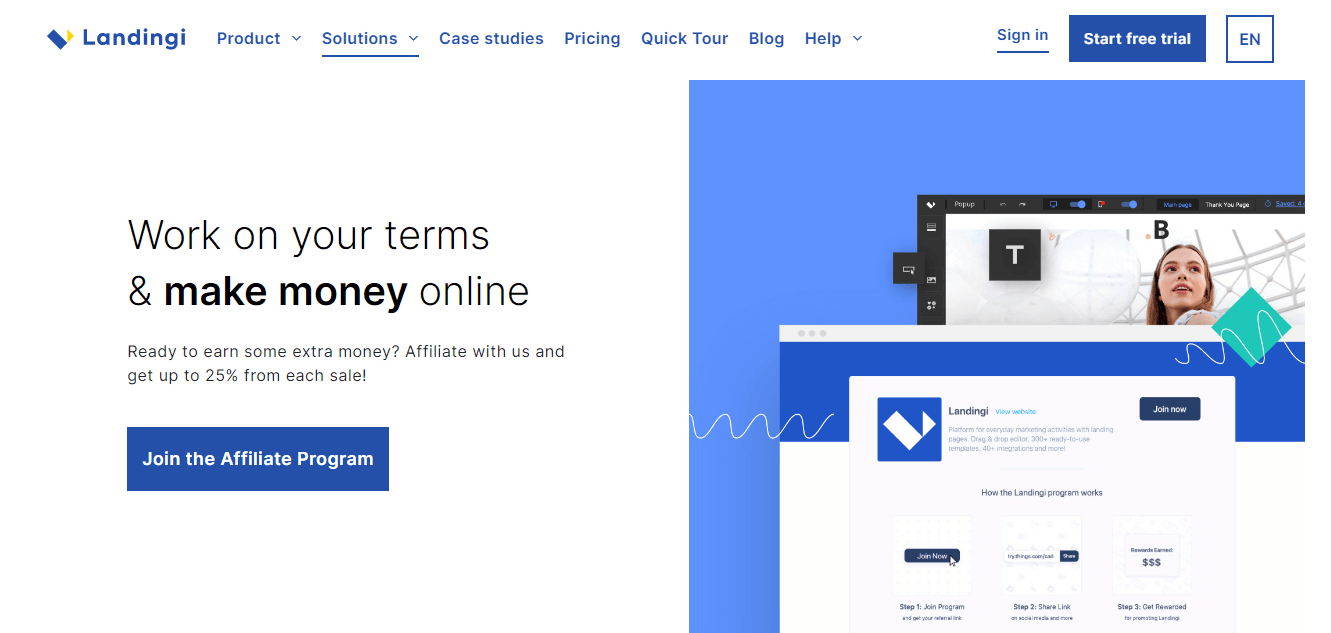
To ensure transparency and clarity for affiliates, Landingi has made sure to prominently display the commission rates they can earn from the affiliate program - up to 25% per sale - at the top of the page. Additionally, it's important for affiliates to understand the cookie window period, which is the time frame between a potential customer clicking on their link and making a purchase, in order for the affiliate to receive their commission. Therefore, the landing page has provided clear information about this as well, so the affiliates are fully aware of the terms of the program before signing up.
4. Canva affiliate marketing landing page

(image source: canva.com/affiliates)
Canva's affiliate landing page effectively communicates important information and selling points for their free and paid plans, highlighting major selling points and outlining the support affiliates receive.
The page provides details on how Canva pays affiliates, tracks their contributions, and offers guides, templates, and tips to help them succeed. Additionally, the page provides potential affiliates with a clear understanding of Canva's products and services and the potential of its affiliate program.
Overall, the landing page provides a well-designed and informative resource for those interested in becoming a Canva affiliate.
5. Claim Compass affiliate marketing landing page

(image source: affiliate.claimcompass.eu)
The Claim Compass affiliate landing page is a well-designed and highly effective marketing tool. Firstly, it has a clear and concise call-to-action that invites visitors to check the information in the affiliate program. Secondly, the page contains persuasive content that highlights the benefits and policies to protect affiliates.
Additionally, the page has a user-friendly layout with clear headings, bullet points, and easy-to-understand language. It also adds step-by-step instructions for better making the decision.
Overall, the Claim Compass affiliate landing page successfully communicates its value proposition and encourages visitors to take action.
How to create an outstanding landing page for affiliate marketing with EComposer
Start creating your one easily & fast with EComposer.
Why EComposer?
Ecomposer is a top-rated Shopify Page Builder app, the most popular platform to build eCommerce stores. This app provides a lot of outstanding features to help online merchants build their own Shopify stores easily even if you are a beginner.
- Easy to use: EComposer provides a user-friendly interface that allows you to create beautiful and professional-looking landing pages without any coding skills. You can simply drag and drop elements to create your desired layout.
- Customizable templates: EComposer offers a wide range of customizable templates that are optimized for conversion and will help you to create a high-converting landing page quickly and easily.
- Mobile responsive: All of EComposer's templates are mobile responsive, meaning that your landing page will look great on all devices, including desktops, laptops, tablets, and smartphones.
- Advanced features: EComposer also offers advanced features such as Ajax cart, All-in-one analytics, and integrations with top Shopify Apps, which can help you to enhance the landing page’s performance and maximize conversions rate.
Ultimate Guide to Creating an affiliate marketing landing page (step-by-step)
Step 1: Install EComposer
- From Shopify app stores, search for “EComposer Landing Page Builder”
- Click “Add app”, and then “Install” to activate the use of EComposer

Step 2: Open EComposer
- In your Shopify store dashboard, go to the “Apps” section. Click on EComposer.

Step 3: Create & Customize the landing page
- From the EComposer dashboard, click the “Start Building” button to start creating the landing page.

- Choose “Landing Pages” by hitting the “plus" button next to it then start building

- Here, you can visit all templates in the library with the “preview” option; after that, you will click “choose” to customize the selected one. Besides, you also can start from scratch with a “Blank Template” to freely build your ideal one.

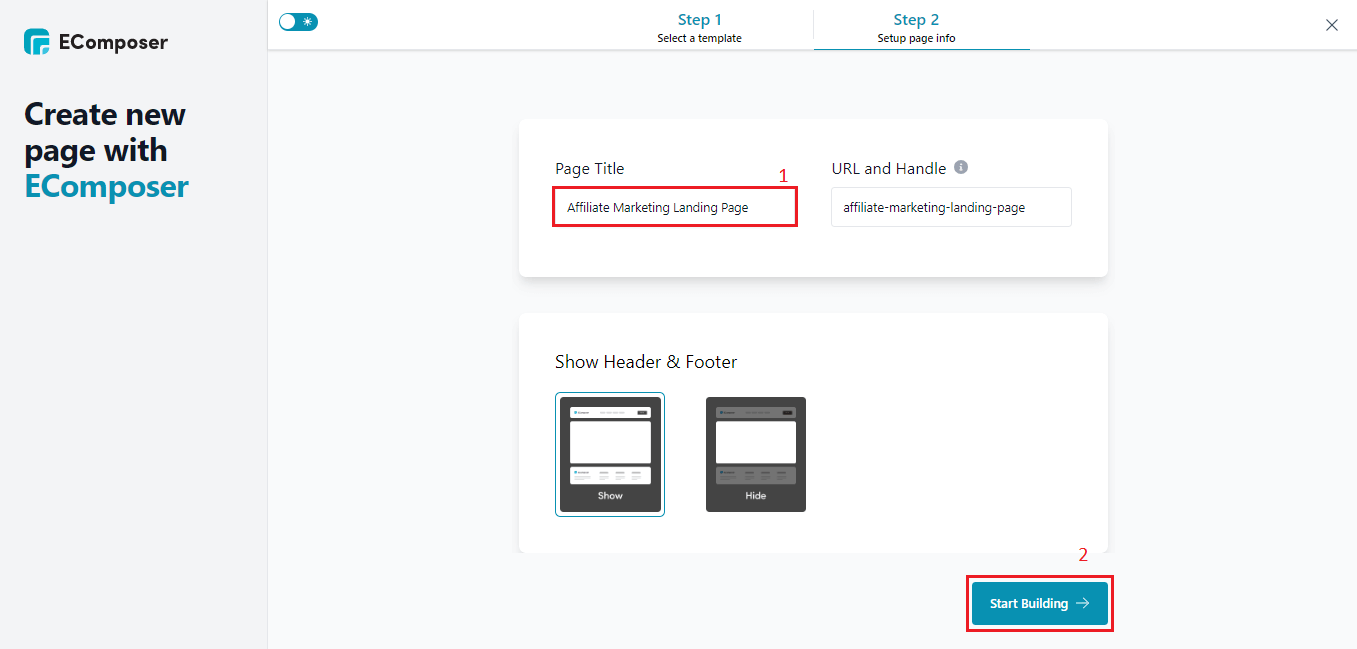
- Fill in the name box then hit “Start Building”
- Drag & Drop the elements such as headlines, banners, testimonials, social share, content, and call-to-action which are must-have components; and more in the desired locations.

- To adjust the design and text, hover over each section and then click on the “edit pen” icon, the editing window will open on the left side. You can change the text in the “Content” part and customize the images/colors in the “Design” part.

Step 4: Save & Publish
Check all of the changes in your template then click “Publish” at the top right corner, and select “Save & Publish”. Now, your affiliate marketing landing page is ready to be displayed.

Watch Full Video Guide To Create A Landing Page with EComposer here:
Key takeaways for optimizing affiliate marketing landing page

Apply the best practices to make your affiliate marketing landing page outstanding.
Know your target audiences
To improve your affiliate landing page's effectiveness, it is important to monitor the search queries that visitors use to reach your page. By analyzing the top queries that resulted in clicks through Google Search Console, you can gain insight into the specific information visitors are searching for and their intent.
Unlike articles that target general queries, landing pages often generate clicks from branded keywords. This means that you can focus on creating conversion-driven content rather than providing a comprehensive overview of the topic.
Design a simple & Sleek Landing Page
When designing your landing page, it's important to keep it visually attractive but also simple. Having a clean layout with plenty of white space can help visitors focus on your call-to-action (CTA) and benefits statement without any distractions.
To ensure that your CTA stands out, you should use color contrast and bright colors. Additionally, it's important to choose images that are both visually appealing and relevant to your offer. With these design elements in mind, you can create an effective landing page encouraging visitors to act.
Litmit Navigation Links
When creating an affiliate landing page, it's important to keep in mind that the ultimate goal is to encourage visitors to take a specific action. Including too many navigation links on the page can distract and potentially discourage visitors from completing this action.
It's best to limit the number of links on your page, focusing primarily on your call-to-action (CTA) button. By doing so, you can increase the likelihood that visitors will stay on your page and ultimately complete the desired action.
Highlight the benefits
Make sure to clearly communicate the benefits of joining your affiliate program. This could include commission rates, promotional materials, marketing support, or any other perks you offer to your affiliates. Be specific about the value proposition your program provides and why people should choose your program over others.
Provide clear instructions
It's important to make it easy for potential affiliates to sign up for your program. Provide clear, easy-to-follow instructions on how to join your program. Include a call-to-action button on your landing page that takes visitors directly to the sign-up form.
Use social proof
Incorporating testimonials from existing affiliates on your landing page can help build trust with potential affiliates and demonstrate the success of your program. Consider including quotes from satisfied affiliates, case studies, or even data highlighting how much your top-performing affiliates have earned.
Increase page loading time
Fast page load time is crucial for website success. It enhances user experience by reducing frustration and improving engagement, leading to higher conversion rates. Additionally, faster loading times positively impact search engine ranking, making it easier for customers to find your site.
To improve your page load time, optimize image sizes, and minimize code and script files. Using caching techniques can also help speed up your site. By prioritizing fast loading times, you'll see a boost in user engagement, conversions, and search engine rankings.
Optimize for Mobile Devices
Mobile optimization refers to the process of designing a website or landing page that is compatible with mobile devices. This includes ensuring that the page is easily accessible and readable on smaller screens and that all buttons and links are large enough to be clicked on using fingers.
Mobile optimization is crucial for affiliate marketing because many users use their mobile devices to browse the internet. Hence, optimizing landing pages for mobile devices to improve user experience, increase conversion rates, and ultimately drive more sales.
[ecom-global-block]ecom-shopify-commerce-coach-block[/ecom-global-block]
Wrapping up
In conclusion, landing pages play a crucial role in the success of affiliate marketing campaigns. They are the first point of contact between potential affiliates and Shopify stores, and they can significantly impact conversion rates.
Through this guide, we hope that you can learn about the importance of landing pages and how they can be used effectively in affiliate marketing. You also can get inspiration from some great examples of landing pages that have successfully converted visitors into customers.
Especially, using the EComposer Landing Page builder in Shopify, creating an outstanding landing page has become easier than ever before. Let’s try now!








0 comments