How to build a Lead Generation Landing Page? Templates & Examples
Table Of Contents
If you're looking to grow your business, then you must have heard the phrase "lead generation". But what exactly is a lead generation landing page, and how can you create an effective one that converts visitors into leads?
In this blog, we'll explore how to create an outstanding landing page for lead generation with best practices; we also provide you with some killer examples to get you inspired. Let’s dive in!
What is Lead Generation Landing Page?

(image source: wordstream.com/facebook-advertising)
A lead generation landing page or email capture landing page is one type of Landing Page. It is a dedicated web page designed to capture the information of potential customers by offering them something of value in exchange for their contact details. The purpose of a lead generation landing page is to increase quality lead generation and improve the conversion rate by converting website visitors into leads and ultimately paying customers.
By focusing on a specific product or service and providing a clear call-to-action, lead generation landing pages can encourage visitors to take action. In addition, lead generation landing pages allow for better targeting of specific audiences based on their interests and demographics, which can help improve the relevance and effectiveness of your marketing campaigns.
A successful lead generation landing page should have a clear and compelling value proposition, attention-grabbing headline, visually appealing design, short form, social proof, urgency, and call-to-action.
Best Practices for Effective Lead generation landing page

To build an effective lead generation landing page, here are some best practices to follow:
Clear and Compelling Value Proposition
Communicate the value of your offer and how it solves the problem or fulfills the need of your target audience. Make sure to use specific and relevant language that resonates with them. Emphasize what makes your offer unique and why they should choose you over your competitors.
Attention-Grabbing Headline
Your headline should be concise, clear, and creative enough to grab visitors' attention. The headline should highlight the main benefit of your offer and make them want to learn more. Use persuasive and active language that encourages them to take action.
Visually Appealing Design
Use high-quality images, videos, and graphics that are relevant to the offer and visually attractive. Ensure that your design elements are aligned with your brand personality and style. The design should be consistent and easy to navigate.
Short Form
Keep your form short and ask only for essential information necessary to qualify the lead. A form that asks for too much information is likely to turn off visitors and reduce conversion rates. Only ask for information that will help you tailor your follow-up communications to their needs and interests.
Reliable Social Proof
Use customer testimonials, case studies, certifications, or trust badges to establish credibility and gain visitors' trust. Highlight how your offer has benefited others and provide proof of its effectiveness. This can help build confidence among visitors and increase the likelihood of them providing their contact information.
Urgency Appealing
Create a sense of urgency by using time-limited offers or limited availability to encourage visitors to take action. Highlight the scarcity of your offer and use persuasive language to encourage visitors to act now rather than later.
Effective Call-to-Action
Use a clear and prominent call-to-action that guides the visitor towards taking the desired action. Your CTA should be easy to find and use active language that encourages visitors to take action. Ensure that the CTA button stands out and is consistent with your brand style.
By following these best practices, you can create a highly effective lead generation landing page that converts visitors into leads and ultimately paying customers. Remember to keep your value proposition clear and compelling, use an attention-grabbing headline, visually appealing design, short form, social proof, urgency, and a prominent call-to-action to increase your chances of success.
[ecom-global-block]ecom-shopify-trial-block[/ecom-global-block]
Create a High Converting Lead Generation landing page with EComposer
Shopify has not supported you in creating a default landing page for lead generation; hence, it is difficult for you to build one with a lot of effort. You can use EComposer - a top-rated Shopify page builder to help you create one professional email capture landing page in minutes.
EComposer is the next-generation page builder on Shopify. This app offers a wide range of customizable templates and features to meet your needs. With Composer, you can choose from a variety of professionally designed templates or build your own from scratch using drag-and-drop customization tools.
It also integrates with other Shopify apps to diversify features for users. Especially, you can get support whenever you need it with 24/7 live chat. If you're looking for an all-in-one Shopify app, an easy-to-use, effective, and affordable way to create landing pages for your Shopify store, EComposer is worth checking out.
Now, let’s follow our ultimate guide to building a landing page for lead generation with EComposer:
Step 1: Install EComposer
- In Shopify App stores, click Add app EComposer Landing Page Builder
- To activate the use of the app, choose ”install”, and you have already added EComposer to your Shopify store

Step 2: Start to create the Email capture landing page
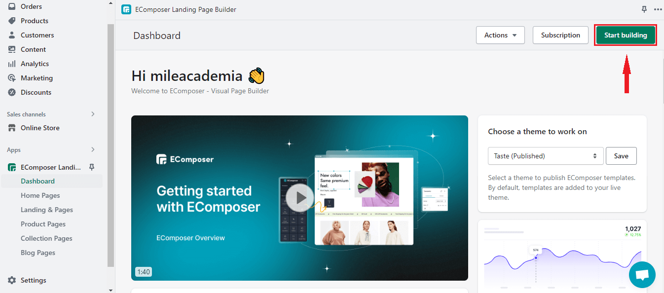
- In your store dashboard, go to “Apps”, and click EComposer Landing Page Builder to open it.

- Click “Start Building”
- From the types of page popup, you will hit the “plus button” next to the “Landing pages” option to go to the templates library.

- Click on “Landing Pages” on the left sidebar, and you can see all premade landing pages, you can sort them according to the newest, trending, popular, Free or VIP and your favorite.
Besides, you also can select “Blank Page” to create your landing page from scratch using amazing elements & extensions from EComposer effectively without effort.

- There are several premade layouts for lead generation pages (Lead Generation 1, Lead Generation 2, Lead Generation 3, Lead Generation 4), you can watch through with the “Preview” option and choose one which is suitable to your Shopify store by hitting “Choose”.

- Name the page and choose “Start Building”.

Step 3: Customize the chosen Landing Page template
You can freely customize the template to make it fit with your brand.
- Use elements and extensions from the left sidebar by drag-drop them into desired locations.

- For example, I want to add a “Timeline” element to the page.

- To adjust content or design for each section/ element in the template, hover through the part and click to choose the editing pen. An editing section on the left will appear. You can change the content or edit the design for the selected section.

Step 4: Save and Publish
After finishing the customization, click “Publish” at the top right corner and hit “Save and Publish” to save all the changes.

- Choose “View” to see how the page is on the live site.

- See the result here.

How to delete the created Lead Generation Landing Page
To remove the email capture landing page that you created before, you go to the EComposer app, Landing & Pages section. In the “Published” category, you can see all the pages that you published.
From the “More” dropdown menu, select “Remove” to delete the page.

5 Killer Lead Generation landing page examples
Explore the 5 high converting Lead Generation landing pages below:
1. Lead Generation Landing Page 1

(image source: EComposer’s template)
Let's take a look at an example of a lead generation landing page that incorporates the three key elements we've identified: a killing headline, a simple form to get contact information, and a clear call to action.
The headline reads "Conversion Rate Optimization Book" and immediately captures the reader's attention by highlighting the benefits of the product being offered. This headline effectively communicates the value proposition of the business and encourages visitors to learn more.
Next, the landing page features a simple form that asks for minimal information from the user, including an email address. By reducing the number of fields required to complete the form, this landing page reduces friction and increases the likelihood of visitors completing the form and becoming leads.
Finally, the landing page includes a prominent call-to-action button that urges visitors to "Download Now". This CTA is visible and compelling, making it easy for visitors to take the desired action and move forward in the funnel.
2. Jack’s Flight Club

(image source: jacksflightclub.com/us)
Let's take a look at another example of a lead generation landing page. The page begins with a clear headline that communicates the insights of the audience and gives the solution. Besides, it provides necessary information for customers to make decisions. To generate leads, the landing form is located prominently above the fold, with only the email required field to minimize friction and make it easy to sign up.
Social proof is also clearly displayed on the landing page, with a section dedicated to customer testimonials and reviews. These testimonials help to build trust with potential customers by showcasing the positive experiences of current subscribers. Finally, the landing page duplicates a compelling call-to-action button at the bottom of the page to remind visitors about getting cheap flight information.
3. Lead Generation Lading Page 3

(image source: EComposer’s template)
Simplicity is a major strength of Lead Generation 3 example. The page is designed to focus on one primary purpose: generating leads. Besides, it also provides detailed information for visitors easy to follow.
Another feature of this example is the timeline element. By providing a clear indication of what prospects can expect at various stages of the webinar, the page helps establish trust and credibility. Similarly, the social proof provided on the page (in the form of attendees’ reviews) further strengthens that sense of trustworthiness.
4. Lead generation Landing Page 4

(image source: EComposer’s template)
Lead Generation 4 focuses on the benefits of the E-book to attract the audience to leave their contact information and get the Book. The Killing Headline is the first thing that can draw customers’ attention.
Additionally, each section is separated with full of necessary data. The information about the author and positive reviews from users are effective ways to increase trust and boost visitors to take action. There are several calls to action put on different desired locations to ensure the audiences do not miss the form.
5. Freelancing Females

(image source: freelancingfemales.com)
Upon analyzing this landing page, it's evident that the creators have implemented a clever strategy of enticing visitors to subscribe to their mailing list by offering a distinctive benefit (Access to the rate transparency database). The use of language piques audiences’ curiosity and creates a sense of urgency to sign up before potentially missing out on something valuable.
By employing this approach, the website is effectively capturing the attention and contact information of potential customers. It's an intriguing example of how creative wording can be leveraged to drive email list growth and ultimately increase business success. Moreover, the eye-catching design is also an interesting point of this example.
Hope that the examples of Lead generation landing pages can inspire you in creating an outstanding one.
[ecom-global-block]ecom-shopify-commerce-coach-block[/ecom-global-block]
Final words
In conclusion, creating an outstanding email capture landing page is crucial for generating leads and ultimately driving conversions. By following the best practices outlined in this blog, such as keeping the design simple and visually appealing, highlighting the benefits of your product or service, and including a clear call to action, you can create a landing page that effectively captures leads.
So, start implementing these tips today and watch as your lead generation efforts soar! Don't forget to include a strong call to action, such as "Register now" or "Get Now" to encourage visitors to take the next step towards becoming a customer.
Others also read:
Ultimate guide to Event Landing Page: Steps to build + Examples
Shopify full width page template: Benefits & How to Make it
Most Successful Shopify eCommerce stores examples + Tactics
Shopify Website Builder Tutorial: Step-by-Step guide for beginners
How to set up Shopify store Under Construction








0 comments