


Shopify Store Design 2026: 15 Tips to Look Professional & Boost Sales

Table Of Contents
According to research, 2026, half of the shoppers think that a company's overall brand is impacted by the design of its website. That is the reason why Shopify store design is one of the most essential components to make your company successful. This blog will tell you the importance of it and then provide useful tips for improving and enhancing your website design.
- Why Shopify Store Design Impacts Sales? Shopify store design directly impacts sales by influencing user experience, trust, and conversion rates.
- What makes a good Shopify store design & look professional? A professional Shopify store design has a layout that is clean, fast-loading, and works well on mobile devices. The images are also high-quality and consistent.
- 15 Design tips & strategies to create a perfect Shopify store: A great Shopify store needs to look good, be easy to use, and be optimized for search engines if it wants to turn visitors into customers. Some important strategies are using high-quality images, making sure the site works well on mobile devices, making navigation easier, building trust through clear policies and social proof, and speeding up page loading times for a smooth experience.
- Professional shopify store design examples:: Industry leaders like Allbirds, Gymshark, and Kylie Cosmetics show that professional Shopify store designs focus on clean layouts, high-quality images, and user experiences.
- How to Implement and Maintain your store design: To set up and keep up a retail store design, you need to take a strategic, customer-focused approach that includes a functional layout, consistent branding, and regular updates
- How to use AI in Shopify Store Design in 2026: Using AI in Shopify store design centers on leveraging automated, generative tools like Shopify Magic and third-party AI layout builders to create, customize, and optimize stores instantly.
Why Shopify Store Design Impacts Sales? (2025 Data)

The design of your Shopify store has a direct effect on sales because it affects first impressions, builds trust with users, and speeds up the buying process by milliseconds.
Over the years that I've been auditing e-commerce sites, I've learned one thing that never changes: the design of your store is your silent salesperson. Based on my most recent study of how people act in 2025 and 2026, a professional appearance is what makes them click and buy.
Here's why your design will bring in the most money for your Shopify store this year:
- Design is the first filter for trust: ODI Consulting’s 2025 research confirms that nearly 94% of a customer's first impression of your brand is purely design-related. If your layout is cluttered or the images are low quality, you lose trust in under 50 milliseconds.
- Mobile first is now mobile only: Heading into 2026, mobile devices are projected to drive over 60% of all web traffic (Flowlu, 2025). I've seen that stores that have easy-to-use navigation and one-click checkouts have a lot fewer people who leave their carts than stores that use generic, unoptimized themes.
- The elite conversion gap: As of 2025, the average Shopify store only converts 1.4% of the time. The top 10% of stores that put professional UX first, on the other hand, have conversion rates of 4.7% or higher (Enrichlabs.ai, 2025). That is a huge difference in income that was mostly caused by better design choices.
I always tell my clients that every dollar you invest in professional design is a direct investment in your conversion rate. If you want to join that top 10% elite bracket, your store needs to look the part.
What makes a good Shopify store design look professional?
A professional Shopify store design features a clean, mobile-first layout, high-quality, consistent imagery, and fast loading speeds.
The best-looking stores don't get in the way of customers. They make it easy and safe to go from the homepage to the checkout button. To get that high-end brand look in 2026, I suggest focusing on these main design elements:
- Intentional use of white space: Professional stores don't clutter the screen. I always advise using plenty of breathing room around your text and images to help the customer’s eye focus on what matters: your products.
- High resolution, consistent imagery: Blurry or mismatched photos are a total trust killer. Use crisp, high-quality lifestyle shots with consistent background colors and aspect ratios to give your shop a unified, high-end feel.
- A limited, cohesive color palette: Choose two or three main colors that stand for your brand. My research shows that stores that use too many bright colors often look unprofessional or spammy to today's shoppers.
- Intuitive navigation: Customers should be able to find what they need on your menu in two clicks or less. I have seen conversion rates go up just by making a messy header menu into clear, logical groups.
- Micro-interactions and polished details: Little things, like a subtle hover effect on a button or a smooth fade-in animation, show the customer that you've put money into quality.
- Seamless mobile optimization: Since most of your sales will come from phones, a professional store must look as good on a small screen as it does on a desktop, with thumb-friendly buttons and easy-to-read fonts.
When you nail these design fundamentals, your store stops looking like a hobby project and starts looking like a global brand. When a customer feels comfortable and at home in your digital space, they are much more likely to complete their purchase.
15 Design tips & strategies to create a perfect Shopify store
A perfect Shopify store needs a design that works well on mobile devices, high-quality images, and a smooth, fast experience for users. Some important strategies are to use a simple, clean theme, show off products with multiple clear images, and build trust through social proof.
1. Plan your ideal website

Before starting to build up your website, you have to plan the thing you want to put on your website based on your users, the core products, and the industry development.
Who are your target customers?
Your online stores are made to attract your customers and provide useful product information for them to get to know more about the business. From that, it boosts customers’ purchasing decisions and leads to sales. Therefore, this is the first step and also the most important one which decides whether your website is successful or not.
What is your core product?
Your core product is the most crucial thing for your business; it solves your customer’s pain points. Hence, the target audience will look for your product’s benefits and engage with your business if the goods give them the right value.
How is industry development?
Industry development shows you about your competitors and development trends. This matter indicates that you have to consider competitors’ strengths and weaknesses to improve and enhance your company’s strategy; make your website distinctive and outstanding.
Besides, you also should appraise the development trend of the industry to keep up with the new things and change your web design to suit the user’s tendency.
Tips:
- Understand your target audience
Drawing customer persona and understanding consumer expectations, behaviours, requirements, and motives is the main goal of customer research. Then, insights are applied to make sure that every product design choice benefits the consumer.
To find out what users think and feel about a product or service, do interviews with them. Consider testing next, customers' statements and actions are frequently at odds with one another. Ask users to describe their behaviours, thoughts, and feelings as they go about using the site by watching them as they carry out specific tasks. You might want to record them on camera for further study.
Limited budget for extensive user testing? Sending out emails with surveys and questionnaires, conducting guerrilla product testing, and listening to incoming calls are all still effective ways to swiftly and cost-freely get data.
Last but not least, take advantage of qualified research about groups of people who are the same as your target customers to understand more about them.
- Showcase your product’s value
In the planning step, you need to sketch the product’s functions and its competitive advantages. Furthermore, prepare the product’s media to visualize them to your users when they land in your online stores.
- Access industry development
In this task, you ought to update new trends regularly via social media and industry magazines. Especially, looking for eCommerce design tendencies and general design trends through the internet and market research.
Another essential point is competitors’ analysis, finding out the merits and demerits of their web design to learn good parts and avoid negative sections. From that, apply the best for your website.
Overall, your website plan will cover customer insight, product value, industry research and the key things you want to display in your Shopify store. Feeling your customer’s pain points, knowing the things which your target consumers are looking for from your business to give them the right product’s value. Also, combining industry trends helps you design an attractive website that can stimulate users effectively.
2. Choose the suitable theme

A Shopify theme is a design template that dictates how shoppers will see your online business. Shopify has a large selection of themes available. To design and organize your web pages and product categories, themes offer a variety of styles and layout options.
Some themes are free to use, however the majority range in price from $140 to $180. One of the most challenging things is choosing the appropriate theme, which serves as the fundamental building block of the design.
Especially if it's your first time using Shopify or theme stores in general, this crucial choice can also be one of the most difficult. You should focus on the specific goals you have for your theme to help you limit your selections.
You can use some free themes or default themes of Shopify to start. However, the customization ability is restricted. Hence, The4 themes are the best solution for your Shopify store because of their flexible customization and professional interface. The4 publishes a range of stunning themes in various fields, some of the most popular Shopify themes are Kalles, Unsen, Gecko, etc.
Tips:
Based on your website plan at the beginning, select the themes which meet the website’s criteria, such as target audience, products’ functions and your budget.
- Customer experience
What type of experience are you attempting to give your clients? – The mood, which ultimately forms the user experience will be influenced by the layout, image sizes, text positioning, etc.
- Product features
What features would you like to see in your store? – Do you like regular or big image displays? Endless scrolling? Make sure you are aware of the characteristics you desire before choosing a theme.
- Rivals' actions
What actions are your rivals taking? Keep an eye on what your rivals are doing to learn what works and what you might do differently and better.
- Product displaying
How do you want your products to be shown? This is a crucial question for e-commerce because the user experience is greatly influenced by how your products are presented. Think about the products you have. For instance, large photos aren't necessary for tech products because they mostly rely on specs, but they are for fashion items.
- Company's budget
What is the price range for the website design? Before deciding on an expensive theme, you should figure out your whole budget because additional plugins and apps might also raise your expenses. Utilizing a free theme first and then enhancing it with a commercial app may prove more cost-effective.
3. Optimize website loading speed

What will you do if you come to a page that takes lots of time to load the page? You will leave the site immediately. It affects customer experience, the customers will feel dissatisfied with your stores.
Google considers a variety of elements when determining how to rank pages on search results. Both your ranking and the user experience may suffer as a consequence of this. Website speed is one of the most crucial aspects of web design. Follow the this post to speed up your website.
Tips:
- Reduce file size and optimize it
If your page contains an excessive number of high-quality photographs, it will take a long time to load. TinyPNG is a great tool to help you compress the media’s size without affecting its quality. You just need to upload the file and then wait for compressing process fast and easy.
- Remove unnecessary Shopify apps
Shopify apps support you in building a complete online store from page builder to tracking orders, etc. However, a lot of apps cause your website's loading speed to slow down. Hence, you have to review all of the apps and remove the unnecessary ones.
You also can use apps which can serve multiple purposes to optimize your website design. EComposer provides a mass of stunning Shopify pages with great solutions for converting with great extensions.
4. Display Value proposition
When designing your website, keep in mind that you must demonstrate your company's value proposition if you want to draw in more clients.
The phrase or image at the top of your website that customers first view is your company's value proposition. This means that it will have the biggest impact on whether or not your clients become interested and scroll down.
Tips:
Make sure to incorporate all pertinent facts in the value proposition's content in the clearest, most concise manner you can. To highlight the brand of your Shopify business, you can include a short but compelling title. Then you can briefly discuss the benefits and standout qualities of your items, such as their safety, dependability, expert endorsement, etc.
The layout of your company's value proposition is closely related to its content. The tone and attitude of your website can reveal a lot about your company.
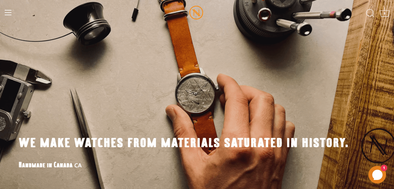
(image source: novowatch.com)
"We make watches from materials saturated in history", claims Novo Watch.
You can tell the difference between a Novo Watch watch and one made by one of its rivals right away. The most compelling value propositions are distinctive and different.
The value proposition dominates the first page of the website when you enter, but it is also repeated on the product pages.
5. Add Conversion elements

One of the most important goals of building a professional online store is to increase the conversion rate and boost customers’ buying decisions. It is necessary to add this factor to the website design.
Tips:
You can adjust every little detail on your website, including:
- Placement of widgets, advertisements, CTAs, etc.
- Specific button colours
- Choices for navigation
- The social media button layout
- Photos that are most effective at converting
6. Use the Page builder app

The default Shopify theme editor is good for basic things, but it often stops working when you want something really unique. I always recommend using a professional page builder app to get full creative control and get away from those cookie-cutter layouts without hiring an expensive developer.
What it is: A page builder is a powerful tool that works with Shopify to help you make custom homepages, product pages, and landing pages using a visual interface. It fills the space between a standard template and a website that has been fully coded from scratch. You can use it to design websites without knowing HTML or CSS.
How to use it:
- Drag-and-Drop Layouts: I use these apps to move buttons, images, and text boxes exactly where they need to be to guide the customer’s eye toward the Buy button.
- Mobile-Specific Customization: One of my favorite strategies is using a builder to hide heavy sections on mobile while keeping them on desktop, ensuring the mobile experience is lightning-fast.
- Built-in Sales Boosters: Most builders include professional elements like countdown timers, progress bars, and frequently bought together sections that look much more polished than separate, clunky apps.
If you are looking for the best app for the job, I highly recommend EComposer. It is a premier Shopify page builder that lets you make professional-looking websites quickly, even if you don't know how to code.
EComposer has a huge library of ready-made templates, AI support, and built-in extensions that are all meant to help you sell more. Its easy-to-use drag-and-drop editor makes it easy to use. This is the best option for new Shopify users, business owners who want to redesign their site, or web agencies that want to cut costs and speed up their work while getting 24/7 dedicated support.
7. Make it highly usable

How simple it is for your customers to access information about the products, make choices, and place orders? How easy it is for customers to utilize your store or fulfil their intended objectives, such as looking at product descriptions, and prices, or completing a purchase, is one way to gauge its usability. Customers shouldn't have to search everywhere to find what they require.
Tips:
Here are a few quick tips to increase usability:
- - Each page should contain pertinent, succinct, and precise information.
- - Cut back on page clutter
- - Keep your offers brief and straightforward: Offering too many options to customers causes analysis paralysis. Because they are difficult to decide, they simply click away.
8. Keep brand identity consistent
Brand identity is how a company is represented externally, including key features, such as its name. Part of forming your brand's identity includes ensuring you design a professional logo, along with considering your visual style and communication. In other words, it's just a way of expressing your brand's great attributes to the globe through talking to the online market. You may stand out from the crowd of competitors and set yourself apart with a stunning brand identity.
Explore: 17 Best AI Logo Generators: Free Options Included!
It is entirely up to you to create a brand identity that attracts more customers to your business. If you want your Shopify store to stand out, you must have a distinctive brand identity. Because a brand identity conveys who you are to the outside world, defines who you are, and leads to better long-term consumer relationships.
Since your brand identity is the primary thing people think of when learning about your company, it should be distinctive and easy to recognize. Customers who have a strong brand are simple to remember when they need anything. As a result, after your brand has made an impression on clients, they could prefer to utilize your items, which can result in sustainable growth. They are more likely to be loyal clients if your brand is strong and your products are of high quality.
Tips:
The quality of your brand and who you are must be reflected in your brand messaging's identity. To reflect the consistency of your brand identity, your brand messaging should be cohesive and connected to your logo.
To incorporate all relevant information about your Shopify store and its products, your Shopify store must have a "home-based" website. For consumers to comprehend your brand's vision, you should also tell your brand's story.
Another important point is the consistency in website colours and visuals. The store theme colours must be presented throughout the website pages. The design style of visual also unifies one another.

(image source: chobani.com)
Although yoghurt may not be the most exciting product, the design team has a serious design crush on Chobani's logo. Their packaging features a distinctive green colour, which is a reflection of their natural, non-GMO components and serves as a backdrop for the fruit to stand out.
9. Use catchy visuals
Utilizing the site's graphics is another excellent suggestion you should keep in mind when you construct your Shopify website. You should give your customers as much information as you can about your products because you are doing your business remotely. And incorporating visuals in your Shopify store is one method to achieve this.
Tips:
To highlight your products and appeal to your customers, attempt to use the highest quality images possible. You can also be used to allow clients to view your products from various perspectives and surroundings. The size of the photos is something else to consider, though, since we just noted that it might have an impact on how quickly your website loads.
Make sure that your website's graphics complement the Shopify store's style. The layout, colour scheme, font typeface, and other elements of the website's general design shouldn't be dramatically different from your graphics.

(image source: drinkolipop.com)
The concept behind OLIPOP is to introduce a new soda that has a modest sugar content but is abundant in dietary fibre to help your gut microbiota.
Their website has a clean, vibrant, and inviting atmosphere. The copy does a good job of explaining the soda's purpose. Additionally, the product page is artistic and changes colour when you choose another flavour.
10. Design Mobile-friendly version

According to Statista, The vast majority of orders placed on digital commerce websites worldwide are placed via mobile devices. Around 73% of retail site visits and 63% of online purchase orders were coming from smartphones as of the third quarter of 2023.
Mobile is the primary device utilized for internet purchasing. Google's preferred website is already set up for mobile users in recognition of the shift in people's use of mobile.
Hence, your ranking on Google would dramatically rise if your page is mobile-friendly. This is understandable given that mobile devices account for more than half of Google's organic searches. Additionally, allowing clients to use any device they choose to shop on will increase your conversion rate.
The focus on making the Shopify website mobile friendly also improves client satisfaction with their time spent on your store. A customer would return or give the store a high rating if they had a positive mobile shopping experience. As it immediately influenced the store's success, rating or review.
Tips:
- Use the search bar instead
Space is precious, particularly on mobile devices when the screen is only a tenth of what it is on a desktop. The mobile webpage has too much space taken up by this.
- Customize the banner's dimensions
Without a doubt, many clients use various mobile devices to access websites. Displaying banner pictures for various screen widths has therefore become essential.
The banner size can significantly affect a page's performance, and making the appropriate decision can increase the effectiveness of your advertising.
- Mobile form optimization
Forms need to be typed into, to keep it easy. Visitors who fill out a long form must type a lot. There are two methods you can use: fewer form fields are used or Divide your form into several steps.
11. Build trust using social proofs

Statistics on online reviews show that 95% of customers read them before making a purchase. Converting cold traffic might be challenging. You need to gain potential consumers' trust before you can expect them to become clients when they first encounter your establishment.
However, social proof can make that process easier. It's one of the most powerful tools an e-commerce company has for establishing trust, and as you expand, it might get even better.
Whether you are aware of social proof or not, it has affected decisions throughout your life, both significant and insignificant. Social proof grabs our attention because we are innately curious about what is occurring, why it is happening, and what the right conduct or response should be by appealing to the "wisdom of the crowd."
Tips:
There are various types of social proof and you can choose the suitable ones and show them to your visitors to build trust.
- The wisdom of the crowd
A typical form of social proof is quantifiable evidence of a brand's popularity, which can reassure potential customers about purchasing from you or at the very least increase their interest in your products.
For instance, as a consumer, you may evaluate a new company based on the followers they have on a particular social media account. A 200,000-follower Instagram account would undoubtedly appear more established than a 1,000-follower one.
The following examples of social proof also fall into this category:
- - The number of social media posts' likes, comments, views, and shares
- - Number of people that watch live videos on Facebook or Instagram
- - To encourage your readers to sign up for your email list, mention how many subscribers you have.
- User reviews
Your most powerful sales technique will be peer-driven praise since customers believe what other people say online. These reviews will undoubtedly affect consumers' purchasing choices, and they may make the difference between a high bounce rate and a high conversion rate.
You can gather and show reviews and ratings on your website, through an app, or in public discussion platforms like Facebook, or even Google. You will gain from both product reviews and general company reviews, and customers will believe what other customers have to say.
- Endorsement by famous people
Creating celebrity social proof can be challenging. Paid partnerships can nevertheless be beneficial, especially if they are sincere, even though they are not necessarily seen as being as real as peer-driven proof.
Public sharing of content from influencers and celebrities still counts as an endorsement. As long as the articles don't read like a sales pitch, micro-influencers, such as industry bloggers and complementary firms in your area, may have an influence that overlaps with your target audience.
- Recommendation from friends
People who observe that their friends think favourably of your goods are referred to as having social proof. Observing a buddy follow you on social media, as an example, or seeing someone using your product, as shown in user-generated content.
UGC refers to internet reviews that pleased clients leave about your business. Customers frequently do this by posting on their personal accounts about their interactions with your business or product. They might reference your hashtag or tag you.
Since it differs from sponsored material, people are more likely to believe it to be genuine. If you can locate it, obtain permission, and share it, do it on your channels.
- Certification
When a reputable someone in your industry gives you their seal of approval, it is certification proof. Consider obtaining a verified badge on Instagram and TikTok.
When an industry authority endorses your goods or services or publicly links their name to your business, you have expert social proof. For instance, having someone as a guest on your Instagram Live or a TikTok shoutout from a professional.
When shopping online, people are on the watch for bogus reviews. Customers may become turned off and their purchases may suffer if they believe reviews are false.

(image source: kettleandfire.com)
By tagging your reviews with verified buyer labels, you may increase customer confidence. The badge "Verified Buyer" denotes that the product has received reviews and recommendations from buyers.
Check out the product pages to see how Kettle & Fire has incorporated these. Each review has a tiny green checkmark and label added by the brand to increase customer confidence before making a purchase.
12. Implement AI-Driven Hyper-Personalization
By 2026, a professional Shopify store shouldn't look the same for every visitor. Hyper-personalization is the practice of using AI to change what a customer sees based on their unique behavior, location, and past purchases.
What it is: It’s like having a digital floor manager who rearranges the shelves for every person who walks in. Instead of showing everyone your New Arrivals, the AI shows Products You’ll Love based on what they’ve clicked before.
How to do it:
- Use Dynamic Product Recommendations: I suggest using Shopify's built-in AI tools or apps like ReConvert to add personalized "Frequently Bought Together" sections to your product pages.
- Implement Smart Search: Use an AI search bar that can figure out what a user wants even if they spell it wrong. This helps users find products faster while keeping the design clean.
- Personalize the Homepage: I’ve found great success by using apps that swap out the hero banner based on the user's location, showing winter coats to someone in London while showing swimwear to someone in Sydney.
By making the store feel made for them, you significantly reduce the time it takes for a customer to hit the buy button.
13. Leverage Immersive AR & 3D Product Previews

(Source: ridealso.com)
Static, 2D photos are no longer enough to command a premium price tag in 2026. One of the biggest sales killers is the uncertainty of how a product looks in real life. Immersive design uses 3D models and Augmented Reality (AR) to bridge the gap between a screen and the customer’s home.
What it is: AR allows customers to use their phone camera to virtually place a product in their room or see it from every possible angle in 3D. It is a professional standard for furniture, decor, and fashion brands.
How to do it:
- Add 3D Models to Product Galleries: Instead of 10 photos, I suggest uploading a 3D model (GLB or USDZ file). Shopify has native support for this, allowing users to spin the product on their screen.
- Enable View in Your Space: For home goods, I always advise clients to enable the AR feature. This lets a customer see if a rug fits their floor or a lamp matches their nightstand.
- Use Virtual Try-Ons: If you sell eyewear or makeup, use Shopify-compatible AR apps that let customers wear the product using their front-facing camera.
From what I’ve seen, stores using 3D and AR experience up to a 40% reduction in returns because customers know exactly what they are getting.
14. Prioritize Inclusive Design & Accessibility
A lot of store owners don't think about accessibility, but in 2026, a store that is truly professional is one that everyone can use. It's not enough to just follow the law when it comes to inclusive design. You also need to let in the 15% of people in the world who have some kind of disability.
What it is: Inclusive design means building your Shopify store so that people with visual impairments, color blindness, or motor limitations can browse and checkout as easily as anyone else. A store that is hard to read or navigate feels cheap and unpolished.
How to do it:
- Maintain High Color Contrast: I always tell my clients to ensure their text color stands out sharply against the background. Light grey text on a white background might look minimalist, but it’s a nightmare for many users to read.
- Use Descriptive Alt-Text: Every image should have Alt-Text that describes the photo. This helps screen readers explain your products to visually impaired shoppers and also boosts your SEO.
- Ensure Keyboard Navigability: A professional site should be fully usable without a mouse. I recommend testing your store by using only the Tab and Enter keys to see if you can complete a purchase.
When you prioritize accessibility, your site feels more stable, trustworthy, and welcoming to every single person who visits.
15. Do not overdo it

According to 84.6% of surveyed web designers, the most frequent mistake committed by small businesses is congested site design (GoodFirms, 2021).
When you start, you might think that your website needs to have everything to be fully functioning. However, doing so will just overburden and overwhelm your clients' intellect.
Tips:
- Keep it short
Do not succumb to the temptation to highlight every characteristic you can think of because, most of the time, less is more. Keep it short, sweet, and to the point. When building your website, you should only preserve the most essential elements and eliminate any that are seldom ever utilized. Make cautious not to overwhelm your customers with information.
- Includes the best images and videos only
It's a good idea to focus on your graphics and only includes the best images or videos rather than including everything. Additionally, you should use no more than two to four fonts to keep your typeface simple.
- Consider whitespace
Whitespace is a further point to be considered. All of the places on a webpage that are purposefully left blank are referred to as whitespace. It is typically utilized to provide a smoother flow for your customers to browse through your store and balance out your website's aspects.
5 professional shopify store design examples
Allbirds (clean, eco-friendly, and high-conversion), Gymshark (fitness-focused, high-engagement visuals, and community-driven), and Kylie Cosmetics (bright, image-heavy, and efficient, with quick-buy functionality) are some of the best professional Shopify store designs.
I've spent a lot of time looking into what makes a store great instead of just good. The best way to learn how design makes money is to look at brands that are doing well. By 2026, the best stores will have stopped using generic templates and started using layouts that are unique to each store and based on its personality.
Here are five real-life examples of stores that use Shopify:
1. Allbirds (Footwear & Apparel)

Allbirds is a masterclass in what I call Functional Minimalism. I never feel overwhelmed when I go to their site. They have a high-end, premium feel, but they also have a very clear focus on their main goal: comfort and sustainability.
Key Visual Decisions:
- Slow-motion video hero banners add an instant premium movement feel.
- Heavy white space keeps focus on products, removes clutter distractions.
- Clean icons quickly explain materials without the need for long blocks of text.
- Matching background colors gives a high-end, cohesive look right away.
Key Takeaway:
Stop trying to fill every inch of the screen if you want to look professional. Use white space and let the quality of your product show through high-end video and photos.
2. Gymshark (Fitness & Athletics)

Gymshark is one of the best examples of mobile-first design. Since most of their audience shops through Instagram and TikTok, their store feels like an extension of an app. It is fast, high-energy, and easy to navigate with a thumb.
Key Visual Decisions:
- High contrast CTA buttons drive fast mobile purchase decisions.
- Athlete lifestyle imagery sells results, not just physical products.
- Sticky navigation keeps the Add to Cart button in view, making it easier to check out.
- User-generated content that comes with the product builds trust and social proof right away.
Key Takeaway: Your design should mirror where your traffic comes from. If most visitors are mobile users, prioritize contrast, speed, and scroll-friendly layouts that feel like social media.
3. Kylie Cosmetics (Beauty)

Kylie Cosmetics is a great example of what I call "Aesthetic Authority." When I look at this store, I see that it sells more than just makeup. It sells a way of life. The design is based on eye-catching images that make every item seem like a must-have luxury for people on social media.
Key Visual Decisions:
- Oversized hero photos build celebrity trust and highlight texture quality.
- Soft pink monochrome palette matches packaging, signals premium consistency.
- Clickable hotspots link to products, shortening the buying journey.
- Bold modern fonts keep mobile reading clean and editorial.
Key Takeaway:
Your website and packaging should work together to make your store look professional. Use big, high-quality images to make people feel something and show that your products are a high-end experience.
4. Haus (Beverage / Aperitifs)

I frequently point my clients toward Haus because they completely reinvented how alcohol is sold online. Instead of looking like a traditional, cluttered liquor store, it feels like a high-end lifestyle magazine. Based on what I've seen, this "editorial" style is one of the best ways to create a high-end brand identity that justifies a higher price.
Key Visual Decisions:
- Muted, color-coded palettes for each flavor help customers "taste" the product visually.
- Sophisticated serif typography signals a high-quality, specialized craft product.
- Use of white space creates a sense of luxury and keeps the layout uncluttered.
- Clean, transparent ingredient sections build massive trust with health-conscious modern shoppers.
Key Takeaway:
If you want to look professional, try an editorial layout that prioritizes high-end fonts and plenty of empty space. This makes your brand feel like a curated experience rather than just another shop.
5. Ratio Coffee (Home Appliances / High-End Goods)

Selling a high-ticket item, like a $500 coffee maker, requires an incredible amount of visual trust, and Ratio Coffee is a store I’ve studied extensively for this reason. Their design justifies the investment through what I call "Performance Design," where the website feels as well-engineered as the machines themselves. They move the customer through technical details without ever feeling boring or overwhelming.
Key Visual Decisions:
- Macro photography of wood, glass, and metal finishes highlights premium build quality.
- Immersive background videos capture attention and set a "high-end" mood instantly.
- Technical "exploded" views of machine parts build authority and justify the high cost.
- Smooth scroll-triggered animations make the browsing experience feel expensive and polished.
Key Takeaway:
For expensive products, use macro photography and technical visuals to show off your craftsmanship. When your website feels polished and smooth, customers naturally assume your physical product is high-quality too.
How to implement and maintain your store design
It's a big first step to design your store, but I've learned that the real magic happens when you put everything together and keep it that way. In 2026, a professional store isn't something you can just "set it and forget it." You need to keep making changes to it to keep your brand looking fresh and your conversion rates high.
Here is how I recommend you bring your design to life and keep it running smoothly:
- Use a Staging Theme for Changes: Never "edit live." I always suggest duplicating your current theme and making design changes to the copy first. This allows you to test everything, especially on mobile, before your customers ever see it.
- Audit Your Speed Regularly: Every time you add a beautiful new 3D model or a high-res banner, check your page speed. I’ve found that even the most professional design will fail if it takes more than three seconds to load.
- Gather Real User Feedback: Do not just rely on your own eyes. I often use tools like heatmaps or ask a few test customers to try and buy something while I watch. This shows you places in your design where things might not be working well.
- Plan to refresh your visuals every three months. Design trends change quickly. To keep the store looking new and active, I suggest changing your hero images and featured collections every three months.
- Look for things that are broken: Over time, links, buttons, and apps can stop working. To make sure that every part of the design still works as it should, I do a link audit once a month.
Think of your store design like a high-performance engine; it needs regular oil changes and check-ups to stay ahead of the competition. If you stay proactive with these maintenance steps, your professional look will continue to drive sales well into 2026 and beyond.
How to use AI in Shopify store design in 2026
Since 2025, I’ve found that the most successful Shopify stores are not just built by hand. They are AI-assisted. Using AI in your design process does not just save time; it helps you create a level of polish and personalization that used to require a team of expensive experts.
Here is how I recommend using AI to build a world-class store this year:
- Instantly Create High-Converting Layouts: I'm really impressed with how EComposer's AI can now make whole page sections or layouts based on a simple prompt. You don't have to start from scratch. You just tell the AI what you're selling, and it makes a professional, mobile-friendly layout that is made to get people to buy.
- Scale Your Copywriting with Shopify Magic: I always suggest using Shopify Magic, the platform's built-in AI, to handle the time-consuming task of writing product descriptions. It is excellent for creating consistent, SEO-friendly content that matches your brand’s voice across hundreds of pages.
- Make your own visuals without a studio: Midjourney and Canva Magic Studio are two tools that can help you make unique images. You can also use EComposer's AI image tools to create or improve product photos right in your page builder. This will make sure your site looks unique and high-end.
- Self-Optimizing Themes: Some modern Shopify themes now use AI native features to suggest layout changes based on real-time customer behavior. This means your store design can actually learn where to place buttons to get the most clicks.
AI is a huge time-saver, but don't forget that your personal touch is what makes people loyal to your brand. I always say to use AI to do design and content tasks that take a long time, and then check the results by hand to make sure they fit your brand.
Final thoughts
In 2026, running a professional Shopify store isn't about following trends. It's about making the buying process easy by making it clean, quick, and reliable. Customers feel safe and stay longer when your design, speed, and branding all work together. Every little change you make helps turn visitors into loyal customers. Keep testing and improving, and your store will keep growing with you.
FAQs
1. Do I need to hire a designer to make my Shopify store look professional?
Not all the time. You don't have to know how to code to make a clean, high-end design with many modern Shopify themes and page builders. A designer can help, but with the right tools and templates, even beginners can make a store that looks good.
2. What is the most important design factor for boosting sales?
Quickness and clarity. You'll make more sales if your store loads quickly and customers can quickly figure out what you sell. A pretty design doesn't matter if the site is slow or hard to understand.
3. How often should I update my store design?
You don't have to redesign everything every year. Every few months, small changes are enough. Update images, make layouts better, and fix problems. Regular tuning keeps your store up to date and competitive.
Build your highest-converting page in 15 minutes


Blog Categories


0 comments