Best 25+ Shopify Coming Soon Page Examples to Inspire your Pre-Launch
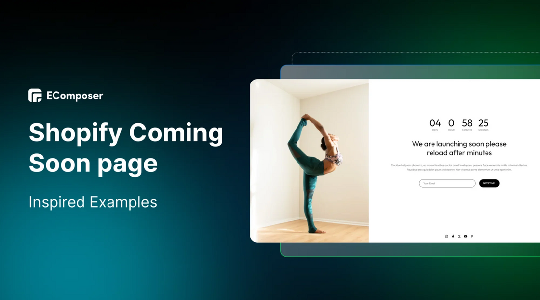
Table Of Contents
Are you getting ready to launch a new product or website? A "coming soon" page can be a great way to build excitement and collect leads before your launch. These pages might look simple, but they’re key to creating interest, urgency, and gathering a list of potential customers who are eager to know more.
In this blog, we’ll explain why these pages matter and share 25+ inspiring Shopify Coming Soon page examples to help you design the perfect one for your launch.
What is a Shopify Coming Soon page?

A Coming Soon page, or a page of pre-launch, is a simple landing page that lets people learn about your upcoming website, business, or product.
Its main goal is to grab visitors' attention before your product or business is fully ready. By having this page up, you can start generating interest and spreading the word about your launch. You can also use it to collect visitors' contact details, which adds to your mailing list and helps you easily reach potential customers when you’re ready to launch.
You might need a Coming Soon page if:
- You’re launching a new website.
- You’re adding new products.
- You’re rebranding.
- You’re building hype across other marketing channels
- etc.
Unlike standard pages like FAQ, Contact, or About Us, a Coming Soon page is temporary and will be removed once your launch goes live.
25+ Stunning Coming Soon Page Examples & Templates
1. Colorful Coming Soon Page

This Coming Soon template features a strong countdown timer to promote their upcoming product launch.
- This is a great example of how countdown timers can be used. Besides creating urgency for a product, service, or new website launch, it helps build curiosity for upcoming products to an existing brand.
- Plus, the social media icons give customers a way to learn more about your brand if they want.
- The sign-up email CTA is especially helpful for attracting new users, encouraging them to join the notification for upcoming news from your brand.
- The vibrant color of the background also brings a sense of excitement, announcing new information that will surely make customers happy.
2. Healthcare Coming Soon Page

This healthcare coming soon page is a great example of how diverse images can boost the pre-launch of a business website.
- This brand also takes full advantage of a countdown timer right on top, remember you should use seconds counting to make the clock run continuously.
- Additionally, the smart use of images featuring a well-known yoga coach helps promote the brand’s trust effectively.
- The layout really makes sense with the stunning image set on the left hand side of the page, while the key elements are displayed on the ⅔ right side.
- Other elements are included fully such as: urging heading, short description, a sign up bar and social media links.
3. Workout Coming Soon Page

The countdown timer highlighted on this landing page creates urgency, motivating visitors to take action.
- This workout business does a great job with its marketing message “We are working hard to bring you new experience”, it would bring a sense of upcoming improvement that deserves what customers are waiting for.
- The page makes it easy for visitors to understand since they use simple, clear language to explain why it is worth waiting for.
- The content is kept short and to the point, ensuring the message is clear and direct.
- A calling out for sign up with email would make customers feel assured that they will be announced whenever the business is ready.
4. Furniture Coming Soon Page

The furniture landing page grabs attention with a bold, concise headline, making a strong first impression and clearly communicating their message.
- The headline is eye-catching and builds anticipation, giving a hint of what's coming soon.
- A well-designed lead capture form encourages visitors to submit their information, helping the brand gather a list of interested users before the launch.
- The call-to-action (CTA) stands out with a contrasting color, making it easy to spot and encouraging users to take action.
- The minimalistic design keeps the page clean and focused, reducing distractions and highlighting the key elements.
5. Men’s Clothes Coming Soon Page

This Coming Soon landing page features a high-quality picture of the cloth they specialize in as the background. Just at the center of the page, there's a "coming soon" message to let visitors know about the upcoming business opening.
- The "coming soon" message is paired with a strong marketing copy that promotes the new launching.
- The website also has a minimalist design with black focus, highlighting the model with the product and keeping the look clean and simple.
- The countdown timer of this page makes a difference that it also provides the information on “Week” left, you can also utilize this if the preparation for launching happens in a few weeks.
6. Adored Vintage Coming Soon Page

(Image Source: adoredvintage.com)
Adored Vintage, a feminine clothing brand founded in 2012, continues to cater to its customers' tastes through its online store.
- While there’s no "coming soon" announcement on the landing page, a popup appears, inviting visitors to share their email address.
- By filling out the popup, users can join the VIP list and receive early updates on campaigns, offers, and promotions.
- Although it’s not for a specific product launch, this lets the brand share upcoming products and deals directly with customers.
- This approach helps them stay connected with their audience and grow their email list.
7. Fenty Beauty Coming Soon Page

(Image Source: https://pagesix.com/2020/07/14/rihannas-fenty-skin-launching-july-31/)
Fenty Beauty Coming Soon Page is a good example for effective elements to learn from. Here are some of the highlight points:
- The page places the sign-up form above the fold for easy visibility.
- Follow icons are included for social media channels to encourage engagement and build community.
- Consistent branding: Ensure the visuals align with your brand's style and color palette of gray, black and white.
8. Allbirds Coming Soon Page

(Image Source: allbirds.com)
Allbirds, a sustainable footwear brand, used its "coming soon" page to announce the launch of a new shoe. The page included a fun animation showing the shoe’s design process, engaging visitors and highlighting their eco-friendly production methods.
- The page followed a simple and clean design, avoiding any flashy tricks to attract attention.
- Like other examples, visitors were encouraged to enter their emails for exclusive access to the new launch.
- Instead of leaving the page blank, this approach allowed Allbirds to collect email addresses for their mailing list, making the most of their upcoming product release.
9. Asphalte Coming Soon Page

(Image Source: asphalte.com)
Asphalte, a fashion brand, did an excellent job with their pre-launch pages for the 'Socks Incoming' and 'Coming Soon' sections.
- The pages are bright, elegant, and engaging, aligning perfectly with the brand’s mission to offer men quality, durable, and accessible clothing.
- Asphalte emphasizes their focus on pre-ordering as a key strategy to deliver great garments.
- On the 'Coming Soon' page, they showcase their "Back Soon" collection, with a contact form for each product, allowing interested customers to sign up for preorder notifications.
10. Surprise Coming Soon Page

(Image Source: https://surprise-paris.com/pages/a-venir)
Another fashion brand that nailed their "coming soon" page is Surprise!
- Their 'Available Soon' page is designed like a calendar, showing upcoming products with launch dates. Each product has a contact form so customers can sign up for the sale.
- A standout feature of Surprise’s page is a pop-up offering a 30% discount during the launch, encouraging more sign-ups.
- This is a great example of how to create a high-converting Shopify "coming soon" page.
11. Depology Coming Soon Page

(Image Source: depology.com)
Depology's pre-launch page hits the right mix of curiosity and information.
- The page connects with its audience by asking, "Do you love Matrixyl 3000?" If the answer is yes, visitors are encouraged to enter their email below.
- Depology likely used social media, email campaigns, and targeted ads to drive traffic to this pre-launch page.
- Below the sign-up box, Depology offers a brief hint about what’s coming, using partially hidden background images to keep some mystery while still generating interest.
12. Fashion Nova Coming Soon Page

(Image Source: fashionnova.com)
Fashion Nova takes a bold approach with its "Coming Soon" page. Shoppers can preview the upcoming collection with images, pricing, and product details, helping them decide in advance if they want to make a purchase.
- This pre-launch tactic not only builds excitement for the new collection but also keeps shoppers engaged on the site.
- To enhance this strategy, the brand could link to similar products that are already available and collect emails from those interested in the upcoming collection, boosting sales for both current and future items.
- You can learn from by creating a dedicated product page to highlight upcoming products, along with their details and pricing.
13. Daybox Coming Soon Page

(Image Source: https://imgur.com/a/PdLjFyS)
Daybox's "coming soon" page is a great example of how using different images can enhance a product's pre-launch.
- Each image highlights a specific benefit, making it easier to showcase key features of the product.
- These visuals help visitors see how the product meets various needs, making it more attractive.
- The page also uses images of well-known figures to promote Daybox's time-boxing technology, a smart marketing tactic.
- By associating the product with successful, credible individuals, the brand gains trust and makes the product more appealing to the audience.
14. The Abundance Plan Coming Soon Page

(Image Source: https://imgur.com/a/USV1IRQ)
The Abundance Plan’s "coming soon" landing page uses a clean, minimal design with one main focus: testimonials.
- By removing distractions, the page highlights the power of social proof to build excitement and trust for the upcoming course.
- Visitors are drawn to real stories from satisfied users, making the course more attractive and credible.
- Seeing others’ success or satisfaction with the product makes it more appealing to potential customers.
15. Kitchor Coming Soon Page

(Image Source: limeble.pl)
The "coming soon" page for Kitchor new product line is a great example of engaging visitors and building excitement.
- The page gives a sneak peek of what’s to come because it combines appealing visuals with practical features. It's not overwhelming visitors since the high-quality images grab attention, while well-placed text provides key information.
- The design is simple and elegant, matching the quality of Kitchor’s products. A countdown timer adds excitement by ticking down to the launch date, creating urgency and keeping potential customers informed.
- A sign-up form for updates helps convert interested visitors into leads by letting them easily stay connected and receive the latest news.
16. Altium Coming Soon Page

(Image Source: altium.com)
The first best practice for a "coming soon" landing page is to use a simple form to collect visitor information without overwhelming them.
- A straightforward form encourages visitors to enter their contact details, for instance an email address, to get updates about the launch. It usually has just one to three fields (name, email, and maybe a phone number), making it quick and easy to fill out.
- A simple form reduces obstacles that might stop users from engaging with your site, helping to boost your conversion rate.
- It shows respect for visitors' time and attention, creating a strong first impression of your brand.
- It also makes data collection more efficient, avoiding the need for complicated data management.
17. Dualipa Coming Soon Page

(Image Source: dualipa.com)
Dua Lipa's official site for her project Radical Optimism is a great example of a "coming soon" page that builds excitement and engages visitors.
- The page features a clean design with vibrant visuals and a user-friendly layout, focusing on a strong call-to-action (CTA) that invites visitors to pre-order products, offering a personal touch to Dua Lipa’s new project.
- Visitors are kept to stay updated with the latest news and information about the project due to the well-placed sign-up button.
- Links to Dua Lipa’s store and tour details give fans more ways to engage, turning the page into a central spot for all things related to the artist.
- Adding interactive elements or sneak peeks could further capture visitors' interest and increase conversion rates.
18. Work Less Earn More Coming Soon Page

(Image Source: learn.howtoworkless.com)
"How to Work Less" is a coming soon course that creates an engaging and enticing headline towards visitors.
- The headline makes it appealing to visitors grabs attention since it offers more profit, more freedom, and fewer work hours.
- A bold, blue CTA at the top of the page is designed to attract early interest and drive action.
- The use of video on the page keeps visitors engaged and helps them understand how the product or offer works, showing its benefits effectively.
- The page also builds trust and credibility with social proof. It answers the question, "Does this really work?" and shows that others have found it useful because of showcasing customer satisfaction.
19. Webmob Coming Soon Page

(Image Source: webmobinfo.ch)
The short and clear content effectively communicates the excitement about the upcoming new website.
- The well-placed CTA turns a simple click into a chance to be part of something new and exciting, enhancing the appeal of the launch.
- A countdown timer on the page builds anticipation for the website's release and it adds to the excitement by.
- The visual also made a good impact on visitors with the animated astronaut, quite a different image compared to the other brands.
20. WorkWeek Coming Soon Page

(Image Source: https://imgur.com/a/BVXCI7j)
This coming soon landing page is both creative and highly focused on its goals. It’s an excellent example of how to generate buzz, collect leads, and convince visitors of the product’s potential.
- The cute doodles at the top are eye-catching, but it’s the accompanying text that truly matters. It highlights three common challenges small business owners face, making the page instantly relatable.
- It then offers WorkWeek as the solution to these problems.
- The next part clearly explains the product’s value and gives examples of businesses that could benefit from it.
- The final section is well-designed, only asking for an email address and featuring an "Industry" dropdown, helping WorkWeek understand user intent.
One suggestion: adding a CTA at the top under the "WorkWeek" logo could boost conversions, as the form is currently below the fold.
21. Online Course Coming Soon Page

(Image Source: https://imgur.com/a/pj1Mzov)
Some businesses also use a 'Waiting List' page along with a coming soon page, especially to promote upcoming courses or services.
- In this example, Kirsty Kianifard created a full sales page for her upcoming course, including clear call-to-action buttons inviting visitors to join the waitlist.
- A "Join the Waitlist" CTA works well because it promotes exclusivity and scarcity, while also helping to collect valuable user data from early visitors.
- She also added a sticky header bar that stays visible as visitors scroll, making it easy for them to opt in and improving signup rates.
22. Skate City Coming Soon Page

(Image Source: https://imgur.com/a/FL6ma47)
This coming soon landing page is designed to promote the mobile game Skate City. It does a great job of drawing attention and encouraging engagement.
- The first thing that grabs attention is a large video filling most of the screen. It's simple but engaging, giving just enough information to make visitors want to scroll down for more.
- Below the video, two lights briefly animate, highlighting the CTA to register for launch notifications. This clever animation directs attention to the main goal: getting users to sign up.
- At the bottom, social media buttons make it easy for visitors to follow the game on other platforms for updates.
23. Uppercase Magazine Coming Soon Page

(Image Source: uppercasemagazine.com)
Uppercase Magazine, a quarterly publication featuring ideas, crafts, and designs, has been around since 2009. This page design helps engage customers by offering a preview of what's ahead.
- While there are no obvious "coming soon" announcements on the landing page, a video introduces the magazine and provides details about the brand.
- As you scroll down, you'll eventually find the Pre-Orders section, which acts as the "coming soon" feature.
- This section highlights upcoming encyclopedia editions that will be released in the coming months, giving visitors a chance to see what’s coming and get excited about future products.
24. Notice Hair Co. Coming Soon Page

(Image Source: noticehairco.com)
Notice Hair Co., a brand offering natural hair products at affordable prices, uses its landing page creatively to hint at upcoming releases.
- Initially, the page doesn’t look like a typical "coming soon" page, but as you scroll, it subtly suggests there’s more to come.
- The short length of the page also hints that more products will soon be added, creating anticipation.
- At the bottom, there's a simple email signup bar where visitors can enter their details to stay updated on future releases.
The brand’s sense of community and cultural connection is present throughout, making visitors feel like they’re part of something meaningful and exciting.
25. Suta Coming Soon Page

(Image Source: depology.com)
Suta is an Indian clothing brand, blending tradition with modern design, handcrafted by skilled weavers.
- While Suta doesn't showcase specific "coming soon" products, they do offer early access through a popup that appears on their site.
- This popup encourages visitors to provide their email addresses, which helps the brand stay connected and keep customers informed about the latest updates.
- As you can see, popups are another effective way to enhance coming soon landing pages and build anticipation.
What Makes an Awesome Shopify Coming Soon Page?
1. Keep It Engage, Excite, and Convert
A coming soon page aims to build excitement for what's coming, show customers what to expect, and encourage them to sign up or share their enthusiasm. There's no strict rule for how long or detailed your page should be, but keeping it short, simple, and clear is usually best. Try:
- Get creative to grab attention.
- Use engaging words, images, videos, and a catchy tagline to spark interest.
- Make sure everything on the page connects smoothly, like a teaser trailer for your upcoming launch.
2. Capture Leads and Reward Sharing
A lead capture form is crucial for your coming soon page. It helps you gather emails and names so you can update customers about your launch, offer discounts, or ask for feedback.
To make it even better, offer rewards for signing up and sharing your launch on social media, like:
- Early bird offers
- Giveaways or free courses
- Gifts or discounts
- Sneak peeks of your brand
Encourage social media shares by offering discounts and freebies. This can boost sign-ups and excitement for your launch.
3. Create Urgency and Build Trust
Adding a countdown timer to your Shopify coming soon page helps boost interest by showing exactly when your brand or product will be available. If you don’t have a specific date yet, you can use general phrases like Launching this Christmas or Coming for New Year's Eve.
A countdown timer makes your page stand out from vague "coming soon" messages. Make sure to stick to your launch promise to build trust with your audience.
4. Optimize for Mobile
Statista reports that over 50% of global web traffic comes from mobile devices. So it’s obvious that mobile responsiveness is a must for a Coming Soon page. Here’s what you need to do:
- Ensure your page is optimized for mobile.
- Use a mobile-friendly theme or template.
- Keep images and CSS files small.
- Adjust button sizes and positions.
- Use a large, easy-to-read font.
- Avoid pop-ups.
Easy Steps to Create a Shopify Coming Soon Page
You can create a Shopify Coming Soon Page (or Password page) in two ways:
1. Using Shopify's Default Password Page
Step 1: Activate the Password Page
- From your Shopify Dashboard, go to “Sales channels” and select “Online store.”
Step 2: Customize the Password Page
- Click “Themes” and then “Customize” to open the main editor.
Step 3: Select “Password Page”
- Choose “Password Page” from the drop-down menu at the top.
Creating a "Coming Soon Page" directly on Shopify is quick and easy, saving you from needing additional apps. However, if you're not tech-savvy or lack design ideas, it might be challenging. Additionally, Shopify's default customization options are quite limited, resulting in a basic, simple page.
2. Create a Personalized Coming Soon Page Using EComposer Page Builder
EComposer - Landing Page Builder is a Shopify app that makes creating a Coming Soon Page easy, offering many free templates and extra features. Here's how to use it.
- Open EComposer - Landing Page Builder
- From the Shopify App Store, search “Page Builder”.
- Download EComposer - Landing Page Builder right on the first position.

- Choose a Page Template
- Open the EComposer app to start building your page.
- Click “Explore Library” to choose a template
- Choose the page type “Coming soon” page and a niche if you need. There will be various options for you to choose from.

- Just select a template, click “Insert now” and you're already more than halfway done!
- Start designing your Coming Soon Page by adding elements like headings, countdowns, text, newsletters, and social media links. You can also adjust the background and colors to fit your style.

- To edit details, hover over the area you want to change and click the pencil icon. The editing options will show up on the left side. You can update the text in the Content section and tweak colors or alignment in the Design section.
- If you need extra features or integrations, go to the Extension Library on the left side; it's the sixth icon.
Step 3: Save and Publish
- Click "Publish" in the top right corner and choose "Save and Publish."
- To see how your page looks, click "View.”
To learn more details about how to create a high-converting Coming Soon Shopify Page, please click the link to find out.
Using EComposer requires downloading the app, but it doesn’t impact your store’s performance. It offers both ready-made templates and customization options.
Plus, EComposer provides additional features for creating home pages, product pages, and more, along with a wide range of professional pages and built-in extensions.

If you don’t have a Shopify account yet, take advantage of a special deal: get your first month for only $1 on any plan and check out all the features Shopify offers.
Others also read
20 High-converting Shopify Landing Pages Examples
How to add Shopify Countdown Timer without Coding
Comprehensive Guide to Design Shopify Registration Form
FAQs
- How to write a Coming Soon page message?
Here’s how to craft an effective "Coming Soon" message:
- Clearly state what’s coming and when
- Create excitement instead of pushing for sales
- Add a countdown timer if you can
- Use just one call to action
- Provide a way for customers to contact you
- What to put on a Shopify Coming Soon page?
- Product or Service Description: Briefly explain what you're offering.
- Sign-Up Form: Collect email addresses for early access.
- Social Media Links: Reach out your audience on various platforms.
- Countdown Timer: Create excitement and urgency.
- Visuals: Use high-quality images or videos to showcase your brand.
- Call to Action: Encourage visitors to sign up or follow your brand.
- Why does my Shopify store say opening soon?
Possible Reasons can be:
- Store is Under Construction: The store might be in the process of being set up or updated.
- Planned Launch: The store might have a specific launch date planned.
- Technical Issues: There could be temporary technical problems preventing the store from opening.
To find out the exact situation and ways to solve the problems, explore more of the reasons why Shopify says opening soon here.
Key Takeaways
A Shopify Coming Soon page makes it easier to promote your brand. It helps you show potential customers what you have to offer and boosts brand awareness, making product launches smoother.
When creating your "Coming Soon" page, remember to:
- Clearly explain what you're bringing to the market
- Use a strong value proposition at the top to grab attention
- Build excitement with discounts and a countdown timer
- Encourage visitors to return by making them eager for the launch
- Add a review section to build trust with potential customers
- Keep the design simple and clutter-free







0 comments