Shopify Masonry Layout: FREE & EASY way to create

Table Of Contents
Are you tired of spending hours trying to design an eye-catching Shopify store layout but it’s still cluttered? Do you feel like you're missing out on potential sales because your website doesn't look professional enough? Look no further than Shopify Masonry Layout! This FREE and EASY way to create a stunning online store will revolutionize the way you do business. Its sleek and modern aesthetic help you keep customers coming back for more.
In this blog, we'll guide you through all the steps necessary to implement this layout on your Shopify store, so you can start reaping the benefits today. Don't miss out on this game-changing opportunity - read on to learn more!
What is Shopify Masonry Layout?

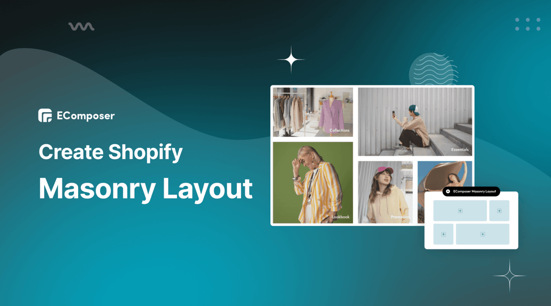
A Shopify Masonry Layout, often referred to as a Pinterest-style layout, is a particular way of displaying products or images on your Shopify store. The term 'masonry' is borrowed from the construction world where bricks of different sizes are used to build walls. Similarly, a Masonry layout arranges content of varying heights and widths in a grid-like style, similar to a mason fitting stones in a wall.
Masonry layouts can be highly visually appealing and allow you to showcase many products or images at once, each of varying sizes, making for a captivating, organized display that optimizes space. This unique presentation method can be beneficial in attracting and engaging customers, ultimately enhancing their shopping experience on your Shopify store.
In a Masonry layout, the elements are positioned to maximize the use of space within the container, and gaps are minimized. As a result, the layout is fluid and responsive, adapting well to various screen sizes. This makes it particularly advantageous for mobile-friendly or responsive web design.
How does Shopify Masonry Layout benefit your online stores?

You can take big advantage of using Shopify Masonry Layout.
Visual Appeal
A Masonry layout brings a unique visual aesthetic to your Shopify store. Its grid-like design showcases products in a visually interesting manner, which can be more engaging to customers. The varied sizes and orientations of the images can draw the eye and create a dynamic browsing experience.
Optimized Space Usage
Unlike traditional grid layouts, the Masonry layout leaves no empty spaces between the elements. This optimal use of space allows for a higher number of products to be displayed on a single page, providing your customers with a more comprehensive view of your offerings.
Enhanced Browsing Experience
By arranging your products in a non-linear format, Masonry layouts make browsing more intuitive and enjoyable. This format can encourage customers to spend more time exploring your products, leading to increased sales.
Responsiveness and Mobile-Friendly
Masonry layouts automatically adjust and reorganize the blocks to fit different screen sizes, ensuring a consistent, user-friendly experience on all devices. This responsiveness is particularly important given the increasing number of shoppers who browse and buy on mobile devices.
Increased Conversion Rates
The unique and engaging design of a Masonry layout can lead to higher customer engagement, more extended site visits, and ultimately, increased conversion rates. The dynamic and visually intriguing presentation can also strengthen your brand image, further encouraging customer loyalty and repeat purchases.
Customizable Ability
Masonry layouts can be easily tailored to fit your brand’s aesthetic and business needs. This flexibility allows you to create a unique, engaging, and personalized shopping experience for your customers.
Although these benefits are significant, the success of a Masonry layout also heavily depends on your implementation, the quality of your product images, and the overall design of your Shopify store.
How to set up Shopify Masonry Layout for your store pages (FREE)
You can use EComposer to build Shopify Masonry Layout for your Shopify store without any cost. EComposer is an intuitive Shopify page builder which enables you to build a professional online store. With EComposer, you can easily create custom pages that align with your brand's visual identity without needing any coding skills.
One of the standout features of EComposer is its drag-and-drop interface. This user-friendly interface makes it possible for you to design web pages exactly how you want them. Plus. This app offers a large library of pre-built templates, sections, and elements that you can use to build out your page content quickly.
Moreover, the support team is available 24/7 to assist you during the page-building time. You can use “Masonry Layout” - one excellent extension of EComposer and is available on free plan. Let’s try it now by following the guide below.
Step 1: Install EComposer
- EComposer is available in Shopify App Store, you can search for “EComposer Landing Page Builder” and then click “Add App”
- After that hit “Install” to start using EComposer

Step 2: Open EComposer
- Now, in your Shopify dashboard, click on “Apps > EComposer”

- Now, choose “Start Building” or open an existing page that you created before

- In the EComposer editor, you can find the Masonry element under the “Advanced” section.

- Now, simply drag-drop it into your desired location.

Step 3: Configure Masonry layout element
- Hover over the Mansory layout part, and click on “editing pen”; then you can adjust the text and description in the “Content” and edit images & structure in the “Design” part.

Step 4: Save & Publish
Hit “Publish” at the top right corner and select “Save and publish” to live your page.

- Choose the “View” option to see the result.

Follow how to configure the element comprehensively here: Masonry Layout
To take user experience a step further with images, we recommend using Nitro Lookbook app. This app allows you to display optimized images in engaging, shoppable galleries, including grid and Masonry layouts.
With Masonry’s non-linear format, Nitro Lookbook encourages customers to spend more time browsing, making exploration intuitive and enjoyable. Fully customizable and easy to navigate, it helps create a seamless browsing experience that invites customers to explore your products, boosting both satisfaction and conversions.
Typical examples of online stores with Shopify Masonry Layout
Check out the best examples of using Shopify Masonry Layout below.
1. The North Face

(image source: thenorthface.com)
The North Face uses Shopify Masonry layout to display the post from customers. This is UCG (User Content Generated). In this way, all customers can see their photos in the best structure that can connect them all together. When looking at the pictures, you can feel the freedom and happiness in each picture, harmonies with nature.
Moreover, The North Face put a link to related products on each image to help customers find their favorite products easily. This is an amazing example for you to learn from.
2. Anthropologie

(image source: anthropologie.com)
Anthropologie provides various kinds of products (clothes, accessories, Home & Furniture, Gifts & Candles). Each kind of item is showcased in a different Masonry layout to attract customers. In the picture above, this shop uses Masonry layout to arrange the featured collections, customers can click on the picture to go to the page of detailed products. That’s a good way to direct customers to your Shopify stores; from that, your business can boost sales.
3. Urban Outfitters

(image source: urbanoutfitters.com)
Urban Outfitters offers a wide range of clothing, accessories, and home decor items. The masonry layout employed by Urban Outfitters is especially effective in highlighting its diverse product offerings. Each product is displayed clearly and concisely, without overwhelming the viewer with too much information or clutter. This layout also allows for easy navigation between product collections.
Overall, the use of masonry layout has proven to be a highly effective way for Urban Outfitters to showcase their products in an engaging and user-friendly manner. By presenting their offerings in a visually pleasing and easily accessible format, they can create a memorable and enjoyable shopping experience for their customers.
Optimize Shopify Masonry Layout for better customer experience

Enhance customer experience with Shopify Masonry Layout by applying the following tips:
Use High-Quality Images
The Masonry layout's effectiveness is highly dependent on the quality of the images you use. Customers are drawn to clear, high-resolution photos that accurately depict the products. Use professional-grade photos and ensure that they're adequately optimized for web use to maintain quick load times.
Maintain a Balanced Layout
The Masonry layout is appealing due to its asymmetrical balance. However, it's vital to ensure this balance is maintained. The various elements, whether they are product images or text blocks, should create a visually balanced layout. Too many large blocks together or too many small blocks can disrupt the balance and create visual clutter.
Implement Clear and Concise Product Descriptions
Even though images are the main focus of a Masonry layout, the accompanying text is equally important. Ensure your product descriptions are clear, concise, and informative. This not only aids in SEO but also helps customers make informed decisions about their purchases.
Use Consistent Color Schemes
A consistent color scheme helps to unify your Masonry layout. It makes your online store more visually appealing and harmonious. Choose a color scheme that aligns with your brand identity and enhances the visual appeal of your products.
Ensure Mobile Responsiveness
More and more consumers are shopping on their mobile devices. Therefore, ensuring your Masonry layout is responsive and mobile-friendly is crucial. The layout should adapt to different screen sizes without losing its visual appeal or functionality.
Optimize Loading Speed
While high-quality images are a must, they can also slow down your site if not properly optimized. Lengthy loading times may increase the number of visitors who leave a website without further engagement. Ensure your images are optimized for speed, and consider implementing lazy loading, where images only load when they come into a viewer's screen view.
Overall, regular improvements and updates will keep your store fresh, interesting, and most importantly, user-friendly.
FAQs: Shopify Masonry Layout

1. Will using a Masonry layout slow down my Shopify store?
Answer: A Masonry layout, by nature, doesn't necessarily slow down your Shopify store. However, because Masonry layouts often involve displaying a large number of images or elements at once, it can potentially slow down page load times if not properly managed. This can occur if the images used are large files that haven't been optimized for the web. To avoid slow load times, you can use Tinify Image Compressor.
2. Can I use a Masonry layout if I have many product categories?
Answer: Yes, you can certainly use a Masonry layout if you have many product categories. Masonry layouts can be especially effective when dealing with a wide range of products. It allows for showcasing of diverse items, each with different image dimensions, appealingly and creatively.
Some tips on how to effectively manage a Masonry layout with many product categories: utilize Filters and Sorting Options, group Similar Products, use Category Headers, and include a Search Function.
3. Can I switch back to my old layout if I don't like the Masonry layout?
Answer: Absolutely! If you decide that the Masonry layout isn't right for your Shopify store, you can certainly revert to your previous layout. The process would generally remove the Shopify Masonry Layout extension.
4. Where in my Shopify store can I effectively implement a Masonry layout?
Answer: The Masonry layout is a visually appealing and popular choice for several areas within a Shopify store. Its dynamic and flexible structure can enhance the presentation of diverse content types. Here are some common areas where a Masonry layout can be beneficial: Product Page, Blog sections, Image Gallery, Portfolio Page, Homepage, and Category Page.
Bottom line
To sum it up, the Shopify Masonry Layout extension is a fantastic tool for merchants who want to create a sleek, modern, and organized storefront without any coding experience. Its drag-and-drop interface, customizable options, and free-of-cost availability make it an easy choice for those looking to elevate their online business.
With this feature-packed app, you can create a beautiful, responsive website that's sure to impress your customers and boost sales.
Don't wait any longer to upgrade your online store. Head over to the Shopify App Store and install EComposer to utilize FREE Mansory extension now to revolutionize your website's look and feel. Contact support@ecomposer.io if you have any question or need further assistance.


0 comments